My essay compared the uses of photography and art as a way of documenting war and their value in doing so. One thing that really stood out to me whilst writing the essay was how Guernica painting really did make people aware of what had happened and changed their views. I found it interesting that a piece of art, which primarily reflects an individuals feelings or outlook about something could be taken as fact. This got me thinking about how propaganda was used to change or manipulate peoples views. The posters with a painting on have no fact or truth behind them yet they convinced and changed so many peoples views on the war. This was exactly what I wanted to focus my publication on.
I had already done quite a bit of research due to my essay being about the war, as well as doing some research out of self interest. I knew I wanted to combine image and quotes in a book. A ration book seemed like the most appropriate type of production as it fed into the whole theme of war as well as with the idea of limitation and control; The book limits and controls how much food you get and the propaganda poster control what information you know. Both the ration book and propaganda were used by the government to control the masses. This really makes the Format relevant to the Content.
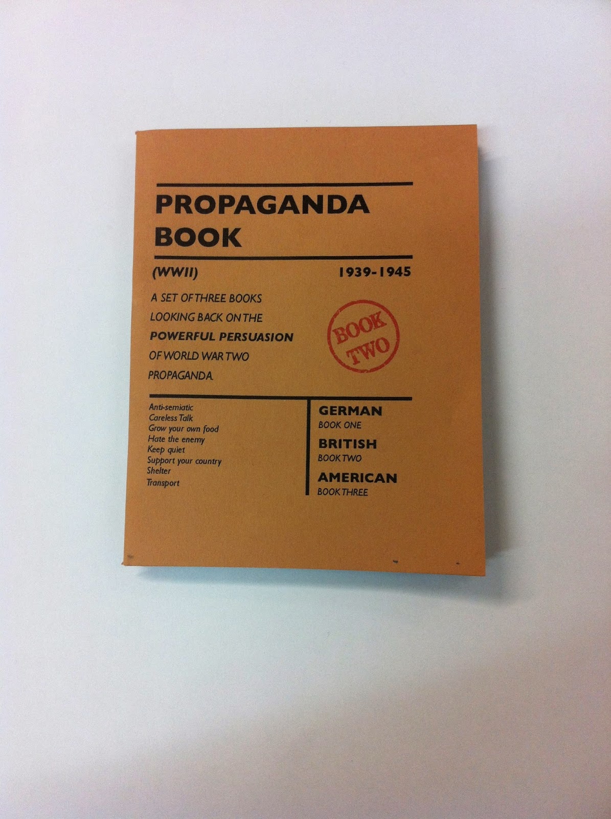
The aim of my book was to show a range of propaganda with a bit of a description or talk about them and the posters aims. My research translated very nicely into content, although for this project I had to research more specifically into propaganda posters and the meaning behind them, but whilst doing this I thoroughly enjoyed it and found it interesting.
In the end I decided to organise the content into 3 sections; German, British and American. As these three countries did a wide range of propaganda from anti-Semitic to being proud of your country and not eating as much. Originally I wanted all three in the same book but once I had got hold of a ration book I didn't realise, and therefore, didn't take into consideration how small/few pages there are. I decided that if I kept with the idea of it all being one book then it would no longer fit in with the concept of a ration book. I decided I would make 3 books; one for each country. Each book would be 20 pages with a short intro which would be the same for each book. Then each book would have a bit about that countries propaganda at the time of WWII. I felt this was the right sort of size and I am glad I changed from making one book to making three.
Design Decisions
Whilst looking through a Ration book I noticed a few key design features (Intentional or not) which I wanted to replicate. I felt by doing this it would make it closer to the ration book and more genuine.
Here is a link to some primary research (Including the ration book) which influenced my design decisions.
1. Small Margins: The books all had text close to the edge of the page.
2. Typewriter Font: The Ration book looked almost like it had been typed up on an old typewriter. The letters were sometimes askew which really made it look hand made even though they would have been mass produced.
3. Large Gutter: In the traditional ration books they were stapled straight through down the left hand side which would have meant a larger gutter would have had to off been there to allow for this. This was something I initially deigned but when it came to printing it was a nightmare so some pages now look like they have a larger gutter when actually they are all the same.
4. Stock Choice: I really wanted to avoid working on normal paper. The ration book had an orangy brown cover and light grey/yellow pages. I decided to get the front cover as close of a match as I could. However for the body copy/main pages I worked with two light shades of sugar paper. This allowed me to vary as in the book some of the pages are different colours. I wanted to work with slightly lighter colours because I was going to be printing images onto it and the white would print as the stock so I needed it to be as light as possible so the images were clear.
5. Binding Method: I decided I would bind it how the actual books were bound, by stapling it. Initially I wanted it stapled on the front cover left hand side, however because the gutters didn't work as well I had to staple it on the fold instead. This wasnt too big of an issue and perhaps works better because of the size of the book having it stapled on the fold means you can open it up a lot easier.
Overall I have really enjoyed this project and even though certain aspects have been challenging such as printing it has been a great learning curve. It has really upped my confidence with making a publication and I feel I have been enthusiastic towards the idea, concept and research as I have enjoyed learning the design aspect as well as the history.