Type is a modern obsession. We only have a sense of history because of type. Type is the visual representation of language, through this we can communicate world wide and also look back to see how things were. It is speech made visible - a durable visual form.
No consensus when language began being visualised. 3200bce (ish) was when the population had spread out and people began to settle in Mesopotamia. Occidental development in an American direction and also oriental so the language began to split and type became very different.
There is no single approach within typography that applies to everything.
"All that is necessary for any language to exist is an agreement amongst a group of people that one thing will stand for another"
The first alphabet to exist was Greek and we have derived our alphabet from this today. The Gutenburg press went into production in the 1450s, this made movable type more accessible and therefore text and information became widely available. This along with William Foster in 1870 bringing in the Elementary Education Act meant that everyone between the ages of 5 and 12 had to go to school. This had a huge impact on type as it meant more people were reading and taking an interest in learning.
1957 - Max Miedinger. The creation of Helvetica, swiss design slowly began to bring out technical designs. Helvetica was one of the first types to be designed under 'function before form' it was made for readability first and look second. It was revolutionary in the type world. Ariel was designed 25 years later by microsoft with minor adjustments so they didn't have to pay the font license fee. Strangely 25 years is the amount of time that a design is protected for.
1990 - The first apple mac was invented to sell for less than US $1000. It was made so that everyday people could use it and not just the rich and wealthy.
Gotham font was created in 2000 and adopted in to the Obama campaign.
Vincent Connare invented comic sans in 1994 - he also worked for microsoft.
1990 - Tim Berners - Lee created the world wide web and browser and kindly gave it away free.
1995- Bill Gates Invented internet explorer. This laid the foundations of web browsers templates for the next 18 years.
Wednesday, 30 October 2013
Mono printing Induction
The mono printing induction introduced us into the idea of mono printing and how it can be used to create different affects. Mono printing is relatively straight forward but allows you to create some interesting pieces of art work.


Next a stencil is created so that some of the ink is stopped this way it'll form shapes. As you can see from above both the negative and positive stencil can be used. The ink is then rolled onto a board, the stencil placed on top and then paper on top again. This is then put through a press where it is rolled and the image comes out on the paper.


A light bulb was chosen as a stencil because then a piece of work could be created that relates to Brief 5. Above shows the piece of work and also the stencil after use which still looks pretty cool and usable.

The board after printing.

Pieces of work can be created by layering, for example above the larger stencil was used to create the yellow bulb and then afterwards the light bulb stencil was placed over the print and black was added.
Brief 4 - Message Delivery: Nuclear Waste
One of the main arguments that people seem to bring up against nuclear power is the waste that is produced. Little is known about the waste produced or what happens to it. An image is created in our heads of a massive pile of green neon waste glowing somewhere, hopefully the point of this research will actually show the facts behind this imaginary image.
Nuclear power surprisingly produces less waste than that that is produced by fossil fuels, whether this is because there is less nuclear power production in comparison to fossil could be a factor. However for the energy produced there is less waste. Nuclear power takes into consideration the cost of disposing of the product safely. The nuclear fuel which is left behind can be used further as another way of forming energy, this is definitely something worth researching although saying this, the fact that this doesn't happen that often suggests there is something about it which may not be worth it.
 The cost of managing the waste is included into the bill of the consumers. There are different types of waste which have different procedures to be disposed of depending on their level of radioactivity. The level of radioactivity decreases over time. Each radioactive nuclide (normally called radionuclide) has an unstable nucleus. For every radionuclide it has a half life, this is the time that it takes for half of its atoms to decay and loose half of its radioactivity. They are easier to handle if they have longer half lives, if they have a longer half life they tend to be alpha or beta emitters. If they have a shorter half life then they emit more radioactive rays which penetrate more, an example of this would be gamma rays.
Radioactive material doesn't stay radioactive forever which is a common misconception it does eventually break down into less harmful elements.
There are four categories that the waste can be split into:
Excempt waste and very low level waste - This isn't harmful to people or the environment, it tends to be things or part of the building structure which has been near nuclear radioactivity such as concrete, bricks or metal etc... This waste is removed along with any domestic waste as it is not seen as a threat.
Low-level waste (LLW) - this includes anything which has been in a radioactive area and contains a small amount of radioactivity which tends to be short lived. It doesn't need special handling and can be buried shallow. However before it is buried it tends to be burnt down, this isn't because of the radioactivity but the sheer size of low level waste.
Intermediate-level waste (ILW) - Requires some shielding as it contains the contaminated materials or chemical mixes like resins, chemical sludges and metal fuel cladding. Any liquids have to be solidified before being disposed of.
High-level waste (HLW) - This is the burning of uranium in the reactor. Because of how radioactive it is as well as the heat it emits it requires shielding and also cooling. HLW is over 95% of the waste produced! HLW can be separated into long-lived and short lived lives this then makes for a more efficient disposal.
Brief 4 and 5 - Message Delivery: Chernobyl Photograph
Many photos were taken of Chernobyl and the damaging after affects that came with it. Some truly distressing images are shown of not only the disaster but the affect of children born with radiation poisoning.
 |
| No use of legs - they rely on their arms to pull them around. |
 |
| Deformed toddler with the brain membrane at the back of his head, almost looking like another head. |
 |
| hydroencephalitis (inflammation of the brain) |
These photos may work well with Brief 5 because they are powerful enough by themselves. They don't need text to explain them, the fact they are in a grey scale makes it more grim and powerful as an image. It will be interesting to look into campaigns and see how they have used simple images to raise awareness.
Brief 4 - Message Delivery: The Chernobyl Disaster
 |
| The spread of radiation from Chernobyl |
The Chernobyl disaster happened in April 1986, It was the worlds worse nuclear accident when reactor 4 exploded. The reason this is so key to the research into Hinkley point because it made people question the very idea of nuclear power. It brought death and birth defects for years to come.
There was a fatal floor in the reactors design where it becomes highly unstable whilst running at low power. The owner and man in charge wanted to dominate over the technology. On the night of the disaster they were supposed to be running a test on the safety after a few years before they were bombed by Israelis, because of this soviet scientists demand tests to check how they would cope with out the power. However the man who was in charge didn't follow the guide lines and did not run the test properly. There was instructions to run the reactor between 700-100 megawatts when the test began but he ran it at 200megawatts to preserve the cooling water from over heating. He didn't listen to anyones opinion of the workers below him.
The water drums levels were low so the low power stalled and grounded to a halt, and the foolish decision to pull the control rods to start power up again was made. The control rods are the break and the accelerator of the nuclear reactor, so doing this was described like cooking a gun. There are over 1000 uranium filled fuel rods the splitting of uranium atoms realises heat from the fuel rods, this produces a mass of steam from the water. This steam then turns a turbine and generates electricity. To control this 211 control rods are spread through the core, if they are raised the power accelerates and if they are taken out altogether they loose the ability to apply the breaks. This is what happened. They believed the chances of the accident were completely rare, even those who are aware of risks and danger estimated that there was only a 1 in a million chance of an accident.
KGB Documents came out which showed the plant had ignored serious warnings about the design floors of Chernobyl between 1979 - 1986. The director and senior mangers rushed to open the reactor number 4 early so they could win bonuses, for them the safety came second. For example the roof was meant to be made from non flammable, fire proof materials but they didn't feel they had time so they used combustable material. Accidents were constantly covered up and swept under the rug so to speak. Interestingly the test that they were running on the night was meant to have been ran before the reactor was even opened and operational.
Power built up at the bottom of the core which formed hotspots where a few of the control rods had been left partially in at the top. These lower parts would not show up on the system so the plant became a ticking time bomb. As previously mentioned the water levels were low, the alarms for this were ignored. This meant that is was boiling like an empty kettle. More and more energy began to be produced with less and less water. The steam pressure from the core managed to lift the 350 kilo caps to the fuel rods out of their sockets!
Reading into the disaster and also watching documentaries on it, it has become clear that living in the soviet country played a part in why the workers didn't speak up more often. It is reported that quite a few did say that the station wasn't following procedures but even they were fully aware of the risks. One of the points that was highlighted was that the workers for the plant had been provided with accommodation near to the plant together and schools were built for their children along with other benefits. They were given a very comfortable life style so rising up over an accident that they thought was unlikely to happen didn't seem worth it.
Tuesday, 29 October 2013
Context of Practice: Semiotics
Semiotics is the meaning we apply to things. However it is a broad subjects so can be divided into the following subcategories:
Media Semiotics: The media can reuse and recycle signs for their own ends. It asks what something is, how it exemplifies its meaning and why it has the meaning it has. For example Superman has been recycled into our society. In the past a hero would have been sent from the gods but now in a secular society this is no longer appropriate.
Types of Signs:
1. Icons - An icon is something that resembles its reference in some way directly. e.g. a map of France is an icon to France.
2. Index - Something that resembles and relates to something else without showing it. It is an inferred link, e.g. a direction showing you where a place is without showing you the place.
3. Symbols - A signifier that stands for the sign in a conventional way. e.g. the French flag.
Codes: Codes are the basic 'ingredients' or 'directions' that are needed for making a sign. e.g. Set codes create the idea of superman, he needs to be loyal and fighting evil to save good. If this were the other way around he wouldn't be superman.
Texts: Text is the actual story behind the codes. The story when remembered is remembered for the codes that stick out and provide a summary.
Myth: Myths help us make sense of our place in society, they give us aspirations and we can live out our virtues through them. e.g. We attach codes to superman such as he is good and caring and then try to live these out ourselves. He becomes an example of our ideal.
OUGD404 - Design Practice: The Anatomy of Type
Typefaces lay in their original way of production this can be the start to how we understand type and when and how to use it. Typography can be viewed from different angles, it is not just the production process but also the language aspect. Typography is a visualisation of the language which has evolved over the years to create the typography we have.
The letter A was originally formed from what would have been a sketch of a calf head to symbolise something, it would have then been stripped to basic lines and eventually resembled an A as we know it today. In contemporary typography we end up with a range of letter forms that communicate the same thing. Typography is now a formalised language and because it is formalist it means it is durable. This means it can be changed in a plethora of ways but still be readable as that letter or word.
The key thing to any font design is that it has a spacial element- a series of lines create a frame work for the font which allows it to have its format. The distance between the base line and cap height is the same for all fonts, however the x height can be varied between fonts.
1 point = 1/72 inches = 25.4/72mm = 0.3527mm 12points = 1 pica
Font - "The physical means used to create a typeface, be computer mode, lithographic, film, metal or wood" The Font is the method of production it is individual to each variation of the type and each point size. For example Helvetica Bold 12pt is one font where as Helvetica Bold 14pt would be a new font but the same typeface. A font is not exclusive to letters it includes numbers and glyphs but it just has to be in a uniform size, weight and style etc...
Catergories of Font:
Block - The big chunky black fonts
Gothic - Cleanist type of font, it is crisp and neat
Roman - most serif fonts
Script - anything created by brush strokes or pen etc...
Typeface - A collection of characters, letters, numbers and symbols that share the same defining features but the line weight varies. A type face is designed together and are intended to be used together to compliment and and structure to a piece of work.
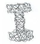
Brief 3 - Alphabet Soup/Typeface: Last Modifications

After the crit it was useful to reflect on the feedback given. One of the main things that became apparent is that the new letter forms should be working around the basis of the chosen font. For this reason some of the ideas were scrapped and four were kept and adapted to the silhouette of Briem Akademi (STD Condensed).
The two preferable outcomes from the ideas shown above are the 'A' and the 'D' as both of these portray his character best. The final alphabet and glyphs will be hand rendered onto tracing paper which will show how Johnathan's hand made style of work.
The 'A' will probably work best because it shows the idea of being busy but from afar looking neat and organised.

The next step (shown above) is to format a grid that fits in a 4 by 8 ratio with all the letters in and 6 chosen glyphs. This will then make the process of hand rendering it a lot easier and quicker.
Monday, 28 October 2013
Brief 5 - Message and Delivery: Brief
Brief
Produce designs for a set of three high impact posters that deliver a personal identified message derived from your research into part one of this brief.
The three posters should work as a set or series and be visually consistent. The first must be produced solely using type, the second solely with image and the third a combination of both type and image.
Background / Considerations
Focus on what you are trying to say and avoid generalisations and vague messages.
Keep it simple and to the point.
Are you making a statement, delivering facts or posing a question?
You should consider and investigate a broad range of possible visual solutions before making your design decisions.
- Tone of Voice.
- Memorable, immediate high impact and clear.
- Challenging, potentially controversial but appropriate and not offensive.
- Factual, statistical, informed and specific.
Each poster should be supported by comprehensive visual research into frame format, composition and content.
Use notebooks to document your ideas. Use worksheets to develop your visuals
investigation.
Deliverables
You are restricted to the use of two colours plus stock.
Three Posters ( 2:1 format) presented at A3 scale (but not A3 format).
Brief 3 - Alphabet Soup/Type Face: Interim Crit
The feedback that was given for Brief 3 has been really useful for developing the alphabet further. The way the crit was laid out meant that we didn't present to the group, but rather lay our work out and let it speak for itself. On a separate sheet was written anonymous feedback which we could then use to develop our alphabet.

The main pieces of feedback that seem to be of value are the following:

The main pieces of feedback that seem to be of value are the following:
- examples of the font silhouettes being used as the starting point
- begin looking at 3D and mechanical
- Top heavy letters work well
- exploring the idea of tracks and working that in with the font of Briem Akademi
- tall letterforms
- 'divided idea is most visually pleasing' - idea of constructing and deconstructing
- choose a clear path, focus on one of his traits or think of overlapping traits
- focus on creating more legible letterforms
From this it allows for a wide range of ideas to be developed further and hopefully form a strong basis of work.
Brief 3 - Alphabet Soup/Typeface: Development
 To create a suitable alphabet it needed to incorporate our partners personality and characteristics in the way it was designed. One thing that is notable from the questions with Johnathan is that quite a few of his hobbies or attributes are linked or could be portrayed in the same way. For example he is a very busy person with work, university and socialising, this can be represented by the idea of movement - lots of lines or a busy letter. However this also could fit in with the idea of his fear of wasps, the lines representing the path the wasp takes.
 On the right shows an initial idea of trying to present 'busy' and the sheer amount of work through the alphabet. A significant part to this design was trying to show that even though he is busy and has a lot going on he appears and composes himself as a calm and neat individual. The development on the right is playing around with using capitals only. Capitals are best because they are a statement, bold and can also relate loosely back to his love for caps.
This idea developed further as it began to look at the slicing up of letters to show the break between the two sections; busy and neat and organised. The first A on the left is showing the idea of it being hectic under the service, the idea that no-one knows how busy he is. This developed further into actually slicing the letter to reflect the mechanical side of his personality. The letter is being constructed and deconstructed depending on your outlook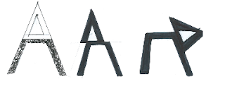

The next idea that followed looked at a combination of a few things: his love for driving to relax, his dream job of being an F1 driver and his love for mechanics. The first thought that comes to mind with the idea of driving was speed, this again links back to the idea of being busy and speeding around. Acrylic paint was used to create letters that looked like they were moving. Acrylic paint was the best material choice as it lends itself well to being smudged and creating movement.


Brief 4 - Message Delivery: Interim Crit
The interim crit proved not only useful but also interesting. It was interesting to see the wide range of stories people had chosen and also to listen to the range of research that the people had collected especially those who had also chosen nuclear power.
After the crit it became apparent that the final piece for Brief 5 will be informative and educational. This means that the next amount of research will be trying to gain more knowledge on different aspects of nuclear power. The final posters will aim to show the facts about nuclear power to people and allow them to make up their own mind on it. Many people are against nuclear power but with no just reason so hopefully this will make it a fair argument.
After the crit it became apparent that the final piece for Brief 5 will be informative and educational. This means that the next amount of research will be trying to gain more knowledge on different aspects of nuclear power. The final posters will aim to show the facts about nuclear power to people and allow them to make up their own mind on it. Many people are against nuclear power but with no just reason so hopefully this will make it a fair argument.
Brief 4 - Message Delivery: Is Nuclear Power just a taboo?
There is a lot of
negative press towards Nuclear power, even the idea being suggested as an
alternative tends to raise a fair few glares and shaking heads. However is it
as bad as people seem to think? What are the real figures and facts behind the
use of nuclear power? As a country we need to think of other alternatives for
energy understanding that one-day coal will run out and renewable energy may
not be substantial enough.
After Chernobyl
and Fukushima people are very hesitant and hostile towards the idea of nuclear
power. However it can be argued that the proper procedures were not in place
when both disaster happened, and although it was a tragic accident, it was
perhaps easily avoided If correct precautions were followed.
People worry
about radiation from nuclear plants, which is a fair concern, however they seem
to overlook the fact that we are subjected to radiation everyday from natural
processes, it is not something that is escapable. For example people who live
near a large source of granite such as Cornwall have a higher exposer compared
to others. Daily checks expose people to a high amount of radiation but this
does not seem to be on the same level as nuclear radiation to people. For
example x-rays expose you to higher doses of radiation than nuclear radiation.
There are very
strict and rigorous plans in place involving both the safety of and in the
plant and also in the case of an accident. After Fukushima there were
restrictions placed in Tokyo about drinking the radioactive water, and as scary
as this sounds they failed to mention that the radiation dose received by
drinking the water in Tokyo would have been less than moving to Cornwall and
living there for a year.
It is thought
that over 100,000 deaths each year is due to coal related air pollution. But
this doesn’t seem to be such a worry to people or at least not as much of a
concern compared to radiation.
Brief 4 - Message Delivery: Are we reliant on others to build Hinkley Point C nuclear power station?
One main factor that the government seems to
be boasting about is the amount of work the new nuclear powerstation will
generate. They argue that it will open up new jobs for an engineering work
force, but does our country have a qualified source of engineers suitable?
Engineers and Scientists have been undervalued over the past years and the
majority of those graduating from university with a degree in hi-tech
engineering are not from Britain.
“The problem is
that we are fast approaching a point where 80 per cent of postgraduate
engineering positions at British universities are taken by students from
outside the UK.” – Sir James Dyson
This plays further
into the idea that we are relying on other countries to be independent. The
government have an ideal of producing nuclear energy ourselves and being fully
self sufficient, however since they shot themselves in the foot by arguing they
wont allow subsidies from tax payers they have made themselves reliant on other
countries.
With the building
of Hinkley Nuclear plant we are relying on EDF expertise and ownership and
money from the Chinese as previous investor Centrica pulled out last year.
Sir James argued
that the country does not invest enough in the engineers and designers of the
future, It could be argued that the Hinkley point project reflects this and
shows that we are heading for a “looming energy crisis”.
There is a looming
feeling of irony with the fact that simultaneous with the government capping
immigration the plans for Hinkley will soon go ahead. The government will need
the skilled workers which we cannot as a country provide internally.
Subscribe to:
Comments (Atom)