Wednesday 13 January 2016

Evaluation

Overall I have really enjoyed CoP3, it has been challenging but equally very rewarding. The module has taught me a wide range of skills and developed me as a designer. When I began the module I viewed it as an opportunity to learn as much as I could and really understand what it takes to create successful packaging design. I have used the module to push myself both creatively and academically, and in the process I have learnt how important the theoretical side of design is, and how big an influence it has over the creative outcome.

I managed my time well throughout the CoP brief by creating a long term plan which I referred back to throughout the process. I also planned my time out on a smaller scale by making plans for each week and again for every day. This gave me a list of set goals to achieve and kept me motivated as I could see that I was progressing. It definitely paid off because I had a finished draft of my dissertation completed before breaking up for Christmas and one of the outcomes sorted. It also meant that I could plan ahead and book printing and photography slots well in advance, which removed a great deal of stress.

I always like to plan things out on paper before designing or working on the computer. I decided to work in sketch books for CoP so that I could easily keep all my notes and ideas in order. This has been really beneficial as it allowed me to look back at previous ideas and see the thought process I have been through. It gave me a set place where I could jott down sudden ideas or thoughts, and test out different techniques and methods as well as figure out problems. 

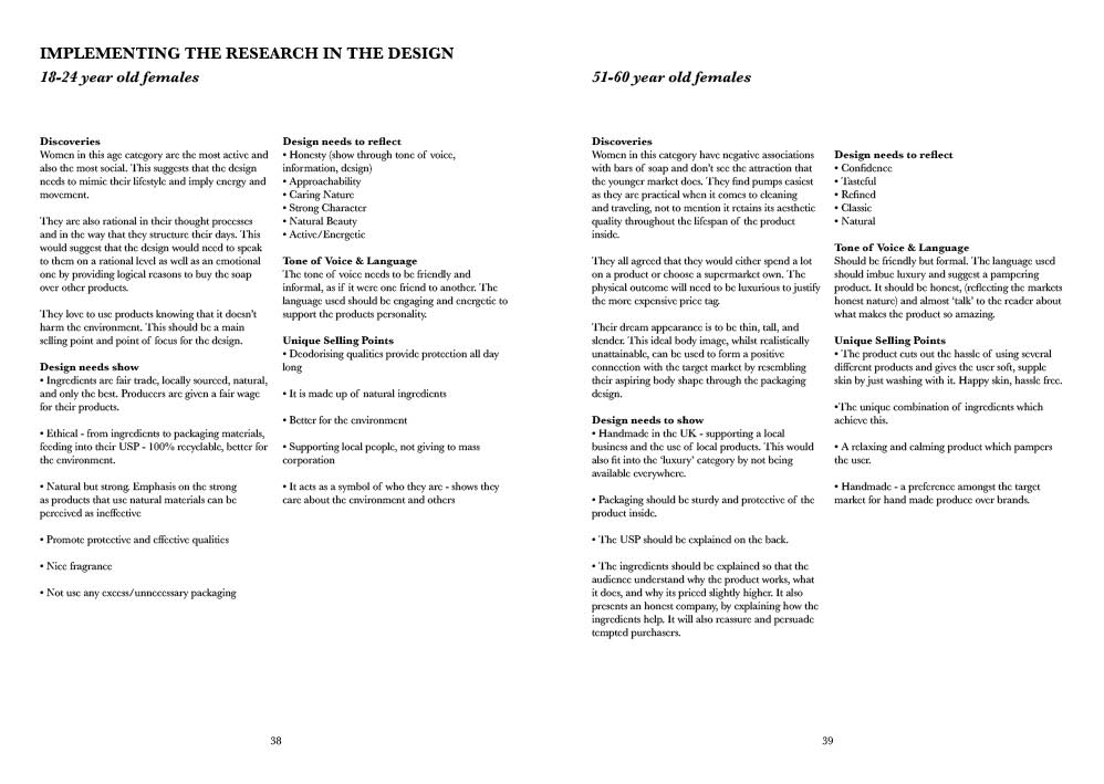
Throughout the project I have stopped and looked at what I was doing critically. This  really helped the project to progress as in the past I have got carried away with ideas and not stopped to check that they actually worked or fitted the brief. By checking what I was doing and taking an objective point of view I was able to write down all the problems with the designs, and as a result create a plan of action. The main time I found this useful was designing the questionnaire; because I haven’t done anything like this before I wanted to make sure I did it correctly (mainly so I wouldn’t have difficulties analysing the results). Being critical with the questionnaire meant that I changed it a lot before sending it out, but this really helped to get rid of stupid mistakes. Whilst there was a few problems with the results received (for example not asking for a model of car) I felt I was able to quickly resolve them. At points during the primary research I felt like I had bitten off more than I could chew, however I am glad I persevered because completing it made me realise just how important market research is. It also taught me how to use market research correctly and how the results can be used to form a practical outcome.

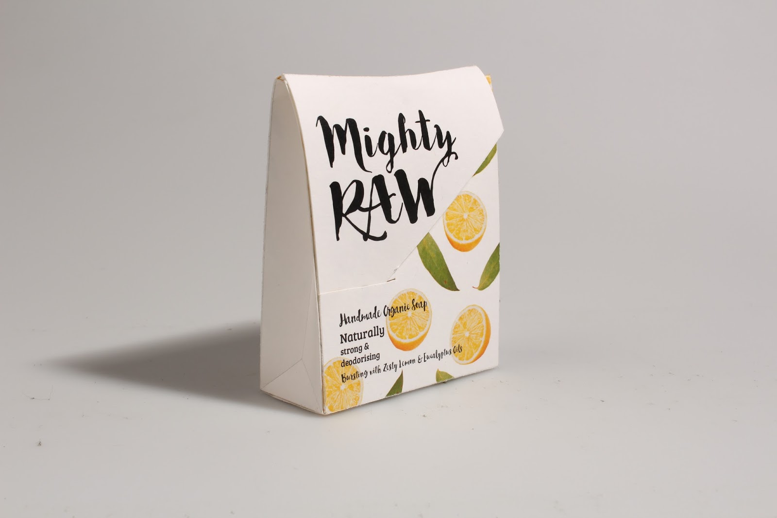
I really enjoyed the practical element as I felt I had a good basis of knowledge to support my designs. The dissertation taught me theory about everything! Colours, type, shape, the importance of personality and positioning etc... Whilst my primary research gave me all the information I needed about the target market to implement what I had learnt through writing the dissertation. Clearly defining the target market gave me something to refer back to throughout the design process, this made me more confident to produce an outcome which actually resonated with the target market. I found designing for the 51-60 age group the most challenging because I don’t fit into this category, I don’t share similar interests or preferences when it comes to products. However, I saw this as a good way to test everything I had learnt so far and in the end I found this outcome the most rewarding.

I feel that the project is well synthesised because not only does the practical support the dissertations argument but it has actually been influenced by it. The soap packages are a visual display of all the theoretical knowledge I have gained through writing the dissertation. Creating my own primary research has formed a strong link between the theoretical and practical outcomes as it acted as a stepping stone between the two. I made sure to pay equal attention to both the theory and practical because I felt it was important to develop both skill sets and not prioritise one over the other.


If I had more time then I would have loved to explore more target markets and design soap packages for different groups such as children and men. This would be really interesting as they are not groups I fit into so I would be designing from my own primary research, in turn strengthening the dissertation’s argument.

Tuesday 12 January 2016

Practical: 18-24 Mighty RAW - Final Changes & Final Outcome


After receiving the feedback from the informal interviews I decided to make a few small changes to the current design. Firstly I neatened up the falling ingredients so that they fitted in with the type and the cut of the box better. I moved the type up so that it was further away from the bottom of the package. 

I made two different outcomes, very similar, although one with smaller overlapping ingredients and the other with larger more spaced out ingredients. Both outcomes were printed on white watercolour paper and on brown eco card.


Final Outcome


I have chosen the white stock with spaced out ingredients to be the final outcome. White stock is a lot clearer than the brown, it looks clean and makes the packaging look vibrant and youthful. I believe this outcome is the best because there is room around each ingredient, they fit in well with the hidden type underneath the flap. I have also created a repeat pattern which has been printed on the inside of the package. This adds more colour and life to the inside of the package, making it more exciting when the user opens it to get the bar of soap. It was wise to change the ingredients into a falling pattern as this implies movement and energy; the packaging visually supports the brands energetic and friendly personality.


Practical: 51-60 Aesir Final Outcomes


  I wanted to test out the range of three stocks to see which stock worked best to make the design look more luxurious and better quality. There were two different design outcomes which I wanted to test; firstly the birch tree box, and secondly the curved edges plain box.


Above shows the three birch tree boxes printed on different stocks. From left to right - Somerset textured white, Somerset satin soft white, and pearlescent paper.


Above shows the curved edge box printed on the different stocks. From left to right - Pearlescent paper, Somerset textured white, and Somerset satin soft white.


1. The white textured stock is a good quality paper which immedietly makes the product feel more luxurious. The information has printed clearly onto it and the texture adds to the birch pattern. These outcomes will be more tactile which may help the packaging and brand to be more memorable.

2. The creamier stock has made the outcome feel warmer and gentler than the stark white. Its smooth texture is perhaps better for promoting a smoothing, moisturising body wash opposed to a rough textured box.

3. The pearlecent paper adds a nice shimmer to the boxes, it has been stuck onto card to give it more support. It hasn't worked as well on the birch tree outcome because it has torn on each edge after scoring. However, if this style of paper was to be chosen it would be bought in a thicker stock.


Final Outcome


I have chosen the pearlescent stock and the curved edge design because it fits in best with the brands personality, positioning, and image. The smooth, shimmering stock is elegant and sophisitcated, it will catch the attention of passing shoppers. The curved edge box design is the best for a few reasons; firstly, it uses less packaging compared to the double box birch design, which is better for the environment and will be cheaper to produce on a larger scale. Secondly, the box suggests a feminine shape by curving in at the sides, removing the sharp corners makes the design more gentle and appealing.


Monday 11 January 2016

Primary Research: Research Report Book

I have decided to make a research report book to present all of my own primary research in. My own research has had a massive impact on the CoP practical as it has informed who the chosen markets are and revealed what sort of design would best appeal to them. A book will condense this whole process and show the order my primary research has taken whilst explaining why I have chosen certain methods. I felt it was important to be throughough with the research because it is the joinging factor between practical and theory. The primary research has used what I have learnt through writing the dissertation and channeled it into a well informed, creative outcome. Below are the pages from the report book.


Sunday 10 January 2016

Synthesis between practical and theory

Whilst I had an interest in packaging design and enjoyed making boxes, I didn’t really have any theoretical knowledge to support my enthusiasm. I decided to view CoP 3 as an opportunity to learn as much information as I could and put it into practice. I felt this would not only help my Extended Practice but would also provide a basis of information and give me a better understanding of packaging design which would ease my transition into industry.

I decided to focus my dissertation around target markets because they are pivotal to the design process; every decision involving the packaging from colours, to typefaces, to tone of voice is influenced by who the product is aimed at. With this in mind, my dissertation acts as a guide by providing all the theoretical information I need to create an informed practical outcome. 

Each chapter focused on a different area which I felt I needed to know more about in order to create a successful packaging design: the environment in which the packaging is seen, market research, and the influences of the target market. The final chapter used Dove and Nivea as case studies to show how all of the information touched on in the first three chapters is practically applied in the real world. I chose Dove and Nivea because they both aim at the same target market however their approach and marketing positioning is completely different. This showed how even when the end user is the same there are alternative ways to create designs aimed at them. I also chose to study Dove and Nivea as they are leading brands in the toiletries industry and I knew from early on that I wanted my practical outcome to be a soap package. This almost killed two birds with one stone in the sense that I could conduct more in-depth research into the practical outcomes product category leaders, whilst also making clear links between my dissertation theory and how it is implemented in industry.

After writing my second chapter on market research it became clear that I would have to conduct my own research in order to create an outcome that has actually been informed by a target market opposed to my own preconceptions and preferences. An initial questionnaire provided data that allowed me to make target market groups through the found correlations. This completely shaped the way I responded to the practical brief, I used the data and the information discussed in my dissertation to outline the products unique selling points and personalities. My dissertation raised the importance of conducting research throughout the design process and taught me what types of research were appropriate at different stages. The type of research I decided to carry out very much depended on what stage I was at. For example, with the 18-24 year old category I quickly gathered a strong idea from the questionnaire responses. This meant that individual interviews with people in the target market were more appropriate so that others wouldn’t sway their opinions. On the other hand, I conducted a focus group with the 51-60 year olds before any designs had been created. The focus group became more of a discussion as to what they felt would be most appropriate; it was beneficial to get their opinion in a group dynamic because I didn’t fit into the market.

For the practical outcome I wanted to take an everyday essential that is used by everyone and create two different packaging designs aiming at two different markets. The aim was to show how two products can have the same purpose (soaps purpose being to clean) but the packaging design differs depending on who the product is aimed at. This reinforces my dissertation argument by illustrating the importance of understanding the market you are designing for before creating a design. Choosing an 18-24 year old female market and an older 51-60 market, provides enough difference in characteristics and lifestyles to have different preferences when it comes to their toiletry products. Interestingly, both outcomes were marketed as handmade and natural (promoting the benefits of natures ingredients) as these were attractive features to both target markets. However, even with this factor in common the two designs are completely disparate, proving that products with similar features rely on a clear personality, positioning, and understanding of the market in order to differentiate themselves and appeal to their desired consumer.


Tuesday 5 January 2016

Practical: 51-60 Aesir - Designing the Package


After I began designing, I thought I would print off the boxes and make them up to see what they looked like and highlight any flaws or problems early on before text is added.

First Attempt


Immediately I dislike the harsh white rectangle which all the information is in, it completely contradicts the products personality and the curvy, feminine image it needs to portray. Every element of the design needs to be gentle and soft. For that reason I think the Æ needs to be changed into the individual letters; the combined letter is sharp and doesn't fit with the design.


Second Attempt


After looking at the design critically I decided that the white box needed to have some sort of curve to it to remove the shape edges. I rounded the top and bottom of the square to make it softer on the eye. I will continue to make this into one of the possible outcomes.


 Third Attempt


I wanted to create a mock of the curved edge box. I decided to make both the sides purple with white information over the top. Whilst the dark purple is luxurious and it looked good on the screen, in reality it makes the text very hard to read. I will keep this idea but opt for a light tint of the purple so that the colour is gentler and in-keeping with the design.

The box design itself is different from the birch tree one as it opens from the top with a lid opposed to another box underneath. The curved sides would not work with a box underneath as the corners wouldn't fit in.


Paper Stock
I have ordered paper from G.F smith but unfortunately it hasn't arrived so I have chosen paper for the universities selection instead.

1. Somerset Satin soft white 300gsm
2. Somerset Textured white 300gsm
3. Pearlescent paper 

Final Design Template Outcomes
I have decided on my final designs before my print slot on the 7th. I am not sure how the designs will look so want to try a few designs out on different stocks so that I can decide which is best once they have all been created.


Firstly I want to try the birch tree background on the Somerset satin soft white, somerset textured white, and the pearlescent paper. 


Secondly, the lighter purple sides will be printed on the somerset satin and the textured white. It will be best to see whether the design looks best on a whiter textured stock or a more creamy off white smooth stock.


The design above will be printed on a white textured stock and the text over the top will be silver.


This design is identical to the one above however I have used a darker purple for the type so that it will be legible on the pearlescent paper.

Sunday 3 January 2016

Practical: 51-60 Aesir Design Experimentation


Combining Type and Image


I originally began experimenting with the type face Alegreya, the whole range of fonts worked really well together to create a type hierarchy. The audience firstly see the brand name, then they should see what it is - a rich moisturising body wash (I will make it stand out). The ingredients are clear and symmetrically laid out. However the type face is too heavy, its chunky look doesn't fit in with the brand image or the personality of the product.

Reading Order
Mart Neumeier in The Brand Gap argues that before you can create emotion with a package you need to get the reading sequence correct. Depending on the product depends on the order in which the information is read. 

1. the shopper should notice the package on the shelf either through good colours, strong contrast, bold type etc..
2. Then the shopper asks what is it? this should then show the product name and category
3. why should i care? this should be answered with a brief why to buy message
4. more information to support the why to buy message and define it
5. they are then ready for the "mumbo-jumbo" necessary to make a purchasing decision.

Presenting the information in a natural reading sequence increases a bond with the consumer and chance of purchase. 


I wanted to combine the lavender and coconut on the design to clearly show the shopper what ingredients are in the product. The birch tree would not be shown with the ingredients but create the pattern of the box. 

Birch Trees
I decided to create my own birch trees by dragging a mix of black and white acrylic paint across a piece of paper with a card. I think the effect has worked well and whilst some of the attempts are perhaps too dark, there are plenty that resemble a birch tree. This method has been a lot quicker than if they were to be painted in detail. Giving the impression of the tree instead of explicitly showing it provides texture and an artistic element (fitting with the target markets main hobbies).  


Sorting the type


I replaced Alegreya with Dubiel Plain, an elegant serif font. This has made the brand name look a lot clearer and neater, it stands tall which fits in better with the box design. Keeping in the same type face I used Dubiel Italic for all the extra information,  this italic font meant that the information remained legible but didn't stand out or catch the viewers eye before the main aspects. The ingredients and 'A handmade body wash rich in moisture' were changed to Elsie which is a perfect second font to compliment Dubiel. The letters are curvy script, beautifully joined together with ligatures that really make the information stand out in a sophisticated manner. 

The combination of the lavender and the coconut works well to show both ingredients off and clearly identify what ingredients are in the product.


Creating birch tree box design


I used the birch trees that I had painted to create a repeat pattern to go around the box. The box uses a combination of light and dark trees, to create more depth they are alternated and overlapped. 


The box will have a solid top but no base, allowing another box to sit inside and protrude out of the bottom. This inside box will be a plain dark colour to compliment the box design. This will add extra protection to the bottle inside whilst also making the box sturdier and the bottle more secure.


I have ordered this pearlescent stock which the birch tree box will be printed on. The shine will catch the light and add a shimmer to the packaging. I want to carefully consider what stocks I print onto because the stock will be a good indicator of luxury. People wouldn't by a 'luxury' product if the packaging was flimsy or didn't look high quality like the supposed product inside. 


White Design


As an alternative outcome, I wanted to stick with the same product and concept but experiment with the packaging and display. I stripped away the birch tree backing and went back to white. White is synonymous with luxury packaging, as it is minimalistic and viewed as refined. I took the curved sides of the packaging from one of my previous experimentations, in fact they work better in this design because the taller box allows them to be more of a feature. The tall, elegant box with curved in sides appeals to the target market due to its pleasing and aspiring aesthetic.