Saturday 28 November 2015

Practical: Belly Band & Continuing Bag Idea

Belly Band


I decided to go back to the first idea where the soap would be packaged in printed pattern and then a belly band would go over around the middle. I mocked up a model of the packaging so I could see how big the band needed to be: the front and back are 5.5cm squares and the sides are 5.5cm by 3.3cm.

 I took design features from the last idea but moved them around so that they would fit in the new shape. I've kept the fonts the same but instead of centrally aligning them I have chosen to align them to the left as this is a better use of the space and fits in with the ingredients better. I decided to swap the ingredients over but keep the lemon facing inwards as it keeps the viewers eyes in the centre of the packaging. The description has not been added to the side of the package because I felt the other pieces of information were more important and any more information would have over crowded it.The design is still eye catching enough from a side view that shoppers would pick it up and read the front, however it should be displayed with the front facing forward anyway.


Extension of bag design


I had an idea on how to improve the bag design that I was working on previously. A slip would be added to the bag that came down diagonally over the front and tucked into a slot instead of being held together with string. This would make the packaging look a lot stronger and eye catching. When the shopper lifted up the tab the image would change and half the ingredients would be replaced with an explosion of colour to emphasise the fragrance bursting out and also the strength and freshness of the product.


This would be the front of the packaging (left)  with half the design printed on the flap (right) and half printed on the front. When the consumer opens the flap the image below will show the bottom half of the ingredients exploding into colour.

Originally I tried to create this affect with a marbling patter I had created previously, I dimmed down the opacity as the colours seemed too bring and garish. The idea worked a lot better in my head because as soon as I made it it just doesn't work or look good. It is too busy and completely clashes with the style of the design.


Instead I created the 'explosion' through a paintbrush effect on illustrator, picking colours from the images and adding in a few others I was able to create a messy explosion of colour. This works a lot better and fits with the organic, creative style. I am still unsure whether this is a good idea or not but I will print it on Thursday and see how it looks once it is made.

Thursday 26 November 2015

Practical: Idea Two - Mighty RAW

 After creating a profile for the 18-24 year old target market, it gave me a direction to begin working towards. The bar of soap needed to have selling point which would mean people would choose it over the easier option of shower jel. I decided that the soap would target females in the age category who care for the environment and don't like using chemicals or heavily processed products. This would then give a reason to buying a bar of soap over shower jel, however this isn't a new idea to the market and wouldn't be strong enough to position it by itself. One of the first trends I noticed when comparing the responses of 18-24 year olds to older respondents is that they tend to have more active hobbies. From here I decided to aim the product at women on the go who are busy day to day and need a product which prevents them sweating and smelling.The bar of soap would be strong against odor and sweating but completely natural; using natural anti perspirants. 

Name
I began mind mapping ideas for names, I felt the name needed to clearly show that the product was strong but natural as this is the selling point of the soap. Most natural products have the association that they will be weak and not as effective as more man made products. I wrote down words related to both 'natural' and 'strong', the combination I liked the best was "Mighty Raw". 

Mighty
possessing great and impressive power or strength, especially because of size.

Raw
(of a material or substance) in its natural state; unprocessed.


'Mighty' sounds impressive and strong, 'raw' relates to the natural ingredients inside the soap but it could also sound like 'roar' relating to the symbolic qualities of a lion - strong, brave, and powerful. 

Ingredients
The ingredients needed to live up to the name and be strong and have natural anti-perspirant qualities. After searching through the benefits of lots of ingredients I settled on eucalyptus oil and lemon. The ingredients needed to be fresh and reviving rather than calming and relaxing to fit with the target markets busy lifestyle.

Eucalyptus
The health benefits of eucalyptus oil are well-known and wide ranging, and its properties include anti-inflammatory, antispasmodic, decongestant, deodorant, antiseptic, antibacterial, stimulating, and other medicinal qualities. Eucalyptus essential oil is colorless and has a distinctive taste and odor.

Lemon
Lemon oil is a great odor eliminator, as it neutralizes bad smells. Whether used as a household cleaner or in the shower, soap containing lemon oil can help erase foul odors.


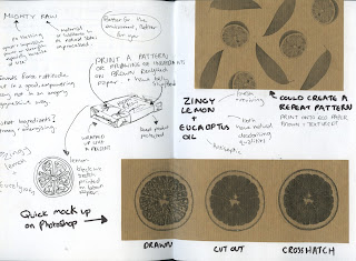
After referring to my mood board for inspiration I came up with an idea where a repeat pattern of the ingredients would be printed on brown eco paper made from recycled materials. The pattern would be in an illustrative style and wrapped around the soap like a present. A belly band would go over the middle which would have all the information and design on. The packaging would be 100% recyclable and would fully protect the soap, whilst it means people would be less able to smell and see it it means it would stay fully protected and would be less likely to be damaged. I think if this product was sold in a supermarket environment then it is important to have it fully covered because it would easily attract dust and dirt and put people off buying.

I quickly mocked up an idea on photoshop by adjusting a image of a lemon and trying different effects. I just printed on some brown paper that I had, however for the real thing I will use recycled eco paper.


Above a quick pattern mock up is repeated in full, I think this would look good with an off white textured belly band around the middle. As well as wrapping it up, I also want to experiment with printed the pattern onto a thicker gsm and creating a box for the soap to be packaged in. A box would be reusable if the consumer wished opposed to a wrapping but would still be 100% recyclable. I have also drawn a pop up box which would be easy to collapse and re build, perhaps this would be more appropriate for a boutique store where customers could pick soap and it would be packaged afterwards. The third Idea I drew out was a box which stood vertically instead with a lid that comes off the top, the aspect I quite liked about this was that it would be a different shape from other soap packages in the category however I think it would be more likely to fall over on the shelf, and the lid that lifts off makes it look too similar to a cigarette package.


The fourth idea which I have expanded on further is a brown paper or card bag structure where the soap would sit inside and the bag would be sealed together with string in the centre top. It has taken the idea of a vertical facing design from the last sketch but modified it so the bottom of the package would be more stable especially on a shelf. The bag would have the printed pattern on with a white label stuck on the front which would display all the information. 


Type Hierarchy 
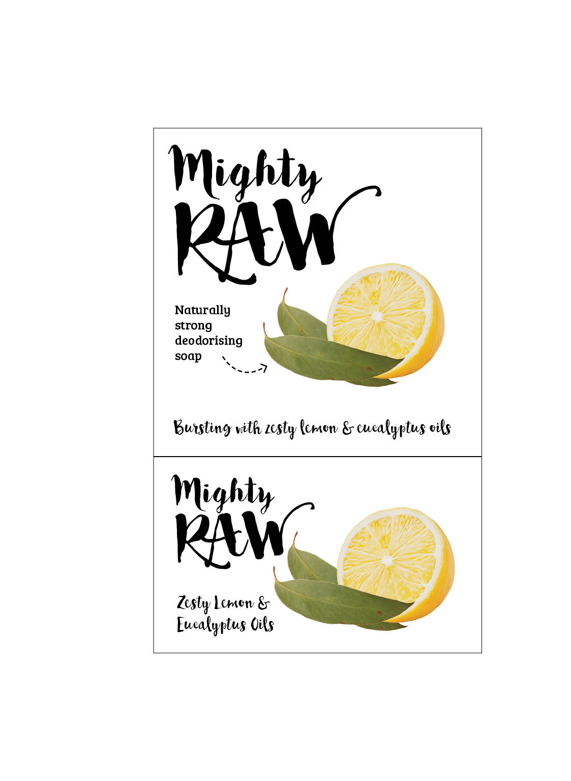
Marty Neumeier in The Brand Gap wrote about the sequence in which consumers want information. Firstly they want to know what is it - this would be the brand name so "Mighty RAW" and also the fragrance. Secondly they want to know why should they care, this is a 'why to buy' statement which differentiates it from other products, for this I have written 'naturally strong deodorising soap'. 'Naturally strong' re-emphasises the brand name and the selling point of the product; natural but strong.

Design Experimentation
I wanted to begin mocking it up on Indesign to see whether it would work or even look good. The brand name font is called Bakery, I chose it because I like its creative and hand rendered style which promotes the organic product. It fits well with the personality of the brand - it is friendly and approachable but equally strong and energetic. I have kerned the letters so that it is easier to read from a distance, this has made it clearer. The secondary font is currently Bree Serif, this slab serif font is strong and sturdy reflecting the product, it is also clear and easy to read meaning that shoppers would clearly be able to see the benefit of this product - naturally strong deodorising soap.

I wanted to use images of the ingredients on the front of the package so that it was instantly clear what was in it. For the time being the images have been changed on photoshop to give them an oil paint affect, however I would like to draw my own images once I have a clear design idea. I have kept the same structure and played around with changing different elements below.
Having the fragrance/ingredients in Bree Serif makes it look too clinical especially combined with the amount of white space.
Changing the ingredients to match the brand font ties both elements together. It also makes the ingredients look more fun and exciting, the language describes the soap as bursting with zesty lemon and eucalyptus oils. The word 'bursting' and describing the lemon as 'zesty' makes the soap sound invigorating and fresh, it will also appeal more to the target market through the use of an informal, friendly tone.

 I quite liked the idea of adding an arrow pointing from the product to the word deodorising, this would highlight what the ingredients do bringing attention to the USP of the soap. However this arrow just keeps the viewers attention for all the wrong reasons, I find that I am staring at the arrow and ignoring everything else.
 I wanted to reverse the design to see if working on black created a strong design. It certainly is strong and eye catching however I think it is too similar to Lush white on black design and also it is straying away from the point of the product; it is supposed to be natural. Black isn't really a natural colour and is quite harsh, whilst it makes the design stand out I don't think its appropriate for or suited to the value of the brand.
 Minimising the black to just a bar at the bottom grounds the design and gives a strong visual image, however I think it detracts from the design. I have also re-introduced the arrow but instead of solid I have used a dotted line, this has helped to break it up so it adds to the design rather than distracting from it.  
 Adding an arrow on the other side of the lemon which points down the ingredients. This creates a natural path for the eye to follow as well as highlighting the benefits from the ingredients.


 Here I was experimenting with what the pattern would look like behind the label. The brown is supposed to imitate the stock it would be printed on, however I don't think this necessarily looks good on screen. The printed pattern compliments the design and reinforces what ingredients are in the soap. 
Using a broken line around the edge compliments the arrows. I have centralised the ingredients so that there is an equal distance either side. I have also adjusted the arrows slightly so that it points to the words better. 

This gives me a good idea of what the design would look like as a label, I want to create a mock up of a few packaging designs to see what it would look like in different formats. I will also create the design as a belly band which could work with my original idea.

Wednesday 25 November 2015

Primary Research: Creating Target Profiles (18-24)

Using the information gathered from the results as a starting point I have begun to create a profile of the target markets so that my design will be informed and directed. It also paints a clear picture of who would buy the product so will give me something to refer to throughout the designing process.

First Target Profile

About them...
• Women age 18-24 living in the United Kingdom
• They are busy and on the go throughout the day so need a product which will guarantee protection from sweat and smells
• They prefer to structure and organise their days so that they can 'get the most out of every day' 
• They are social, and whilst they enjoy time to themselves they love a group dynamic and enjoy spending time with their friends
• They care what others think about them but don't let it stop them from doing what they want
• They are happy in their own company 
• They are rational, whilst their heart may have influence over their decisions they rarely fail to look at the situation logically and use their head to decide on the most appropriate decision
• They don't like to upset others and they would rather keep the peace than make sure everyone knows they're right
• Care & show some concern towards the environment, they may not be an avid environmentalist but they prefer environmentally friendly products. The type of people to buy organic when they can, recycle, and by locally made produce supporting real people over corporations
• They are 'plugged in' and have an understanding about whats going on in the world
• Natural inside and out - they don't wear heavy amounts of makeup, they use it to enhance rather than cover
• On the whole, they are happy with their appearance and who they are as a person
• Have humanistic personalities 

Design needs to reflect them
• Honest (show through tone of voice, information, design)
• Approachable
• Caring 
• Strong
• Natural
• Active/Energetic

Design needs to be...
• Handmade in the UK - supporting a local business and the use of local products.
• Ingredients are fair trade, locally sourced, natural, and only the best. Producers are given a fair wage for their products.
• Ethical - from ingredients to packaging materials, this could feed into a USP - 100% recyclable, better for the environment.
• Natural but strong. Emphasis on the strong as products that use natural materials can be perceived as weak 
• Informal language - friendly, from one friend to another
• Promote protective and effective qualities
• Nice fragrance 
• Not use any excess/unnecessary packaging 

USP - why would they buy this over something else?
• Better for the environment
• Supporting local people, not giving to mass corporation
• It acts as a symbol of who they are - shows they care about the environment and others.

Friday 20 November 2015

Primary Research: Target Market Groups

After the tutorial I have decided to only do two package designs instead of my original plan of four. There are a few reasons for this change: firstly, time is a big issue I didn't realise how long it would take to conduct the research. Sorting the questionnaire took a lot longer than I had anticipated but I felt it was important to spend the time to get it right as if I rushed it I would make more work for myself later on when analysing. Equally collecting results has taken its time, although I was prepared for this, the results I currently have show two categories  prominent in responses - women 18-24 and 51-60. For now these will be the two markets that I will design for, I think it is better to solidly focus on two and be able to research them in depth rather than rushing four designs. These two categories will be able to show enough difference in the design to still support the dissertation's argument, I also think it is wiser to aim at women opposed to men because they realistically they are more likely to purchase soap products. This means that I can conduct research after the designs are finished and get the opinions of people in the target market category as to whether they are attracted to the design and would buy the product.


I still need to collect more responses, especially for the 51-60 year olds. However trends are beginning to form when you compare the results. The tables below show both groups responses currently:


18-24 year olds
• Females in this category have the highest 'group' hobby option compared to boys their age and also older categories. This would suggest that they are social and enjoy being in a group setting. 
• The alone hobbies tend to fit more into the creative and intellectual category as they are things like art, making music and reading. 
• There is a balance between sporty hobbies and the creative hobbies which suggest the respondents like doing things whether its making something or physically getting out and doing something.
• Products targeting an active audience need to promote anti-perspirant qualities and how the product will keep them clean and fresh all day. The design equally needs to be active and engaging. Attractive colours should be used to represent energy and movement, reflecting their target market.
• The numbers are exactly balanced for going with the flow or structuring and organising days.
• The females tend to side with keeping people happy over being right. This suggests a humanistic personality. 
• They seem to agree that their head rules their heart, this shows that they are logical and pragmatic.
The majority of them care what people think or are somewhere inbetween which suggests that they do value other people's opinions of them and are more likely to buy products to create a positive self identity. 
 
51-60 year olds
• A much bigger number in stationary hobbies, this is expected as older generations are less likely to be running around. 
• The design should be refined and classic, elegant over active and busy.
• There is a much bigger rise in the hobbies being alone compared to the younger females, this is supported by the fact that they are happy in their own company. It suggests self development and enjoying time alone away from the busy world.
• The hobbies are mainly creative and intellectual, however there isn't enough numbers currently to prove anything.
• Women in this category sway to being ruled by their heart over their head which suggests and emotional way of thinking, i.e doing what their gut tells them and deciding what to do on how they feel about it. They have perhaps learnt to trust their judgement and have more caring personalities. This would also make sense seeing as they are on the side of keeping people happy over winning a debate.
They still care what others think about them which would suggest they will buy products to fit in or be noticed (in a good way). They have a more humanistic personality, putting the needs of others infront of their own.

Next Steps:
• Once I recieve more results I will look closer into what they state their hobbies are and see if there is a comparable difference between the two age groups. 
• Look into soap packages to get an idea of what is out there and find inspiration.
• Begin to make a target market and really understand everything about them before beginning to design.


Tuesday 17 November 2015

Primary Research: Implementing the Questionnaire

Questionnaire
A questionnaire was chosen over other forms of data collection as the starting point because it gives a large quantity of responses. It will be more beneficial to start with a quantitative form of data collection which will produce a broad range of results and after analyses qualitative research can be implemented to produce further informed and in-depth answers. Every aspect of the questionnaire has been designed with the aim being as quick and easy to complete as possible this is conducive to getting a substantial amount of responses. The more responses I receive then the more valid the results are as it will form stronger correlations.

The questionnaire format is closed ended questions meaning that the respondent has a finite amount of possible responses. When appropriate lists, categories, and scales will allow the respondent to choose the most applicable answer to them whilst keeping the results easy to analyse. The close ended structure of the questionnaire will also allow them to respond quicker than if they had to think of an answer themselves, this in turn speeds up the time it takes to complete the questionnaire and makes the respondent feel more comfortable participating. The quicker the questionnaire is to complete the more responses I shall get on the street, as the amount of responses is dependent on how long it takes me to ask the questions and receive answers.


The questionnaire will be distributed in two ways; online and in person. Firstly I will take advantage of social media as a platform of distribution and using a program such as Survey Monkey I will ask online friends to complete the questionnaire. The prevalence of social media will work in my favour as a lot of people will see the survey, however the disadvantage of this method is that it is impossible to predict how many responses I will receive. If I only get a few responses then it will be too weak to draw any conclusions from. A limitation of using social media is that it will produce results from a similar range of people; the people I am friends with online are of a similar age category to me which is great when the target market is 20 - 25 but not so useful when I want to design a product for a 50 year old woman. To combat this emails including the questionnaire will be sent out to an older audience, social media tends to be used by a younger crowd so it is important to contact people via the devices they use. I am aware that social media and emails will not be enough alone to gather a diverse range of results so my secondary method of distribution will be to go out onto the streets and ask people the questions myself, this way I can make sure a range of different target markets have been addressed. Targeting a wide variety of people will produce more variations in the results as different segments will have different responses to the questions. This variation will hopefully reveal trends and correlations in the results.


Ideally I would want between 50-80 responses as this would be a strong enough to notice trends and correlations, I want the results to be as valid as possible and for the design element to be strongly supported by my primary research. Combining social media and emails will optimistically yield around 30 responses, the other 50 will be gathered by asking people on the street to complete the questionnaire. One considerable problem that could occur when gathering data on the streets is simply that very few people will be will to stop. Although this is not something I can control, it is a problem I can minimise by designing the questionnaire in an efficient way so that it takes the least possible amount of time to complete.

-----------------------

Inputing the Results into Excel
Surveymonkey won't let you view trends or patterns without signing up and paying. So instead I have decided to type up all the results into Excel so that they are easily viewable, it will also allow me to view trends and patterns easily during and after all the data has been inputed.

Above is an example of how the data looks, I have categorised Occupation, Car, and Hobby into definite categories so that I can compare similarities and also just to make it easier to analyse. I have kept the original answer and then inputed my own categories below. The categories go as follows:

Occupation
Service - This covers anyone who provides a service so bankers, gardeners, hairdressers, sales assistants... to name a few. I thought this was a better way to word it than 'unskilled'
Qualified
Management
Student
Retired
Unemployed

Car
Estate - Family cars, big, practical.
Saloon - Upper/middle class, willing to have less space for luxury.
Sports/Flashy - Want to show off, all about image, symbol of wealth and power.
Hatchback - Students, people who don't need big cars or care what car they have, less space but less expensive.
SUV/4x4 - Big cars, shows power, intimidating, lots of space. Also used for their functionality - people in the country who aren't always on roads.
Super cars - Lots of disposable income, sacrifice space and functionality for speed and image.
Vans - Work, own business, commercial, practical 

Hobby
I decided instead of having a list of categories I would do several options as this seems more appropriate.
1. Stationary or Active 
2. Creative/Intellectual/Sporty/Relaxing
3. Group or Alone
Answering each of these options will be the simplest way to categorise hobbies and allow for comparison. 

Questionnaire Review
I am really happy that I currently have 74 responses, however after putting them into Excel and viewing them in a grid (see below) I have become aware of how much I have underestimated how many responses I need to be able to see trends. Whilst I now need to gather a lot more responses than anticipated, I am relieved that by using the grid you can begin to see trends in the results. For example using the demographic data I can view Female students age 18-24, looking at the results I can see that they think keeping people happy is more important than being right, this suggests they care about others. This is also supported by the last question results where the majority argue that they do care what others think of them. However they are all happy in their own company. Another revealing result is that the majority of them have active hobbies opposed to stationary ones, this would suggest that the soap package design needs to emphasise anti-perspirant qualities, keeping you clean and fresh all day. It also suggests that the design should reflect them and also be alive, bold, and engaging.


After inputing the data I noticed there are a few parts of the questionnaire that I should have worded differently or changed. Firstly question four, what car do you drive? should have been written as what is your main mode of transport, if a car, then what model? This would have given me more to work on, for example if people walk or get the bike that would suggest they have greener lifestyle than those who drive SUV’s. I also regret not asking what model car because it meant when analysing the results I had to make assumptions to what car category it would fit into. Secondly, question six what comes to mind when you hear the word soap? should have been written as ‘What associations do you have with bars of soap?’ this would have given a better insight into why people don’t use soap, some of the answers addressed this such as ‘too dry’, however other answers were ‘eastenders’. If I asked about a bar of soap in particular it would have been a lot clearer what I was on about and would have also given me more usable results.

I have decided to change the questions before distributing them further because it won't affect the current results, it will only provide a clear picture. I haven't included question 6 in the data results because it is qualitative, it is not something I will be able to quantify and categorise. 

Friday 6 November 2015

Dissertation: Last Chapter


For my last chapter I want to compare two different brands in the toiletry market. I am thinking about comparing Dove and Nivea as they both have a similar target market range but their products are designed with different unique selling points and they have different marketing strategies. The chapter could compare the two and look at all the things that I have touched on in the other chapters in relation to the two brands. Below are some of the main areas I have/will write about in my dissertation. This final chapter will be a great way to tie in the message of my dissertation with the practical design element.

Market Research
- what are people's views of the brand? do they correspond with the brands identity?
- who buys the product 

Semiotics 
- is any signs, symbols or indexes used?
- linguistics - the way its worded and the words chosen in relation to the target market.

Local/Global
- What audience does it reach?
- what companies is the brand in?
- has the design changed for the needs of other countries?

Logical/Emotional connection
-How does each brand connect emotionally and logically with the consumer?
- 'illusion of reality' is there one?

What are the goals, needs, motives, desires, wants of the target market?
Aspirations?

What problem is that product offering to solve?
What does the brand say about the individual?

The History of each brand
- changes in design to fit with lifestyle?
- change in target market
- extending to a mens range

Brand personality

Brand positioning
- where are they in relation to each other?

Brand loyalty