Belly Band
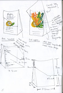
I decided to go back to the first idea where the soap would be packaged in printed pattern and then a belly band would go over around the middle. I mocked up a model of the packaging so I could see how big the band needed to be: the front and back are 5.5cm squares and the sides are 5.5cm by 3.3cm.
I took design features from the last idea but moved them around so that they would fit in the new shape. I've kept the fonts the same but instead of centrally aligning them I have chosen to align them to the left as this is a better use of the space and fits in with the ingredients better. I decided to swap the ingredients over but keep the lemon facing inwards as it keeps the viewers eyes in the centre of the packaging. The description has not been added to the side of the package because I felt the other pieces of information were more important and any more information would have over crowded it.The design is still eye catching enough from a side view that shoppers would pick it up and read the front, however it should be displayed with the front facing forward anyway.
I took design features from the last idea but moved them around so that they would fit in the new shape. I've kept the fonts the same but instead of centrally aligning them I have chosen to align them to the left as this is a better use of the space and fits in with the ingredients better. I decided to swap the ingredients over but keep the lemon facing inwards as it keeps the viewers eyes in the centre of the packaging. The description has not been added to the side of the package because I felt the other pieces of information were more important and any more information would have over crowded it.The design is still eye catching enough from a side view that shoppers would pick it up and read the front, however it should be displayed with the front facing forward anyway.
Extension of bag design
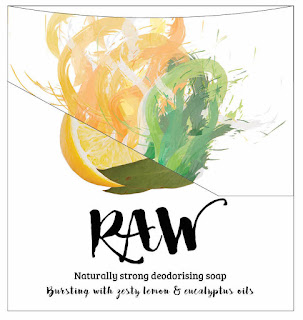
I had an idea on how to improve the bag design that I was working on previously. A slip would be added to the bag that came down diagonally over the front and tucked into a slot instead of being held together with string. This would make the packaging look a lot stronger and eye catching. When the shopper lifted up the tab the image would change and half the ingredients would be replaced with an explosion of colour to emphasise the fragrance bursting out and also the strength and freshness of the product.
This would be the front of the packaging (left) with half the design printed on the flap (right) and half printed on the front. When the consumer opens the flap the image below will show the bottom half of the ingredients exploding into colour.
Instead I created the 'explosion' through a paintbrush effect on illustrator, picking colours from the images and adding in a few others I was able to create a messy explosion of colour. This works a lot better and fits with the organic, creative style. I am still unsure whether this is a good idea or not but I will print it on Thursday and see how it looks once it is made.


No comments:
Post a Comment