Thursday 31 December 2015

Practical: 51-60 Idea Generation


One idea that stuck from the focus group was using a silver birch tree. They look pretty, elegant and give me the opportunity to use silver in the design! I decided to research into birch trees to understand the meaning behind them. Birch trees symbolise growth, renewal, stability, initiation and adaptability. They are known for surviving harsh conditions and their ability to grow quickly in most conditions. Everything the birch tree symbolises is a strength in the markets personality and characteristic. 


I want to make a birch tree pattern which will become the backing of the box.


What is it?
A relaxing body wash/soap which soothes your senses whilst smoothing your skin


Ingredients
Birch Tree
Whilst the birch tree fits in with the target markets character and the brands values, it also has great qualities when used on the skin. The oil from the birch bark helps to treat skin conditions such as eczema and psoriasis. Its also good for rheumatic pain and treating dandruff.

Lavender
Lavender is known for its calming aroma which makes it ideal for this product and fits in with the USP. 

Coconut oil
Smoothes the skin, It is filled with vitamin E which is good for skin repair, growth, wear and tear and cracking. Its basically good for achieving heathy skin. It is anti-aging, preventing premature wrinkling of the skin. 

I wanted ingredients that smooth and help the skin, they need to be calming and relaxing but it is also important for them to actually work and offer benefits to the user. After researching into all the benefits from the ingredients, it began to present the product as all round good for different skin conditions.


USP
• All round good for different skin conditions - it is the quickest and easiest way to healthy, smooth, supple skin. The product key selling point will be its 'all in one' feature, getting rid of the hassle of applying several different lotions. The focus group revealed the markets dislike of having to apply lots of different products so this body wash will offer a quick and easy way to have healthy skin.

• The soap will be handmade in the United Kingdom, this will be a selling point as it is not made by a corporation. The user will be contributing to a smaller independent company.


Name
AllureÁsynja

Chosen Name: Aesir
The word “Aesir” is almost certainly derived from one of two Proto-Germanic words: *ansaz, “pole, beam, rafter,” or *ansuz, “life, vitality.” In either case, we see that the Aesir were thought of as being the powers that hold the cosmos together, the animating personalities of the “forces of nature.”

I chose Aesir (the name for the norse gods) as it symbolises the power of nature, much like the ingredients in the soap being a natural force against skin problems.


Pricing
It was made clear in the focus group that the product would have to be a luxury one. For that reason the price will be more expensive than the average bodywash. However the price will be justified by the ingredients in the product, how well they work and how long it lasts.

Wednesday 30 December 2015

Primary Research: Creating Target Profiles (51-60)

I have decided to begin building a profile of my other target market from the research results. I have been able to highlight similarities amongst the responses I have received.

What the results show
• Predominantly drive Saloons 
• Their hobbies are mainly stationary and alone which suggests they enjoy quiet time to themselves opposed to being out in a group dynamic like the younger age group
• Their hobbies are mainly creative and intellectual
• They prefer going with the flow over organisation and structure. They have learnt to take things as they come and realised you cannot plan everything
• They don’t like to upset people and prioritise keeping everyone happy over making it known they are correct
• They are happy in their own company which is supported by their hobbies - proving that they enjoy being by themselves
• They tend to use a balance of logic and emotion when making decisions, however their hearts to have a bigger influence over what they decide
• They still care what others think about them which means they would be more likely to buy products which project a positive self image 


About them...(a more in-depth target market profile)
• Women
• 51-60 years old
• British
• Middle Class
• Good Education, gained qualifications
 Secure career and good salary
• Disposable income
• Well spoken, Hard working, Sense of entitlement
• She has children who are either late teens or have left the home so she can focus more on herself
• She can treat herself more to things she wants
• She likes the finer things in life
• She doesn’t mind spending a little more for better quality
• She gives more thought and consideration into the products she buys, so doesn't mind spending a little bit more if it means its locally sourced or ethically tested. 
• Hobbies tend to be alone, stationary, and intellectual or creative this shows that they enjoy their own company and like to do things by themselves whether it is creative like glass painting or more intellectual like reading.
• She prefers going with the flow over organising her day, she doesn't worry too much over timings and love spontaneous plans with friends
• Doesn't like to upset people and would rather keep the peace than insistently be correct.
• Happy in her own company
• Heart tends to rule over her head, her emotions have a big influence in decisions because she empathises with people
• She cares what others think of her

Design needs to show
• Handmade in the UK - supporting a local business and the use of local products. This would also fit into the ‘luxury’ category by not being available everywhere.

• Packaging should be sturdy and protective of the product inside.

• The USP should be explained on the back.

• The ingredients should be explained so that the audience understand why the product works, what it does, and why its priced slightly higher. It also presents an honest company, by explaining how the ingredients help. It will also reassure and persuade tempted purchasers.

Design needs to reflect
• Confidence
• Tasteful
• Refined
• Classic

• Natural

Practical: 18-24 Mighty Raw - Ingredients Falling

Whilst I was happy with the Mighty RAW concept and how the design was beginning to look, I wasn’t overly sure on the front face. It wasn’t as eye catching as it could be and it needs to stand out if it were actually displayed in the supermarket. Equally I didn’t like the explosion of colour that was revealed when the flap was lifted. 


I horizontally flipped the flap so that it tucked in on the left opposed to the right. This created a larger amount of unbroken space that fitted the brand name in nicely. This immediately gave the information more space, allowing the point size to be increased and the packaging to become easier and clearer to read. I originally wanted to create the images ‘falling’ down the side of the pack to give the design more energy and imply movement. However I think the ingredients shown on the top flap detracts from the name.


By removing the top images and leaving the flap blank the name jumps to the forefront and stands out more to on looking shoppers. The design looks a lot clearer and neater by just keeping the white space.

Removing any design from the flap edge meant that no design had to be carried on underneath. This will firstly make it a lot easier when actually making the mock ups because it means nothing will have to be aligned. It also left room to provide extra information underneath, on the other (belly band) designs information was printed about the environment which showed the brands caring personality. This information could now be placed underneath the flap so that it is the last thing the shopper reads before seeing/using the soap. “It’s good to care!” has been written at the bottom of the statement to give the target market a feel good factor, it both describes the products caring nature (to the environment and to their skin) and the caring nature of the target market as my primary research found that they tend to have humanistic personalities.

The information is aligned to the left with the details about the soap at the bottom. This has left rooms for the ‘falling’ ingredients to continue falling on the underneath design helping to join the main design with the logo (flap).


Here you can see a template design, which shows how it would look as a net. I haven’t changed much about the back although it does need work done to improve it. Overall I am happier with this design as I think it looks more interesting; the packaging now suggests movement and energy, one of the main traits of the target market. The information is a lot clearer and each line has its own space opposed to previously being squished at the bottom centre design.


Tuesday 29 December 2015

Primary Research: 51-60 Focus Group

Before designing a bar of soap aimed at 51-60 year old females, I decided to conduct a focus group to get a better understanding of their opinions of soap. Because I don’t fit into this category myself I felt it was important to understand what would appeal to them and equally put them off purchasing it. 

How much do they usually spend on soap?
Usually they will either go all out and buy a luxury, good quality soap or they will buy a supermarket own brand.  It seemed quite clear that they don’t buy middle of the range products, they don’t see the point as the cheaper products are just as good as middle range brands such as Dove. 

What are their opinions of bars of soap?
Bars of soap got quite a negative review from them. They prefer soap that comes in a bottled dispenser as it is easier to use, looks nicer, and is more practical. One respondent stated how dispensers were a lot better because they are easier to pick up and move when cleaning the bathroom and easier to pack when going away. 

Another lady stated how dispensers are better to use with children around because bars of soap are slippery and harder to handle. However she also added that if she was buying a luxury soap as a treat for herself it wouldn’t be allowed near the children. 

Interestingly, one point was made about how bars of soap used to be the only form of washing. When bodywash was invented it was a new and better alternative, leaving soap as the outdated and old fashioned option. Since then soap has improved a lot but this memory and preconception of soap has remained amongst the focus group.

What do they do to care for their skin?
Whilst the respondents agreed that they occasionally moisturised or took extra care of their skin. They stated that they didn’t spend much time on applying a range of specialty products onto their skin as they didn’t have the time or couldn’t be bothered. 

What type of soap do they prefer to buy?
They all agreed that they are more likely to buy soap if it is handmade or organic; I got the impression that they prefer to avoid bigger brands if possible. They like to support smaller businesses and independent shops, and have the financial capabilities to do so. This suggests that the final product should promote organic ingredients.

What main quality do they want from a soap product?
The main quality that they want is for it to be moisturizing and good for their skin. One respondent stated that the reason she doesn’t use bars of soap is because of the way it leaves her skin feeling dry. 

It was clear that the soap needs to be beneficial to their skin and the packaging needs to clearly show that the product will make their skin softer than before. If the product can leave them feeling good about their skin, even making them feel younger and revitalized it will have a positive impact on their self-image and make them more likely to repurchase.

What tone of voice to do they react best towards?
The tone of voice should be friendly and personal. They all agreed that they form a stronger bond with packaging, and prefer products, that show personality and character. One respondent mentioned Innocent Smoothies as an example, whilst they aim at a different audience, their tone of voice is friendly and approachable making the brand stand out from competitors. Another respondent said that the use of humour and tongue in cheek language stands out to them and makes the brand memorable.

Suggestions for the design
They quite liked the idea of a long thin bottle; the slender design would subconsciously relate to their aspirational physique of being tall, slim, and elegant. 

A cut through from the box showing the product would be favoured so that they could see what they are buying.  

They agreed that the name should be natural in order to relate to the natural ingredients used in the soap. They suggested that French name would imbue a feeling of luxury, and to research into constellations, trees, gemstones and other natural beauties.


How this will shape the design
I found the focus group extremely useful, it has given me a new perspective and a better understanding from their point of view. I now have a clearer idea about what sort of product would appeal to them. 

• Dispenser over a bar of soap - easier, slicker, more elegant than a bar of soap

• Natural - ingredients and design

• Will not buy middle of the range products - it needs to be a luxury product. The design should imbue luxury, i.e white, nice stock, silver detailing, rich colours

• Package should be tall and slender - resembling a sophisticated and elegant body image

• Handmade and organic products are preferred. They like to avoid brands

• It must be good for the skin - moisturising and other main benefits should be explicit

• Tone of voice should be friendly but formal


Monday 21 December 2015

Primary Research: 18-24 Mighty Raw Informal Interviews


After coming up with the basic concept of Mighty RAW and applying it to several different packaging outcomes, I decided to conduct two informal interviews to gauge the markets reaction to the concept and design before going any further. I decided to take an informal approach as the respondents would respond better if it was a friendly conversation opposed to a formal Q&A. 

I spoke to both respondents casually about the packages to get an idea of what they felt. I then sent them some photos and a few questions, their answers are below:


Informal interviewee number one
Which packaging design stands out to you most?
The diagonal box is my favourite because its so unique, I haven’t seen it before. Secondly I like the box with lid, again because it’s different, and could maybe even be re-used. 

The diagonal box is the one I find most attractive and eye catching. Because I haven’t seen packaging like that, I also like how the picture splits and opens with the exploding lemon!

Does the name Mighty RAW express the products natural but strong ingredients?
Yes, the name does the job and I like that it’s gender neutral too.

What do you think about the ‘explosion’ of colour on the inside?
I really like the detail that the explosion creates, but maybe you could experiment with bolder colours, or a bigger explosion?

Does the white backing fit in with the brands personality and unique selling points?
I think the plain white backing works well, I’m not sure that another colour would work so well with the yellow. it contrasts nicely with the brown paper.

The images and detail in the design would encourage me to buy it. I usually buy wine based on then design of the bottle and label rather than what it might taste like. The natural ingredients make it appealing and the box packaging. The chatty nature of the text and the fact that the company “cares” is attractive to me personally. 


Informal interviewee number two

What is your opinion of the current design style?
I love it, a very natural and clean appearance. It looks authentic and ‘not fussy’, I would assume that the product was natural and good quality from the packaging.

Which packaging do you feel is most attractive/eye catching?
I like the diagonal box because I haven’t seen packaging like that before and it would stand out and get my attention. However, the little box with the belly band is my favourite as it reminds me of a gift - I would buy it as a present to myself!

Does the name Mighty RAW express the products natural but strong ingredients?
Yes perfectly! I really like the name as it sounds punchy and gives the product character. It gives me confidence that the product would actually work, as I have tried a lot of natural products and have found that they aren’t that effective.

What do you think about the ‘explosion’ of colour on the inside?
I like it, it looks original. However, perhaps experiment with another idea or brighter colours as it doesn’t really fit in with the rest of the design.

Does the white backing fit in with the brands personality and unique selling points?

Yes, the white makes it look clean and makes the detail (images and type) stand out further. The contrast in colours against the white makes the packaging eye catching.

Wednesday 16 December 2015

Practical: 51-60 Box Experimentation


I have a focus group lined up in a few weeks which is where I am hoping to get a better idea on what to design, however before then I want to experiment with making a few boxes so that I begin thinking about a potential outcome and have something to show the focus group. 


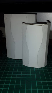
1. This is the first box I have made. The sides curve in to the box which is a nice feature, suggesting a feminine figure. The top part of the box closes into a floral pattern, whilst this looks pretty I feel it is impractical as it would easily tare and it is hard to get back into the shape. The target market won't want to faf around trying to close it properly. 


2. This box is square with each top side dipping in to form a swirled lock lid. The lid pushes down into the box and securely fastens it, making it perfect for keeping things inside safe and contained. However it would only work if the box was a square and this isn't appropriate for the bar of soap.


3. This design was one I got from a book of templates, I couldn't really make out how it would look from the picture so decided to make it and see. I like how the curves are elegant and feminine however the box itself would be impossible to fit soap in. The larger bottom and smaller top half makes it difficult to fit a bar of soap in the packaging.


4. Whilst the last box didn't work practically, I really like the silhouette shape it created when viewed from the front. Taking this feature, I decided to design my own box which would be more practical to fit a bar of soap in. This package creates an eight sided box with the front and back tiles mimicking the curved silhouette. I really like this package design as it works both in shape and in practicality; I can fit a bar of soap in there and also fit a design onto the front. 


Saturday 5 December 2015

Practical: Printed Mock Ups


I printed three different packaging designs for the soap aimed at the 18-24 year old females to see what they would look like mocked up. They all have used the same elements however they have been placed in different compositions depending on the space I had to work with.

Box with lid


The box with the lid turned out well apart from there is a bit too much space around the lid, if I end up running with a similar design then I will increase the box size by half a centimetre in width and height so that it better fits the lid. Apart from that I think the design looks good; the white belly band has a good contrast against the natural box which makes the design stand out. The repeat pattern printed on the box reinforces the ingredients that are in the soap. Again, if this outcome was chosen then i would aline the patterns so that it follows around onto the next side, however for a quick mock up this is acceptable. I found that this belly band was easiest to fit information into because of its rectangular shape opposed to the square shape of the wrapped box below, it meant information sat nicer and was easier for the shopper to read. 

Wrapped Box


This design is slightly smaller than the last but no information has changed on the back. There was no room for decorating it with ingredients so it looks slightly barer, with extra details on it the design would be crammed. For that reason I don't think this is a packaging option I want to pursue. I also think that the packaging of the other two ideas is slightly longer lasting and could be used either for storing other things or kept for its point of difference where as a wrap and belly band would just be thrown away.


Diagonal Tuck Box


The last design is probably my favourite because of its unique shape and design. The design fits well onto the box and the line down the middle of the box leaves room for a secondary design to be shown once the flap has been lifted. Currently it is an 'explosion' of colour coming out of the ingredients symbolising the strength and fragrance of the ingredients, however I am not too sure on this idea and may change it after asking people at the crit on Tuesday. It perhaps isn't appropriate or strong enough, a more illustrative style may be better suited or perhaps this is where the ingredients could be explained giving the user a better understanding to how it works. 

I haven't written on this box about its organic and natural packaging/ingredients. This is something that would need to be added as it would be a big selling point of the product. I will also try making this design in different recycled paper opposed to watercolour which would then support the statement.