Saturday 18 January 2014

Brief 4 - Communicate: Packaging

I wanted to create a box packaging for my cards but as I have previously not designed any packaging I wasnt too sure where to begin. I began looking into a wider range of packaging but with a similar box format as it seemed pointless to explore ideas which are inappropriate for my product.


This was a website I discovered whilst researching which makes the box template for you. 
http://www.ideogram.nl/boxmaker/ Ive found it really useful as it means I know the box sizing will work and fit in with the design. 


The vibrant colours on the coffee packaging really attracts your attention but the type layout keeps a theme running throughout the packaging.


The simple outline illustrations is what I liked about this packaging . It is neat, clear and crisp. It is also informative about what is in the packaging without overcomplicating the design.


I quite liked the set era theme of these boxes with the overcrowded combination of text and image somehow merging together and working. However I don't think this is appropriate for the target audience of 18-25 year olds because it feels dated although this style has come back into fashion it would be hard to keep a consistency through each card.

The block rectangle packaging really stood out to me with the bright contrasting colours. The colour theme would fit in well with the cards and could easily be adapted to fit in with my work.


I absolutely loved this box idea and think it is so different from conventional boxes however it may be age appropriate for a much younger audience with the illustrated animal. But the box style could be taken and used but I wouldn't be able to justify why I had chosen this particular style.


I thought this was a nice simple idea on the playing cards. To have hearts on the inside tabs just gives it that extra something that stands out.

Brief 4 - Communicate: Chosen games

I want to colour code and divide the games into three categories; Traditional, Drinking and Gambling. Each category will hopefully have five different games in. Those games will be rated on a scale of how easy they are to play and also how long they take to play. Obviously some games can be transferred to different categories so an originally traditional game could be played as a drinking game.

Traditional:
1. chase the ace
2. go fish
3. old maid
4. cheat/ bullsh*t
5. irish snap
6. beat jack out of doors

Gambling:

1. blackjack/ pontoon
2. poker
3. newmarket 

Drinking:

1. ring of fire
2. higher or lower
3. ride the bus
4. cards on a cup
5. palmtree 

I wanted to have a simple rating system so that certain information was obvious. The information I decided I wanted to be shown was:
  • How many people can play
  • How easy the game is
  • How long the game takes
  • What category the game is - Drinking - Traditional - Gambling.
Originally I had the idea of a staring system but this didn't seem to fit in with the questions. You cannot star how long the game takes or how easy it is because people will misread the stars for how good the game is. If it is easy to play and quick then it will be mistaken for a bad game. 

I researched into other rating systems. On games the age appropriate number is in a square. It is bold so it is easy to see and stands out. Other game symbols show what the game includes like a warning such as gambling, violence and bad language. I like the high contrast colours because they work as a set, they are informative and you immediately know what the game involves rather than having to read around for it. 


Whilst cooking I noticed that the cookbook had a good rating system which was in a column on the right top corner. This style really fitted in with the book as it uses a strong colour theme and you can quickly find the information you need - how many people, how easy it is, costing etc...


In the front of the book they had a useful key to highlight what each section meant. This is something that I would definitely look into and want to implement. 


Brief 4 - Communicate: Final Crit

The feedback I got from the final crit was extremely useful. It was suggested that the outside line around the cards should be made bigger to be more obvious. Another suggestion was that the backing should be the colour of the type of card for example, if it were a drinking game it would match and be red. Sorting the backing is something I had been struggling with and I had forgotten that they aren't playing cards so they don't have to all be the same. The backing could just have the cards name on, however the only problem will be printed double sided in the digital printing room because the paper has to be fed manually so this means it might be slightly out of line especially with the use of text. Plain colour wouldn't be as bad because the bleed on the document could be extended but this wouldn't stop the text from printing in the correct place.

Monday 13 January 2014

Brief 4 - Communicate: Rewritten Brief

Communicate Brief

To create a piece of work which solves the problem of understanding card game rules. This will be solved in an engaging and interesting way and aimed an a specific audience.

The product will be aimed at students age 18 - 25 to reintroduce the idea of traditional card games. They will need to know the rules and understand the system of marking the games difficulty and time length. The purpose of the project will communicate in the way of explaining the rules and educating people to new games.

The final piece will work if people can read the rules easily and then play the game from these rules.  It will be a collection of different cards with rules on them. The tone of voice will be appropriate for students whilst maintaining a formality and clearness in explaining the rules.

Mandatory Requirements 

You are required to include design development, solutions and contextualisation.
Photographic documentation of the product, interaction or event will need to be included.
On going documentation on your blog.


Deliverables
A clearly defined resolution(s) to the problem in an appropriate media and format.
Two min presentation that clearly communicates your effective solution.


Brief 4 - Communicate: Interim Crit

In small groups we discussed out ideas. We asked ourselves the following questions:

  • Is it appropriate?
  • Is it achievable?
  • What is the purpose?
  • Who is the target audience?
My idea was to create a pack of cards which provides rules to the card games. The problem I discovered in my research was that card games are not played as much as they used to be. This is down to several factors; not knowing or having clear rules, not knowing enough/appropriate games, rules are hard to understand. 

By creating a small pack of cards with clear rules it would illuminate all of these problems and allow everyone to play by the same rules. I will research into the cards people said they liked playing in my survey.

Plan for the week:

Monday - book printing room for deadline, write brief, research the card games people enjoyed playing, create a mock template design.

Tuesday - Rate the card games on how easy they are to play and how quickly they can be played. Begin designing the cards.

Wednesday - Design

Thursday - Design and final tweaks - Print final designs at the end of the day

Brief 4 - Communicate: Brief


Brief


You are to identify a problem from your individual research and provide an answer to it. You must the resolve this problem in an engaging and interesting way to a specific target audience.

Background / Considerations
Who needs to know?

What/ why do they need to know?

How will you tell them?

You must identify whether you are trying to EXPLAIN, INFORM, INSTRUCT or EDUCATE the audience?

What will the audience respond to, where will they look? How will they need to interact with it? How will you know it is working?

Will it be a; collection of, a presentation of or instructions to.

What is the tone of voice? It must be appropriate to your subject, audience and method of delivery.

Mandatory Requirements 

You are required to include design development, solutions and contextualisation.

Photographic documentation of the product, interaction or event will need to be included.

On going documentation on your blog. 

Deliverables

A clearly defined resolution(s) to the problem in an appropriate media and format.

Two min presentation that clearly communicates your effective solution.

Thursday 9 January 2014

Context of Practice: The Photograph as a Document (8.1.14)

Helen Clarke - helenclarke@leeds-art.ac.uk

William Edward Kilburn took the photo ' the great chartist meeting at the common' (1848) Here the photographer was visible as it was a larger camera however because he was at the back he didn't distract from it, he did not want to interrupt.


Jacob Riis, 1890 - "How the other half live" began looking at the other classes and how they live. Tension already formed because only the upper class would have had cameras. He used the photographs to educate people, however a bias was formed. For example in the photo directly above the men in the foreground look menacing like they are staring him out but perhaps they are staring at the technology - something they would have never seen before and without understanding the purpose of why the man was taking a photograph.
However Lewis Hine shows the working class under a different light. He focused on showing them as hard working and motivated, this completely contradicts Riis' work. The russian steel workers look like hardworking honest people and the little girls in the factory are shown as happy little girls.

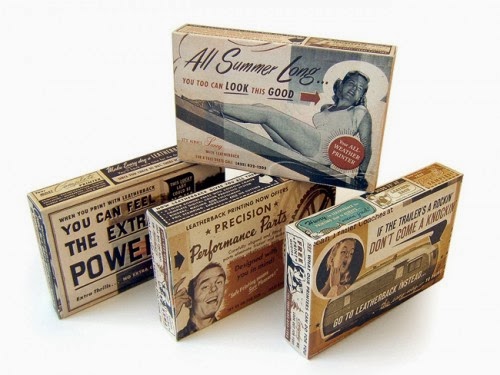
F.S.A (farm security society) was a group of photographers which captured images of lower class migrant houses. They were sent out with an image in mind of what to capture and would often move objects around in their houses to get the 'right' image.

Margaret Bourke-White took photos of 'sharecroppers home' (1937) Here she focuses the child in the middle to grab peoples attention and sympathy. He is surrounded by newspaper and magazines on the walls for insulation. The visual irony being this is the type of magazine the photo of him will end up in.

Russell Lee took a different approach with 'interior of a black farmers house' - where he doesn't use people as a symbol of poverty. Here (below) he focuses on the room itself.


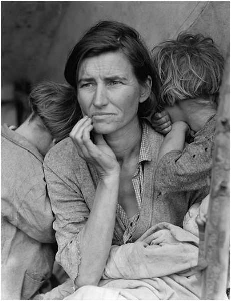
Dorothea Lange 'Migrant mother' (1936) Shows the mother and family rising above poverty. She was sent to capture this idea of patriotism - the idea that no matter how bad the poverty is she was happy to be in the country and loved the country. To her the image became more important that the people. She doesn't ask her name or anything about her situation. Other images which showed the situation in context were not chosen. Perhaps this is because the curiosity of the image is enough and more exciting to viewers because it allows their imagination to wonder. 

Magnum group - founded in 1947, ethos of documenting the world and social problems. 

"Photography achieves its highest distinction - reflecting the universality of the human condition in a never-to-be-retirieved fraction of a second" -Cartier Bresson

Documentary of War

Robert Capa 'the falling soldier' (1936) Is still debated today whether it was constructed or not.

Normandy, France (1945) Introduces the idea of the photographer as a soldier looking as if he is in the water.

George Rodger 'Bergen-Belsen Concentration Camp' (1945)
Clarke argues this has a respectful way of documenting what has happened from a distance.

Napalm Girl - Shows the extreme affect of conflict, read as an anti war statement. It exposes the affect of war. 

Visual Tourism - A pleasure in looking at something sensational and shocking.

It was referred to the war in colour as it was the first war to be televised.

Robert Haeberke (1969) ' People about to be shot' Just before people are about to be shot he shouts stop! and captures the moment before death. His need for the photo supersedes his humanity.


Wednesday 8 January 2014

Brief 3 - Page Layout: Grid Research


I currently no nothing about grid systems. Through research I have found that there are two main types of layouts: vertical or landscape. Which one of these you work with will affect your grid. There are also only two types of grids. One that has an even number of columns and one that has an odd number of columns. Being able to choose the right design for what you are presenting is really important.  In one article I found it gave some really good examples of how grids can affect text layout and the page dynamics as a whole.

It also looked at the rules of thirds where with photography the intersecting lines is where the centre image should be placed. This is really useful to know and means I may redo some of my photography.

The golden ration is equally interesting and useful for designing. I still don't understand this properly so will look into it and how it can be used in design with page layout.


Brief 3 - Page Layout: Planning

I have never previously used indesign or created any kind of booklet so knowing where to start for this project seems a bit tricky. I decided the best thing to do was to write down all the areas I want and need to cover in the book let and then decide on an order to put them in which makes sense. I have already decided that I don't want a page for each section of research. I would rather have the booklets showing the history of cards but adding in pictures and facts etc as it goes through. This will make for a more interesting read and a nice design.

What do I want to include?
  • Facts
  • Opinions
  • Statistics
  • Imagery
  • Words
  • Tarot Cards
  • Other uses
  • Nicknames and who the court cards are
  • History
  • Manufactures - Bicycle/ Waddingtons
  • Card games with rules
1st page: an introduction to cards, brief history of cards.
2nd page: Tarot cards
3rd page: nick names/who they are
4th page: manufactures OR Other uses
5th page: games

This might not be the final layout but now it is written down I am aware of what I need to fit in. Each page will have a mix of the 100 research items on it.

I've decided to go against the normality and have my page vertically. The reason I want to do this is so that it can work within the proportions of the playing card. I feel that this will link better to the idea of playing cards and combined with my chosen typography it will reinforce the fact it is designed for playing cards.

Brief 3 - Page Layout: Research

I decided to research a bit more into card backings so that I could get an idea on how they were designed and to see what colours are associated with cards and also styles.
The thing I loved about these cards was how elegant they look. The royal blue works really well with the royalty on the cards and the gold is a nice extra touch which makes the cards feel more expensive. This is a colour scheme I will explore especially if I can print gold, however this may have to be screen printed and issues could arise with fine detailing.

I really like the simple font used on these cards. The gothic san serif fits in so well with the joker illustration. It makes the cards look modern and the white negative space plays into the minimalistic approach.


I just absolutely love the detailing and patterns on these placards. I think the intricate lines make the cards more interesting and special. This feels so much better than the usual bog standard red and green - something I would very much like to get away from.


The dark grungy style of this card almost feels tattoo-y like cards a biker gang would play with. The text and use of colours work really well together and the illustrations have a lot of effort put into them to make them look this good. 

I am still unsure on layout but the colours and style of text on these cards should give me a good basis to work from when it comes to designing my booklet.

Brief 3 - Page Layout: Reseach into Books

To get a better understanding of grid systems and page layout I went to the library and looked into a few books. The first one I looked at was 'Making and Breaking the grid' the page that caught my eye was about two columned pages where the page is divided into two with margins around each edge (allowing more for the right hand side/inner margin for binding). The thing that stood out to me on this page was the simple use of just two colours plus stock. The blue grabs your attention and the traditional black and white juxtapose this making for an ascetically pleasing page design.


The second book I looked into was called 'The Layout Book' by Max Weber. I was initially attracted to the book for the interestingly detailed front cover. This drew me in and once I began looking through I found an interesting page using two columns and illustration. It was all printed on newspaper paper with dark blue ink. The magazine was created by the department of Design and Architecture in the British Council with the aim of English as a foreign language. All the illustrations we done by hand by graphic designer, Sara De Bondt. What attracted me to the page was the beautiful hand made illustrations which really took a nice focus. I want to create something with the same idea of it being two columns with illustrations mixed within but with enough surrounding space so that the focus really is on the drawings.


The third book that caught my eye was called 'Good Layout' I found this useful as it really higlighted the basics when it comes to creating a good layout. The piece of design should help the viewer read it with ease - if they struggle they just wont bother. By arranging and emphasising certain parts of text it makes the message clearer and can also change the 
order in which the person reads. 


To organise a layout you must use different type sizes; the header being the biggest, then subheading then body copy. Put colours behind important information to make it stand out. Changing the weight and also leaving white around heavy text draws your eye to it. By putting a photo next to an important piece of text your eye is drawn to it and it re emphasises the point that was being made in the text. 


Tuesday 7 January 2014

Brief 3 - Page Layout: Design Research

I want my design of the pages to be synced and relatable to the design history of the cards.
Searching around I have managed to find a free downloadable font which is used and referred to as ' card characters' http://haroldsfonts.com/portfolio/card-characters/ 

I am really drawn to this slab serif font as it fits in so well with the theme of the cards. It has an element of looking like a typewriter but the fact that it is thicker removes this. When I first see this font I immediately think of cards. This will be appropriate for headers and titles within  the page layouts, however since there is no lower case it may not be appropriate for body copy. It would be too loud and overpowering and would distract from the words themselves. I will try and find a simpler font which will compliment it.


Although this is an online page layout I loved how the text overlaps the image and the text colours compliment certain aspects of the image. The article as a whole is simple to read and you don't feel bombarded with information or adverts. They have used a simple colour scheme and with two main type faces; a san serif gothic for the titles and buttons and then a serif roman font for the body copy. The light grey/ cream background provides a good base for the typography.


The thing that attracted me to this page layout is how the page follows so nicely from left to right. You could imagine opening this in a magazine and seeing it as one spread. The use of block colours really stands out and the title works great in complimenting this. I am unsure of the yellow text on the right hand size as i feel they would have been better sticking with black and white. However the theme as a whole is something I could incorporate with patterns found on the cards being used as dividers of colour.


I loved the idea of having the images and type separated but with the lime green, black and grey linking the two. The bright colours keep your attention and the use of typography and the chosen fonts make the piece easily readable. It is a risky move having the title so far down the page but the white boarder really balances out the design and links nicely to the pictures.


The colour of the backing images really contrasts against the grey background with black boxes. I completely love the colour scheme used here and there is a great balance of image with text. This way you have something to keep your focus whilst guiding your eye around the page. 

Before I create my page layouts it would be useful to have a decided on theme. I really want to incorporate different aspects of the playing cards such as the typography and colour schemes when it comes to designing the layout. 


Brief 3 - Page Layout (InDesign): Brief


Brief

Based upon your given research theme:

Use Adobe Indesign to put together 5 double page spreads, one for each the five areas you have researched.

20 FACTS

20 OPINIONS

20 WORDS

20 STATISTICS

20 PHOTOGRAPHS

The content should be specific to your own interests in the area you have researched. Your choice of layout, type and size should be informed rather than arbitrary.

Background / Considerations
You should research page layout design and grid systems. You should look at publications including magazines, books, leaflets etc.

Each page should be B5 paper size (250mm x 176mm).

The double page spread should be printed on A3 paper (420mm x 297mm)

5 double page spreads each printed on A3 paper.

A pdf for each double page spread.

Research into layout design should be posted to your blog.

Sunday 5 January 2014

Brief 2 - Research: 20 Statistics

1. 29.03% of people (in primary survey) play cards

2. A further 58.06% of people said they play cards occasionally

3. Only 12.90% of people said that they don't play card games

4. A mere 3.33% of people play card games daily

5. A small 16.67% of people play cards weekly 

6. And a massive 80% of people play less than twice a month

7. 80% of the survey think that card games have become less popular than 10 years ago

8. The other 20% believe they have increased in popularity

9.  The highest score for one hand in Cribbage is 29: 555J in hand with the starter 5 of the same suit as the Jack (8 points for four J-5 combinations, 8 points for four 5-5-5 combinations, 12 points for pairs of 5s and one for his pip).


10. There are more possible arrangements in a deck of cards than there are stars in the known universe. The full number is 52 factorial, which is (very, very roughly) an eight followed by 67 zeroes.

11.  73% of the adult population (16 and over) participated in some form of gambling activity. This is a 5%
increase since the 2007 survey.

12. The most popular gambling activity is the National Lottery, with 59% of the adult population purchasing
Lottery Tickets.

13. Men are more likely than women to gamble overall, with 75% men and 71% women (The exception being
Bingo: 12% of women and 6% men).

14. Probability of being dealt a royal flush (ten, jack, queen, king and ace of same suit) is 0.00015%

15. There are 12,994,800 possible hands in Cribbage

16. Not accounting for suit, there are 14715 unique hands in cribbage

17. It's impossible to score 19 in Cribbage

18. The probability of drawing 4 aces consecutively is 1 out of 270,725

19. The odd of pulling out 4 different suits in a row is 0.1054981993

20. In cribbage a hand of four aces (AAAA) is the only combination of cards wherein no flip card will add points to its score.


Brief 2 - Research: 20 Facts

1 - Originally was the French version. The face cards in the deck were named after, and designed to look like, actual historical figures. The King of Hearts was Charlemagne; the King of Diamonds was Julius Caesar; the King of Clubs was Alexander the Great, and the King of Spades was King David from the Holy Bible.

2 - Playing cards was a popular form of entertainment in France. The rulers saw a way to make more money by taxing the Ace of Spades, and only that card in the deck. Aces were given the most open space so they could be stamped showing that the tax had been paid. Today, card manufacturers use the space to print their company information in, including trademark information.

3 - Specially-constructed decks were sent to American soldiers who were being held in German camps during World War II. The United States Playing Card Company collaborated with the government in the production of these cards. What made these cards so unique was, once they became wet, they peeled apart. Inside, the prisoners found parts of maps that would lead them to freedom.

4 - In the Renaissance, when art was popular, artists began to paint the backs of the cards with pictures, whereas they were previously blank. This idea of putting pictures on the back of cards came from Tarot cards.

5- When companies made playing cards around this era, often they printed cards that reflected political views of the times or supported a cause. An example of this is The Worshipful Company of Playing Cards. They controlled the printing and manufacture cards to raise money for the reign of King Charles the First. The Worshipful Company also started a tax on playing cards that lasted until 1920.

6 - The English name "Blackjack" comes from the original French game where a player was rewarded if he was to draw a Jack of spades and an Ace of spades as the first two cards.

7 - There is a special deck in Spain called Brisca. It also has four suits, but they are named differently. They are called oros(gold), espadas (swords), copas (cups), and bastos (clubs). This deck is used not only in Spain but in other countries where Spain maintained an influence.

8 - Face cards - Jacks, Queens, and Kings are called "face cards" because the cards have pictures of their names.

9 - "deuces, aces, one-eyed faces" is sometimes used in certain games to claim that the aces, twos and jacks are all wild. (the jack of spades and the jack of hearts are known as one-eyed jacks as they only have one eye showing.)

10 - Americans began making their own cards around 1800. They soon adapted the cards to remove any last problems. They decided to have double-headed court cards (to avoid the nuisance of turning the figure upright), varnished surfaces (for durability and smoothness in shuffling), indexes (the identifying marks placed in the cards’ borders or corners), and rounded corners (which avoid the wear that card players inflict on square corners).

11 - The most common sizes for playing cards are poker size 2.5×3.5 inches.

12 - Each of the suits on a deck of cards represents the four major pillars of the economy in the middle ages: heart represented the Church, spades represented the military, clubs represented agriculture, and diamonds represented the merchant class.

13 - In 1935, card manafacturers tried to introduce a fifth suit: green eagles (USA) and green crowns (UK)

14 - The 4 suits represent the four natural elements:  Hearts = Water, Clubs = Fire, Diamonds = Earth, Spades = Air

15 - Jacks were originally called knaves but the abbreviation (KN) was too similar to King (K) so it was changed in 1864.


16 -  In Bridge the cards are ranked. Spades are highest, then Hearts, Diamonds and finally Clubs.

17 - In other card games such as whist cards are ranked Spades, Diamonds, Clubs and then Hearts.

18 - There is a significant link between problem gambling if an individual:
  • Has a parent with a gambling problem.
  • Is divorced or separated.
  • Has low educational attainment.
  • Smokes cigarettes.
19 - If you spell out the cards from A-C-E to K-I-N-G then there are 52 letters.

20 - There are 75 casinos in Las Vegas


Friday 3 January 2014

Brief 2 - Research: 20 Opinions


I asked for peoples opinions on what they liked/disliked about card games. Here are a few of their opinions:

1. "Cards is a good non-electronic skills based game for all ages"


2. " Cards is something to do with everyone, can bring people together"


3. " Cards is a great for conversation, especially as an icebreaker"


4. "Used to play card games a lot when I was younger. Nowadays the only time I see them is for drinking games."


5. "The design of them is quite nice, but I enjoy the fact that each game is completely diferent because the cards are so randomised."

6. "Reminds me of when I was a child, we didn't have all these electronic games then."


7. "I enjoy the variety of different card games and that a pack of cards is easy to take anywhere with you."

8. "You have to think about the next turn or move when playing card games. It can be quite tactical. There is a thought process and it keeps you on the ball. And it's a great time killer."

9. " I hate cheaters"


10. "I don't enjoy learning the rules"


11. "The gamble/simplicity of it"


12. "having to think about it is my favourite bit working out what card to use and if youll win etc, if people don't concentrate"


13. "I enjoy the competition and social aspect of playing cards"


14. "I think card games are a waste of time"


15. "I hate it when people mess about with the rules... It ruins the game!!"


16. "How it brings everyone together"


17. "The thing that I love about cards is that there are hundreds of different games to play just from having 52 cards"


18. It's a good fun and a social occasion.


19. "I can't understand the interest in them"


20. "simple, fun, quick and breaks the ice meeting new people"

(+) "It is better with a big group of people"