Sunday 30 March 2014

Brief 2 - CoP - Publication: Binding Methods

I've struggled to find how ration books were created but will keep looking. In the mean time I found an interesting video of how a book was bound in the 50's using string and sewing and a saw! https://www.youtube.com/watch?v=R448dZVgl4M This style is useful to bare in mind when thinking about how I am going to bound this. I want to figure out how to bind it pretty quickly into the project because then I am aware of what page restrictions I am working to. 


During World War II all sorts of essential and non-essential foods were rationed, as well as clothing, furniture and petrol.

Why was rationing introduced?
To make the British weak, the Germans tried to cut off supplies of food and other goods. German submarines attacked many of the ships that brought food to Britain.

Rationing was introduced to make sure that everyone had a fair share of the items that were hard to get hold of during the war.

When was rationing introduced?
Rationing was introduced at the beginning of 1940.

On National Registration Day on 29 September 1939, every householder had to fill in a form giving details of the people who lived in their house.

How did rationing work?
Using the information gathered on Natoinal Registration Day, the government issued every on with an identity card and ration book. The books contained coupons that had to be handed to or signed by the shopkeeper every time rationed goods were bought. This meant that people could only buy the amount they were allowed.

What were ration books?
They were books which contained coupons that shopkeepers cut out or signd when people bought food and other items. 
People still had to pay for the goods with money.

Why did they issue ration books?
To make sure that everybody got a fair share. The government was worried that as food and other items became scarcer, prices would rise and poorer people might not be able to afford things. There was also a danger that some people might hoard items, leaving none for others.

Was rationing fair?
Some people considered food rationing to be very unfair. Eggs, butter and meat could be obtained fairly easily without coupons in rural areas.

By the summer of 1941 greengrocers in the towns were taking their lorries into the country to buy vegetables direct from growers.

When did food rationing stop?
Fourteen years of food rationing in Britain ended at midnight on 4 July 1954, when restrictions on the sale and purchase of meat and bacon were lifted. Thi happened nine years after the end of the war.


Brief 2 - Cop - Publication: Page Content

One thing that stood out in my essay was how the Guernica bombings would hardly be remembered if it wasn't for Pablo Picasso's famous painting. The painting acted as a form of communication and really raised attention to the bombings and what had happened. This raises the interesting point to how art can affect and change how people see or interpret a situation. 

I aim to make a small booklet in the style of a ration book which shows different pieces of powerful WWII propaganda. The ration book not only fits with the concept of war but also with the idea of propaganda only feeding you a certain amount of information. The government give you the information which tells you what to think about the war; much like a ration book, they limit the amount you get. 


Propaganda:

"information, especially of a biased or misleading nature, used to promote a political cause or point of view"
Professionals have called it the fourth front of warfare, comparing its strategic importance to military campaigns, diplomatic negotiations, and economic sanctions. No one has claimed that the tide of conflict has been turned solely by leaflets, radio broadcasts, posters, or psychological ploys but there is little doubt that propaganda has been a powerful weapon in the arsenal of war. During World War Two, propagandists exhorted citizens at home to produce more, keep their lips shut, and hate the enemy; at the front they sought to strengthen the morale of their own troops and weaken the enemy's will to fight.


- Propaganda, The art of persuasion WWII 


Just eight days after having been elected as Chancellor of Germany, Hitler established the Ministry of Public Enlightenment and Propaganda and appointed Joseph Goebbels as its head. Their objective was to spread Nazi ideology throughout the globe, and maintain an iron-fisted control over every aspect of German society and culture. One department dealt exclusively with German and international newspapers. Other departments worked on assigned portfolios such as Budget, Law, Propaganda, Radio, Film, Personal, Defence, International, Theatre, Music, Literature, Visual Arts, and Tourism. In 1933 the fledgling Ministry had only five departments and 350 employees but by 1939 at the start of World War II there were 2,000 employees in 17 departments. Quite noteworthy is that between 1933 and 1941 the Ministry's propaganda budget skyrocketed from 14 million to 187 million Reichsmarks.


Quotes

"Nothing is easier than leading the people on a leash. I just hold up a dazzling campaign poster and they jump through it"   - Joseph Goebbels

--------------------------------------------------------------------------------------------------------------------


1930's "Germany Lives" K. Stauber

The German people looked up to him as their only hope for the restoration of their national pride and readily embraced everything that he said believing it to be the Gospel truth. The German people saw him as the only leader who was capable of restoring Germany to glory. This propaganda poster underscored by the inscription "Long live Germany" depicted Hitler as a savior to the nation.  It illustrates a silhouette of the German eagle as if it were descending from the heavens, like the dove which descended upon Jesus Christ at his Baptism. Nazi propaganda projected Hitler as the very embodiment of the German nation.


“Children, what do you know of the Fuhrer?”


This Hitler Youth poster shows Adolf Hitler interacting with a group of young Germans. The caption reads, “Children, what do you know of the Fuhrer?” In the poster, the usually much more sternly portrayed dictator is depicted as an approachable figure – although still an authoritative one – who is friendly towards children.
Hitler understood that his power depended on every German citizen regarding him as infallible and following his word above written law – the so-called “leader principle,” or Führerprinzip. This commonly led to Hitler being portrayed as a messianic, almost god-like figure.


1933: Jewish students and teachers expelled from schools


This poster references the expulsion of Jewish teachers and students from German schools. From 1933, the numbers of Jewish students in public schools was limited, supposedly due to overcrowding.
In this picture, we can see that the Jewish characters have been given negative stereotypical characteristics like large noses, bent postures, and generally undesirable demeanors. These strategically planned caricatures were designed to distinguish Jews from the Aryan ideal and to create an image of inferiority and untrustworthiness.


“Every Girl Belongs to Us”

This poster shows a smiling young member of the League of German Girls, an organisation designed to indoctrinate young women by instilling them with the values of Nazi Germany and preparing them for motherhood. Like their male counterparts, the girls also had to be able to partake in strenuous physical activities.
German children were particularly important propaganda targets, especially through the institutions of schools and education. By 1936, 97 percent of German teachers belonged to the National Socialist Teachers League. Children, meanwhile, belonged to government organizations from the age of 10.
Until the collapse of the Nazi system in 1945, many children had lived their entire lives on a perpetual diet of government propaganda. The situation was so bad that a prolonged period of “denazification” was necessary.

“The Jewish nose is bent. It looks like the number six…”

This illustration comes from the book Der Giftpilz, which was published in 1938 and was intended for children. The book aimed to increase anti-Semitism by teaching youngsters negative myths about Jewish people.
In the scene, a class is taught how to recognize the supposed physical characteristics of Jews. They are taught that the Jewish nose is hooked like the number six. Other attributes mentioned in the story are puffy lips, fleshy eyelids, and a “deceitful” look. Towards the end of the book, it is also claimed that Jewish people were responsible for the murder of Jesus, who is called their greatest enemy.
The publisher of the book, Julius Streicher, was additionally responsible for the rabidly anti-Semitic newspaper Der Stürmer. Streicher’s propaganda was so extreme that, following the war, he was judged to be responsible for dehumanizing the Jews in the lead-up to the Holocaust. He was found guilty at the Nuremberg trials and was executed in October 1946.

Der Sturmer Newspapers

Der Sturmer was the most vehemently anti-Semitic newspaper in Nazi Germany. This image was the front page of its May 1934 issue which depicted a caricature of Jewish men collecting the blood of Christian children for a religious ritual. It was one of many anti-Semitic slurs against the Jews and included accusations of pornography, anti-capitalism and anti-catholicism. Jews were portrayed as ugly characters with grotesque facial features and misshapen bodies. The publisher of the tabloid, Julius Streicher, promoted the myth of blood libel which had originated during the Middle Ages. It claimed that Jews killed Christian children, sacrificed them and drank their blood.


Superior Race


Fundamental to Nazi ideology was the myth of the "master race" exemplified by the white skin, and blue-eyed blondes of the German and Nordic peoples, and with it came the notion of safeguarding the purity of their race as a means to preserve their cultural superiority in the world of mongrels.


England


Your Britain - Fight for it Now [South Downs]


From the famous series of four posters by Newbould. An example of how an inter-war travel poster style was used unchanged during the war to arouse patriotic feelings for an idealised pastoral Britain, defined by the landscape of southern England. Newbould was a noted designer of travel posters. In 1942 he joined the War Office as an assistant designer 
to Abram Games.


Tittle Tattle Lost the Battle
Humour appealed more to Britons than heavy-handed exhortations. On of the many humorous treatments of the careless talk theme.


KEEP MUM SHE'S NOT SO DUMB Created in 1941, Keep Mum She’s Not so Dumb, is typical of Second World War British propaganda attempts to instill caution in the public through humorous, memorable slogans, rather than through fear-inducing images of spies and saboteurs. 'Keep Mum' was another way of saying be quiet and don't say anything.


A Clear Plate Means a Clear Conscience - Don't Take More Than You Can EatA plate with cutlery on a checked table-cover. Reminding people not to be greedy and only take what they can eat. It also helps to reinforce the idea that simple everyday actions can help win the war; everyone feels involved.


The 'Truffle Eater. Pretty Stories and Funny Pictures' 
It was published in 1933, the year Adolf Hitler became Chancellor of Germany. It is the earliest anti-Hitler comic book of its kind to ridicule the German dictator. This vicious attack against him is extraordinary in its analysis and understanding of the early Nazi regime. The book follows the events in 1933, including the burning of the Reichstag in February. Here the author suggests that Goebbels was behind the fire, and the event was used by Hitler to curtail German democracy. It also covers the infamous book-burnings and increasing anti-semitic activities in Germany, and shows an acute observation of the sudden changes following the election of Hitler as Chancellor.


USA


Go ahead, please - TAKE DAY OFF!
This poster was aimed to make American employees feel guilty and bad for taking a day off. The statement is coming from a Japanese man with a menacing look this reinforces the idea that if the Americans slacked then it helped out the enemy.


This is the Enemy - Karl Loehler
This aristocratic officer seems a far cry from the crudeness of many Nazi leaders.


“Jap...You’re Next!”

This poster shows Uncle Sam holding a wrench and saying “Jap...You’re Next!” The personification of Uncle Sam looks very noble, and in using the image of him holding a wrench, there is a certain air of him being close with the people from the lower class. Again, this poster made the people think that the Japanese deserved to be wiped out. The message, “Buy extra bonds” is telling people to invest in war bonds and help the country.


“Captian America”

Captian America first appeared at a time of the most vibrant patriotism, the beginning of WWII. The character was Steve Rogers, a sickly young man who was given an experimental Super-Soldier Serum and “Vita-Ray” treatment that made him very strong and healthy in order to aid the United States war effort. His costume was inspired by the American flag. He has no superpowers but he carries a red, white, and blue indestructible shield. Captain America was often portrayed as fighting for the Allies and he was Marvel’s most popular hero during the war. 


“It Can Happen Here!”

The phrase “It Can Happen Here,-Unless We Keep ‘em Firing” is an example of the appeal to fear propaganda technique. It shows a family house completly destroyed by a bomb and it tries to tell the audience that ordinary homes can be destroyed as the one in the poster. This propaganda sends the message that if there is an increase in production of war machines then people will be safe. It tries to inflict fear in the audience, so that women and people who are too old to go to war will choose to start working in manufacturing weaponry. This way, the soldiers at war can keep the Germans and Japanese away from America. This generates a feeling in the American people that if they don’t contribute with war, their security and their honor can be taken away by the enemy.


“Keep These Hands Off!”

The poster shows two symbols of two hands, which represent Nazi Germany and the Empire of Japan. The hands loom over a mother and her young child. Above the two ‘Keep these hands off!’ is written as a form of persuading men to join the military. The mother and child are in the center of the propaganda. They are painted with pale, delicate colors while dark, witch-like hands jeopardize their security. These details are important because they affect the viewer on an emotional level, by making them feel responsible for the wellbeing of women and children. The mother and child are symbols of the helplessness of the female gender and suggest the need to protect them through aiding the war’s finances.


“I Want You for U.S. Army”

Perhaps one of the most recognizable propaganda posters of any time, “I Want You for U.S. Army” was actually commissioned for WWI. Based on an equally iconic British recruiting poster, this indelible image was so effective that it was also extensively used in the Second World War. Even to our 21st Century media-savvy eyes, it isn’t hard to see why so many young men heeded its call. The stern, paternal face of the national icon Uncle Sam seems to be staring right into your soul, no matter which way you look at the poster. The appeal to honor and duty, not to mention the slightly sinister undertone, was enough to convince countless men to willingly sign up for a tour in Hell. If that isn’t an effective piece of propaganda, what is?


“We Can Do It”

Besides the very real need to convince citizens to sign up for military service, governments also had to convince the people who stayed behind of the importance of their war efforts. In the U.S., which found itself in need of an incredible amount of skilled workers to produce the materials it, the U.K., and Russia needed to fight the Axis, many of the most memorable propaganda posters were aimed at the civilian population. Most iconic by far was “We Can Do It.” A simple poster of a working woman (based on the existing character of “Rosie the Riveter”) flexing her muscles, it encapsulated the new found power of women all across America. Pressed into service in factories across the country, these women were a vital part of the U.S. war effort and for the first time in the nation’s history, became an economic force to be reckoned with. Although things changed once the war ended, the poster is still used as a symbol of female power. A power, only awakened by necessity, that would change the face of the country for generations to come.

Wednesday 26 March 2014

Brief 4 - Speaking From Experience: Brief (Rewritten)

I've decided to venture down the route of crits because it was something that I personally struggled with and I know a lot of others did as well. I decided not to do budgeting because I did research into both and there seems to be quite a bit online about how to budget and not much about crits especially for students. I feel that if I knew more about them then I would have been less scared when it came to taking part in them.

Brief

When students first join a Graphic Design degree course, a large amount of them are unaware and cautious of the idea of a Critique. Crits are of great use as they allow students to get feedback on their work and in turn develop their project however most students do not take full advantage of this. Produce a graphic response either physical or digital which would help to ease first year Graphic Design students into the idea of a crit.
Work with any appropriate media or format and develop and identify the content will be entertaining, advisory or informative.

Background Considerations
What/ why do they need to know?
How will you tell them?


You must identify whether you are trying to EXPLAIN, INFORM, INSTRUCT or EDUCATE the audience?


What will the audience respond to, where will they look? How will they need to interact with it? How will you know it is working?
Will it be a; collection of, a presentation of or instructions to.
What is the tone of voice? It must be appropriate to your subject, audience and method of delivery. It could be serious or tongue in cheek however it must be appropriate for your target audience of first year graphic design students.

Mandatory Requirements
A piece of graphic design either physical or digital which resolves the brief.

Deliverables
Design development sheets.

Test Prints
Resolved design solutions in a format and media appropriate to your ideas.
Evaluation.

Monday 24 March 2014

Brief 4 - Speaking from Experience: Starter Task

Today we were put into groups and had to list the problems we had when we first joined uni/moved to leeds. These words were then formed into a problematic statement to which we could write a brief around. One problem we found was distinguishing a statement from a problem as everything we wrote sounded like a statement. 

We picked one problem which happened to be about eating healthy and being able to cook at uni and then wrote a brief around the problem. We asked other groups to write down on the back how they would solve this and the answers we got back really fitted with what we initially hoped for. 


Our five problems and below trying to word them into problematic statements.


The final question we worked with.


Written brief.


Doing this task was useful as it gave us an idea of what we will be doing in the second year for our briefs but also what process we need to do to start this brief. After the lesson I mind mapped some initial ideas of things that I and others were scared or nervous about before University.


At the moment the ideas I think have most possibility are:

Crits
When I first started I found crits really hard because I didn't feel confident in my work or really know how to present it. I also had no idea on what kind of feedback to give without sounding mean or critical. However I've now learnt its fine to sound mean and critical.
I quite liked the idea of making something to help with Crits and presenting your work as most people feel it is quite daunting. I love the idea of a title "Crit Happens" taken from "Sh*t Happens" because crits are always there it is just about seeing the benefit to you. Below is a list of things it could include.

- what is a crit
- types of crit
- why crits are useful
- what to get out of crits
- what to include
- what to consider

Budgeting 
One thing I started doing when I came to uni was budgeting and accounting for my financial expenses, especially without a job I needed to know what I was spending on what and how much. For the majority of students its their first time away from home where they are in-charge of their finances and making sure their loan lasts!

One Idea I had for this was a downloadable spreadsheet where they could write in the amount of money they have and then it subdivides it into average categories. However I don't know whether this would be classed as graphic design or not. Perhaps I could link it in with where to shop and what is cheap but good etc...

Sunday 23 March 2014

Brief 2 - Communication is a Virus: Hanging the Origami

Thursday 20th March
Once Packs were handed out on monday, Aimee and I felt greatly concerned that there hadn't been as big as a reaction as we were hoping for, Throughout the week we were unsure on what to do as we didn't physically have enough origami to create the exhibition and it would have been an embarrassingly small amount on show. 


Thursday night we managed to make an outstanding amount, over 300 birds! and cubes to hand in between. On the friday we were overwhelmed with how many we had made. On the friday I stayed behind with Aimee, Elliott and Kieran as we hung them all up. Other people from graphics also stayed which was really helpful as we were missing members of our team and we would have struggled to do it all ourselves in the time frame.

String was hung around two pillars so that we could attach the origami as we went and get an idea of how full it was. Below are some photos from the night.


This was them all hanging from a distance, Unfortunately we couldn't move it because the fish wire would have tangled.


We had quite a few left over however, we were running out of time and equally if we added any more it wouldn't have looked as good as they were all evenly spaced out.


Thursday 20 March 2014

Brief 2 - Communication is a Virus: Posters Up

I printed lots of posters off and went around with Elliott as we stuck them up on free notice boards to advertise the show and also how to enter.


Wednesday 19 March 2014

Brief 3 - Screen Print (Poster): Crit Feedback

I presented my three ideas to the crit. Below is some of the feedback I was given:
IDEA 1
IDEA 2

IDEA 3 


"Really Strong ideas, the compositions really work well. I think your strongest idea is idea 1, I like how the page is split into thirds. The silhouettes are prominent and the white text is highly readable against the purple. Maybe try inverting the colours or experimenting with different ones'"

"I like all your ideas as they all have really strong concepts. Although the scene may not seem as iconic as the rest, my favourite is number 3. Think it has really strong layout composition and like the illustration. Could you try different colours maybe from the purple idea!?"

"Idea 3 seems to be the strongest however I would change the visuals. Perhaps paint splatters next to a weight bench or the two paint buckets without the weights and bar."

"My favourite is design number 2, strongest and very memorable moment from the film"

"Idea one looks most like a movie poster BUT Idea 3 is most intriguing - makes me want to watch it. Love the importance of the hand reaching for the pole. Could you play on the water theme more - could you look at exposing things on live fabrics or use marbling to get a water like pattern"

"Idea one seems the strongest - I  think it would look stronger without type - Purple is always a good choice"

"Idea three looks could be the strongest with some further development. Consider communicating that scene in a more subtle way"

"idea 3 looks the strongest - Nice colour scheme"

"Idea one looks cool"

"Idea one is my favourite. The two meant standing in-front of a cracked city. nice. Idea 3 reminds me of Saul Bass' style. Its nice, but I prefer number 1"

"Idea 1 is most affective. Experiment with the negative space, composition is strong though."

"The aesthetic that you have created (especially the hand design) reminds me of Saul Bass, really well backed up and thought through. Design with hand or silhouette are strongest"


After this I am unsure what poster design to go with. I will take on board the feed back and play around and develop idea three more.

Tuesday 18 March 2014

THEORY INTO PRACTICE - A Visual Response: Research

Publication:
The preparation and issuing of a book, journal, or piece of music for public sale.

Essay Title:

Should fine art be given more value than other types of communication?

What did I write about?:
The uses and value of using fine art and photography as mediums to document war

Possible areas to create a publication in from essay:
  • The importance of art in documenting war
  • Propaganda Art in war
  • The differences between photography and art in the war
Initial Ideas:
  • War packaging - everything unties as a parcel
  • name tags used for children
  • airborne leaflet propaganda
  • ration books
Propaganda Definition:
"information, especially of a biased or misleading nature, used to promote a political cause or point of view"

If I went with the concept of propaganda, I could look at how the leaflets dropped changed peoples opinions and also the posters behind the propaganda, How the art affected peoples opinions and country moral


WEBSITES:
http://www.historyextra.com/propaganda
http://www.smashingmagazine.com/2010/06/13/100-years-of-propaganda-the-good-the-bad-and-the-ugly/
http://guity-novin.blogspot.co.uk/2010/05/chapter-29-propaganda-posters.html#Eleven

-----------------------------------------------


War Shelter Guides

War Shelter booklets were distributed in the war to provide people with all the information they needed to know about the war and what to do in the situation of a raid or bombing.
Below shows a few few pages from the Edinburgh Raid Shelters booklet. The design of it is very simplistic and all about the information. The worn off white paper and tattered cover shows how much it would have been used. I could Incorporate this style into my final publication.


Propaganda In Art
Art was a major way to produce propaganda cheaply. The photo below shows women painting the posters to sway peoples opinions. Propaganda not only changed peoples views but united the country as everyone pulled together and felt they had a roll to play.


Below shows some propaganda work done by Dr. Seuss Propaganda. I found this quite interesting as he is an iconic children's novel writer. His drawings were simple black and white but really interesting and definitely got his point across. 


War Ration Booklets and Other Information Books

Ration books were a large part of the war as less food was being imported. The thing that interested me from a design point of you was the layout and making of the ration booklet. Perhaps this is a design I could look into with a perfect bind/ saddle stitch. 


The thing I liked about this book was the simple make do and mend culture and layout. The illustration in the top right makes the page more interesting.


Airborne Propaganda Leaflets:
Airborne leaflet propaganda is a form of psychological warfare in which leaflets (flyers) are scattered in the air. Military forces have used aircraft to drop leaflets to attempt to alter the behaviour of combatants and civilians in enemy-controlled territory, sometimes in conjunction with air strikes. Humanitarian air missions, in cooperation with leaflet propaganda, can turn civilians against their leadership while preparing them for the arrival of enemy troops.

Functions - 
There are six different functions of airborne leaflet propaganda that have been used over the past century:
  1. Threaten destruction
    • Warn enemy combatants and civilians that their area will be targeted. This has the dual purpose of reducing collateral damage and encouraging enemy combatants and civilians (who may be engaged in wartime production) to abandon their duties, reducing the target's military effectiveness.
  2. Prompt the enemy to surrender
    • Explain to prospective deserters how to surrender.
  3. Offer rewards
    • Rewards could be offered to encourage individuals to provide assistance, or to encourage defection.
  4. Disseminate or counter disinformation
    • Reduce enemy morale through propaganda.
    • Neutralize enemy propaganda.
    • Advise radio listeners about frequencies/times of propaganda broadcasts and methods for circumventing radio jamming.
  5. Facilitate communication
    • Create a friendly atmosphere for the enemy by promoting ideologies such as freedom, capitalism, and "noble intentions".
  6. Provide humanitarian assistance
    • Inform people where to find airdropped food, how to open and consume it, and when it comes.

First World War

Aerial leaflets were first used on a large scale during World War I by all parties. The British dropped packets of leaflets over German trenches containing postcards from prisoners of war detailing their humane conditions, surrender notices and general propaganda against the Kaiser and the German generals. By the end of the war MI7b had distributed almost 26 million leaflets.
The Germans began shooting the leaflet-dropping pilots, prompting the British to develop an alternative method of delivery. Mr. A. Fleming invented the unmanned leaflet balloon in 1917, and these were used extensively in the latter part of the War, with over 48,000 units produced. The hydrogen balloon would drift over no-man's land to land in the enemy trenches.
At least one in seven of these leaflets were not handed in by the soldiers to their superiors, despite severe penalties for that offence. Even General Hindenburg admitted that "Unsuspectingly, many thousands consumed the poison" and POWs admitted to being disillusioned by the propaganda leaflets that depicted the use of German troops as mere cannon fodder. In 1915, the British began airdropping a regular leaflet newspaper Le Courrier de l'Air for civilians in German-occupied France and Belgium.


Advantages of leafleting

  • The printed words on the leaflets were more authoritative before the advances in technology.
  • One leaflet has the potential to reach many civilians.
  • Leaflets can be hidden and easily destroyed in case of emergency.

Disadvantages

  • Due to illiteracy not all civilians are capable of reading the leaflets.
  • In order to have accurate delivery, aircraft need to fly at low altitudes and low speeds making them easy targets for the enemy.
  • Leaflets can be destroyed or altered by the enemy.
  • Messages must cater to the cultural norm of society.
  • Weather conditions can alter the message being delivered to civilians

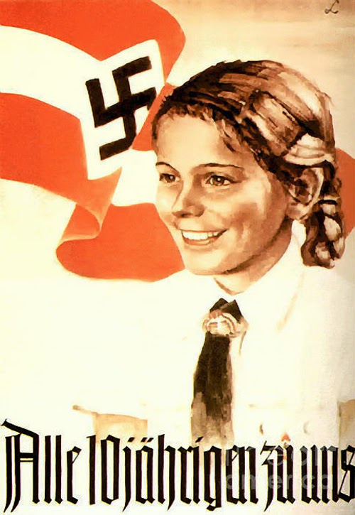
Propaganda Posters - Germany WWII
After the first world war practically every government resorted to intense propaganda campaigns for capturing the hearts and the minds of the masses. In particular, the extreme right in the form of fascism and the extreme left in the form of communism found posters a potent tool in their propaganda campaigns. Here are two examples from Nazi Germany, and Soviet Russia. 


Hitler’s fervent desire to attain propaganda supremacy among nations was a direct result of the German defeat in World War I and his belief that superior allied propaganda trumped Kaiser Wilhelm II’s meager output. Through intensive barrages of posters and other visual media, Britian and America effectively defamed the “Hun” in the eyes of the world, portraying the Kaiser’s military as callous blood-thirsty beasts. The German counterattack was tepid at best. “The Germans were sent into this mighty battle with not so much as a single slogan,” wrote Eugen Hadamovsky, the Nazi propaganda expert and Josef Goebbels’ deputy, in Propaganda and National Power (1933, reprinted by Arno Press in 1972). So when the Nazis came to power, Hitler commissioned a book titled Das Politische Plakat: Eine Psychologische Betrachtung by Erwin Schockel (Franz Eher Verlag, published in 1939), a psychological assesment of English, American, French, Russian and German political posters. It was a handbook for German propagandists and others. ...
Das Politische Plakat was one in a series of textbooks and manuals issued through the Reichspropagandaleitung, based in Munich (Reich Propaganda Office of the Nazi Party, a separate department from the more powerful Berlin-based Ministry of Propaganda and Enlightenment) for use by party members only. Schockel’s message was clear: powerful propagandistic graphics must be simple and memorable.
 Work for Victory. Just Like We Fight for it!
German: Yes! Leader, we follow you!


German: Hitler, resembling Jesus. Extreme personality cultism surrounded Hitler thus resulting in the coining of the phrase the "Hitler Myth".

Propaganda Posters - USA WWII

It is estimated that the U.S. produced more than 200,000 different posters during the second war, more than any other country. Many of the US war posters were designed by the artists who participated in various competitions to produce a design in support of the war. Many corporations produced posters that while supporting the war was also promoting their products. Many corporations were allowed to treat their war propaganda posters as business expenses. 


Propaganda Artists

DIMITRI MOOR: RUSSIA, 1917–1921

Dimitri Moor (or Dmitry Stakhievich Orlov) changed the face of graphic design in Soviet Russia back in 1918. His work dominated both the Bolshevik Era (1917–1921) and the New Economic Policy (1921–1927). The main theme of Moor’s work is the stark contrast between the oppressive evil and the heroic allies. A lot of pressure was put on Russian workers to rise up against imperialism.
Screenshot
A lot of Moor’s artwork was restricted to black and red. Black was generally used for the main part of the poster, and all of the solid colors for the capitalists. Red was used for socialist elements such as flags and workers’ shirts.
Screenshot
This is a lesser known poster by the artist, appealing for help for those staving from the Russian famine in 1920. It features the single word “Pomogi,” meaning help. The drawing is of an old man who is just skin and bone. The last stalks of barley are barely visible in the background.
Screenshot
EL LISSITZKY: RUSSIA, 1920
El Lissitzky spent his whole career absorbed by the belief that the artist could be an agent for change and good, and his work in a lot of respects shows this. He himself was a huge agent of change in the artistic movements of the time. He was one of the fathers of suprematism, along with Kazimir Malevich; and along with many of his peers, he changed the look of typography, exhibition design, photo montage and book cover design. Most of the modern techniques we see today and that appear in film and modern Kenetic typography are the product of Lissitzky’s work.
One of his most famous pieces, shown below, really embodies Lissitzky’s work. It is so avant garde that even a lay person could recognize the style. The abstract geometric shapes and clear color pallet scream of modernist art, and yet the poster has a real message. It describes the Russian revolution that took place in 1917. The white circle represents the royalists from the old regime, and the red triangle represents the communists moving in and changing opinion. It has been described as a stylized battle plan for communist victory.
Screenshot
Then in 1921, El Lissitzky accepted a job as the Russian cultural ambassador to Germany. His work influenced a lot of the iconic designs of the Bauhaus and De Stijil movements. His last poster, seen below, was a return to propaganda, with a poster encouraging the Russian people to help Russia build more tanks to win the war against Nazi Germany.
Screenshot
HANS SCHWEITZER: GERMANY, 1930S
In Germany in the 1930s, propaganda was in full swing and being used by Hitler’s advisers to call the German people to arms and spread lies about the Jews. One of the most famous artists behind Nazi propaganda was Hans Schweitzer, known as “Mjolnir.” This poster by Hans Schweitzer shows the typical pro-Nazi theme of the German army’s strength, depicting an S.A. man standing next to a solider. The text reads, “The guarantee of German military strength!”
Screenshot
This next poster by Mjolnir, titled “Our Last Hope: Hitler” was used in the presidential elections of 1932, when Germany was suffering through its great depression. Nazi propagandists targeted the German people who were unemployed and living on the breadline, and they suggested Hitler as their way out, their savior.
Screenshot


The propaganda then used the scapegoat of the Jews, blaming them for all of Germany’s problems and the war. Many posters were entitled, “He is guilty for the war.” This was the key message of Hitler to start his campaign of terror and for the ethnic cleansing that ensued. Almost the entire campaign from beginning to end was driven by the artist Mjolnir. Just as the media molds public opinion today, Mjolnir most definitely molded the opinion of the German people through his designs. There is no doubts about the immorality and emotional deception of these designs; they are still worth mentioning because they were extremely powerful and effective at the time.

PABLO PICASSO: SPAIN, 1937

Picasso painted Guernica in response to the bombing of the town by Germany and Italy, which were following orders from Spanish Nationalist forces, on 26 April 1937. It must be said that it was commissioned to Picasso long before the bombing of the town und was supposed to be a classic painting first; after the bombings, Picasso changed his drawing to respond to the recent bombing. The giant mural shows the tragedy of war, using innocents civilians as the focal point. It became a huge symbol of anti-war, and upon completion it was exhibited worldwide to spread the message. The piece also educated other countries about the horror of the Spanish Civil War, which till then most people had never heard of.
Screenshot

NORMAN ROCKWELL: US, 1939

Norman Rockwell is probably one of the best known of the propoganda movement. He admitted that he was just a propaganda stooge for the Saturday Evening Post. The newspaper paid many artists and illustrators to whitewash American news with patriotism and propaganda for around 50 years.
His work has often been dismissed as idealistic or sentimental. His depiction of American life included young boys running away from a “No swimming” sign, and happy-go-lucky US citizens going about their business unaware of the crumbling world around them.
Screenshot
Rockwell’s famous Rosie the Riveter poster is shown below, representing the American women who worked in the munitions and war supplies factories during World War II. This was a call to arms for the women of America to become strong capable females and support the war effort.
Screenshot
J. Howard Miller’s “We Can Do It!,” commonly mistaken to depict Rosie the Riveter, conveyed the same message:
Screenshot
Rockwell was always unhappy with the politics of the Saturday Evening Post, so in his later years, he took up the controversial subject of racism in America. He became respected as a painter for these hard-hitting pieces of American culture, much more so than for his work for the Saturday Evening Post. The piece below is called “The Problem We All Live With.” It is not known whether this painting is based solely on the Ruby Bridges story, because it was also thought that the idea came from John Steinbeck’s book Travels With Charley.
The subject was the integration of black children in American schools. Little Ruby Bridges was filmed making her way into the William Franz School at 8:40 am. At this time, a gigantic crowd of 150 white women and male youth had gathered. They threw tomatoes and shouted vile comments at the tiny girl. It is hard to look at this picture without being affected.
Screenshot
Screenshot

Books 
I got some books out from the library which I thought would be useful. They were looking at posters during the war and also war propaganda. Both very fitting with my idea for a publication.