Showing posts with label Screen Print (Poster). Show all posts

Monday, 28 April 2014

Brief 3 - Screen Print (Poster): Evaluation and Style Explanation


This was my final outcome for Brief 3 Screen Printing a Poster. The Film I was given was Unbreakable, "A suspense thriller with supernatural overtones that revolves around a man who learns something extraordinary about himself after a devastating accident." After watching the film and then rewatching it several times I noticed some key themes that ran through the film. Purple was a colour which kept appearing throughout the film to represent Elijah. His first comic - which gets him into the idea of good and evil/ superheros was wrapped in purple paper. His coat lining, and any key colours were purple. During flash backs he would be shown in Purple.  The colour purple represents various things such as royalty, wealthy, magic and mystery. This colour is known to stimulate imagination and inspire high ideals. This is quite fitting with Elijah’s expansive imagination and the feeling of mystery and magic that comes with it.

Ive decided to work in this high impact style because the bold blocks of colours really represent the bold clash of personalities and beliefs between the two main actors. The negative space of the city really breaks the colours up and lets them stand to their own. I don't think I would have used any more colours because I don't think any more are needed and if they were added they would potentially take away the powerful visual design.  The tear down the middle helps to separate the characters and imply that they are fighting for different sides rather than being on the same team; without the tear it looks like they are on the same side.

The target audience would be creative people who look for pieces of work which are not mainstream, but rather something different and reflects an individual response to the film. Because of this Screen printing fits really well as it adds a personal touch which people with a creative interest can appreciate.

Overall I am really pleased with the outcome. It has connotations which are apparent to people who have watched the film; such as the strong purple colour used to represent Elijah and also the silhouettes of the people. At the same time it is still visually pleasing and enticing for people who have not seen the film. On a more practical level I think this outcome is the best for the method of screen printing as it is high impact but the colours are separate, this means it is easier to line up as there is no risk of the colours overlapping.

Wednesday, 19 March 2014

Brief 3 - Screen Print (Poster): Crit Feedback

I presented my three ideas to the crit. Below is some of the feedback I was given:
IDEA 1
IDEA 2

IDEA 3 


"Really Strong ideas, the compositions really work well. I think your strongest idea is idea 1, I like how the page is split into thirds. The silhouettes are prominent and the white text is highly readable against the purple. Maybe try inverting the colours or experimenting with different ones'"

"I like all your ideas as they all have really strong concepts. Although the scene may not seem as iconic as the rest, my favourite is number 3. Think it has really strong layout composition and like the illustration. Could you try different colours maybe from the purple idea!?"

"Idea 3 seems to be the strongest however I would change the visuals. Perhaps paint splatters next to a weight bench or the two paint buckets without the weights and bar."

"My favourite is design number 2, strongest and very memorable moment from the film"

"Idea one looks most like a movie poster BUT Idea 3 is most intriguing - makes me want to watch it. Love the importance of the hand reaching for the pole. Could you play on the water theme more - could you look at exposing things on live fabrics or use marbling to get a water like pattern"

"Idea one seems the strongest - I  think it would look stronger without type - Purple is always a good choice"

"Idea three looks could be the strongest with some further development. Consider communicating that scene in a more subtle way"

"idea 3 looks the strongest - Nice colour scheme"

"Idea one looks cool"

"Idea one is my favourite. The two meant standing in-front of a cracked city. nice. Idea 3 reminds me of Saul Bass' style. Its nice, but I prefer number 1"

"Idea 1 is most affective. Experiment with the negative space, composition is strong though."

"The aesthetic that you have created (especially the hand design) reminds me of Saul Bass, really well backed up and thought through. Design with hand or silhouette are strongest"


After this I am unsure what poster design to go with. I will take on board the feed back and play around and develop idea three more.

Sunday, 9 March 2014

Brief 3 - Screen Print (Poster): Ideas From Watching the film

I decided to rewatch the film and this time screen shot parts that I felt were key or that could be incorporated into a poster design. 


Right from the very beginning of the film you can see it is based around comics; good fighting evil.


The train crash that he was one could make a great poster however it doesn't really hint at what the film is about. Although this may not be a bad thing.


I thought this was quite an iconic image of the silhouetted main character focused in by the dark framing. His waterproof coat looks like a cape, he is standing as if he is viewing the city and protecting it from trouble. 


I noticed that this colour purple was used a lot with Elijah. It seemed no matter how small purple was really a key colour. The colour purple represents various things such as royalty, wealthy, magic and mystery. This colour is known to stimulate imagination and inspire high ideals. This is quite fitting with Elijah's expansive imagination and the feeling of mystery and magic that comes with it.


This was a very detailed comic sketch which seemed to be an interesting style of art. The detail and precision that goes into even the smallest aspect of the piece could make a great poster. However the finer details may be too small to be screen printed.


The whole scene where he is lifting weights but then runs out so adds paint tins to the end seemed to me to be an iconic scene. He is beginning to realise he isn't like normal people and perhaps Elijah was right.


This was another part where he is beginning to realise; as people brush by him he gets snaps of what they have done.


His family all sat on the floor after his son tried to shoot him to prove Elijah right.


David falling in the pool with water being his weakness this is a great scene.


Reaching for help.


Fighting the man who hurt a family.


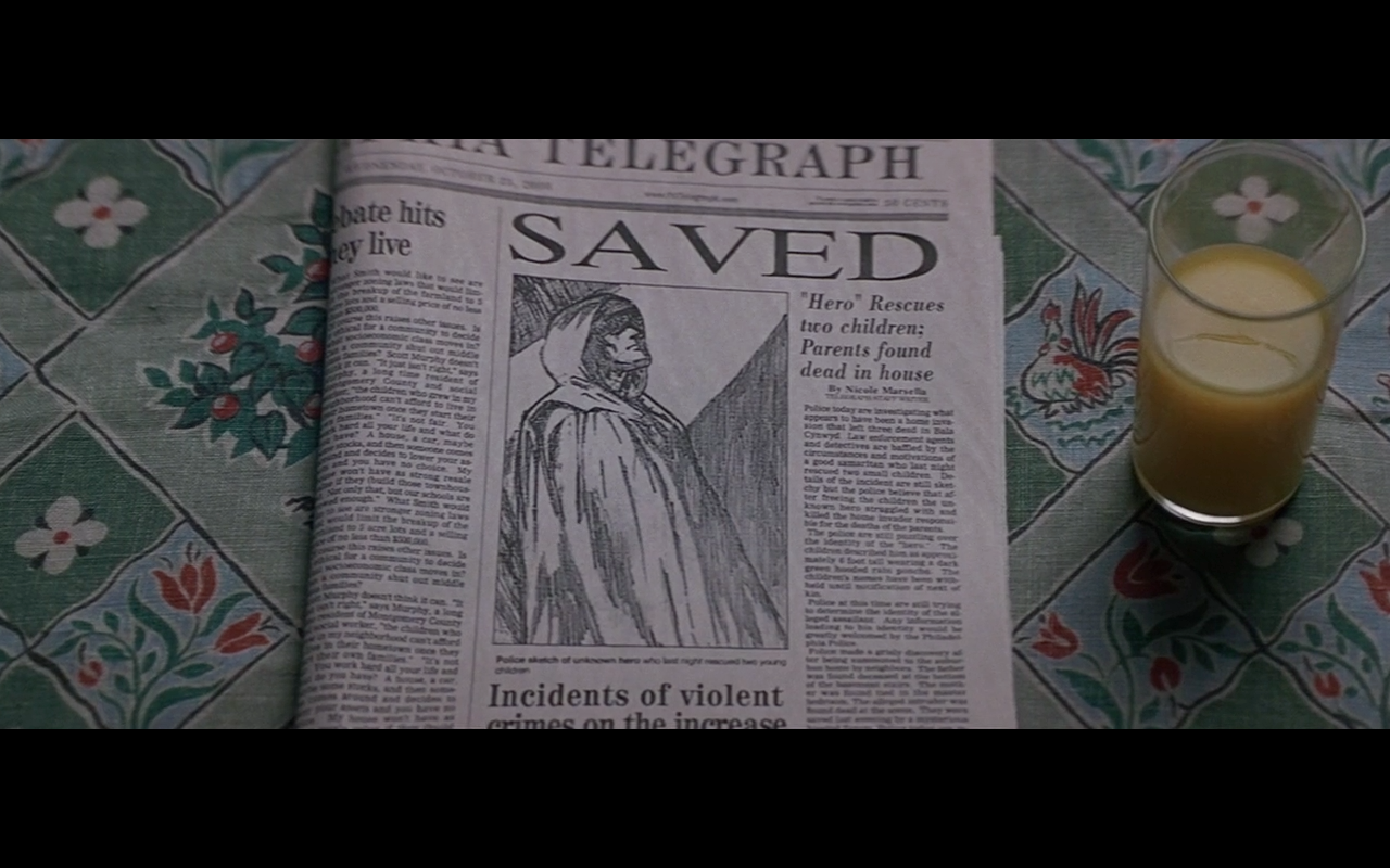
Newspaper report showing him as a mysterious hero.


Purple is a key colour again for Elijah on flash backs.


Brief 3 - Screen Print (Poster) : Comic Book Art Research


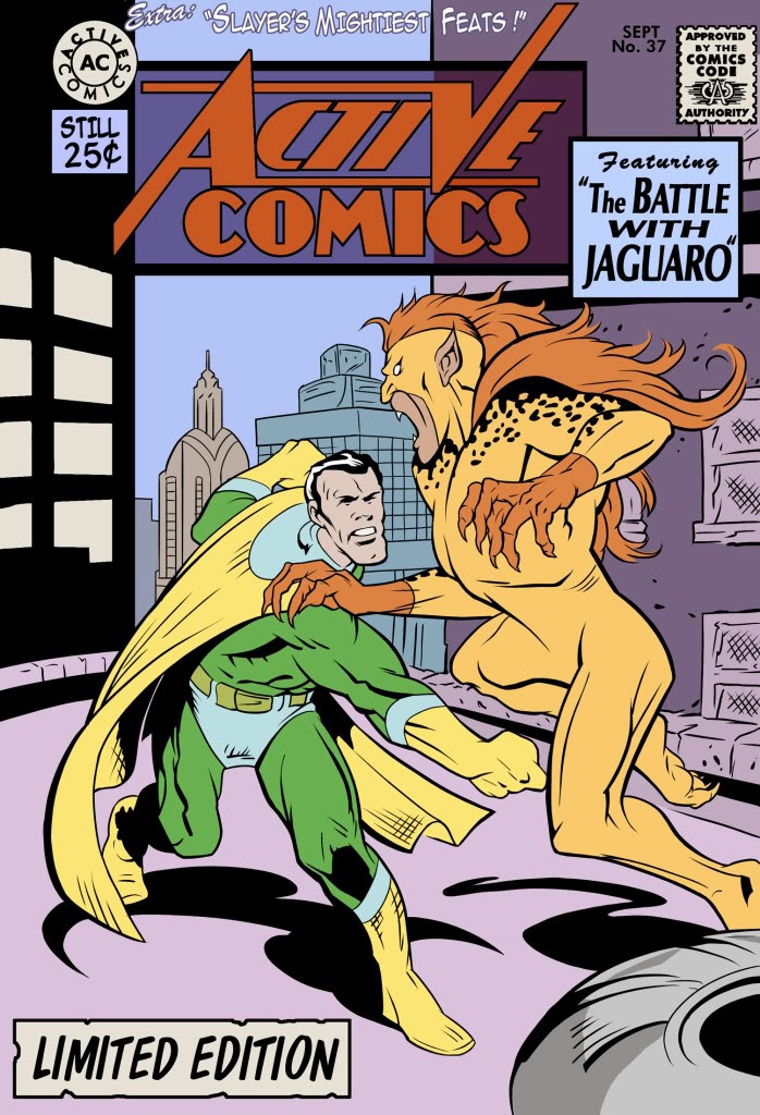
One key thing I picked up on In watching the film was Elijahs love for comic books and how they had distorted how he saw the world. They allowed him to justify what he did to find his opposite. I thought that a comic book style poster would really fit in with the theme of the film. However when I began looking into comic book art in more detail I realised that there are too many colours used including a black outline which I just couldn't do screen printing. From here I looked into comic books covers that had been screen printed and found this interesting Wolverine one. The use of colours made a good contrast and the whole piece did not need to be outlined or defined for it to be understood.


I really liked the idea of having an open comic book and having the people coming out. These two above were great examples simple screen prints but with great detail; an interesting change from saul bass. 

Tuesday, 4 March 2014

Brief 3 - Screen Print (Poster): Poster Research

Richard Amsel

Richard's work has an iconic and a very clear style to it. Most of his work uses a lot of fine detail but does not show the whole image. The white page edges are used to write information and occasionally have the image overlapping (such as the Raiders of the Lost Ark) where it makes the image feel like it is coming out into real life. The fonts he uses outside of the drawing are simple and clear; They are bold which catches your attention to the important information. Where as the fonts/titles mixed within the work are bolder and aren't a set font, but tend to be hand rendered to fit with the work but also so the letters overlap to create more layers.


Bill Gold

Bill Gold's posters work with simple colours and imagery. The text stands out to me on the posters, he hasn't tried to make it smaller or hide it. Through the text he gives you a clue to what the film is about. His style of the poster reflects the mood of the film; for example the clockwork orange poster looks menacing as well as slightly strange, mysterious and creepy. This reflects the film without giving too much away.


I like the detail and colouring on the My Fair Lady poster, however since I only have two colours to work with this bright colour idea is out of bounds however I can look into intricate styles of illustration.


Saul Bass
Saul Bass' work is one of my favourites and definitely one of the most appropriate for this brief as we are having to screen print the posters. He works with only one or two colours plus stock but the affects he produces really show that it is about the idea behind the work. 
He works with the outlines of objects which make it iconic along with his hand rendered style type not following or sitting on the line.


Monday, 3 March 2014

Brief 3 - Screen Print (Poster): Brief

Brief

Design and produce a two colour screen print for your given Bruce Willis movie, the final prints will be part of a Level 04/05 movie poster exhibition and uploaded to the AMP website. Your design must work at a minimum scale of A4.


The print must use only two colours plus stock.
Background / Considerations


Think visually, explore both literal and lateral responses. Explore working with text and image, both combined and separately.


Explore the work of amongst others:


Richard Amsel

Bill Gold

All City Media

Olly Moss

Heinz Schulz-Neudamm

Reynold Brown

Saul Bass

Drew Stuzan

http://www.alternativemovieposters.com/


Mandatory Requirements 

Portrait A4 stock

Two Colour Screen Print

Based on your given Bruce Willis movie.

Deliverables

Final screen printed A4 poster.

A range of possible resolutions.

Minimum of 3 digital positives.

Design boards/sheets which document your research, process and design decisions.