Saturday 30 November 2013

Brief 1 - Frame (Photoshop): Interim Crit

At todays interim crit I asked the following questions:

  • Would the photography idea overcrowd the frame?
  • Does the purely typographic piece work? Is it too illustrator-y?
  • What type faces would be appropriate?
  • Any other feedback?


Some pieces of feedback were really useful, when considered altogether then it solves certain problems. For example the first question people said:

"I think some of the photographs could become overcrowded if it is a general landscape. Stick to processing on a specific object"  

"use minimal photography and black and white"

"if it does feel too much then you can always change the opacity or desaturate the image until its not overpowering"

"photography could be fun, the ones focusing on perception would be interesting then you could experiment with different filters/scanning techniques"

These were the 4 pieces of feed back which I feel I can develop on. If imagery is chosen then it will be focusing on objects or close up framing, perhaps so you have to question what it is. The photos should be in black and white and the opacity and saturation can be played around with.

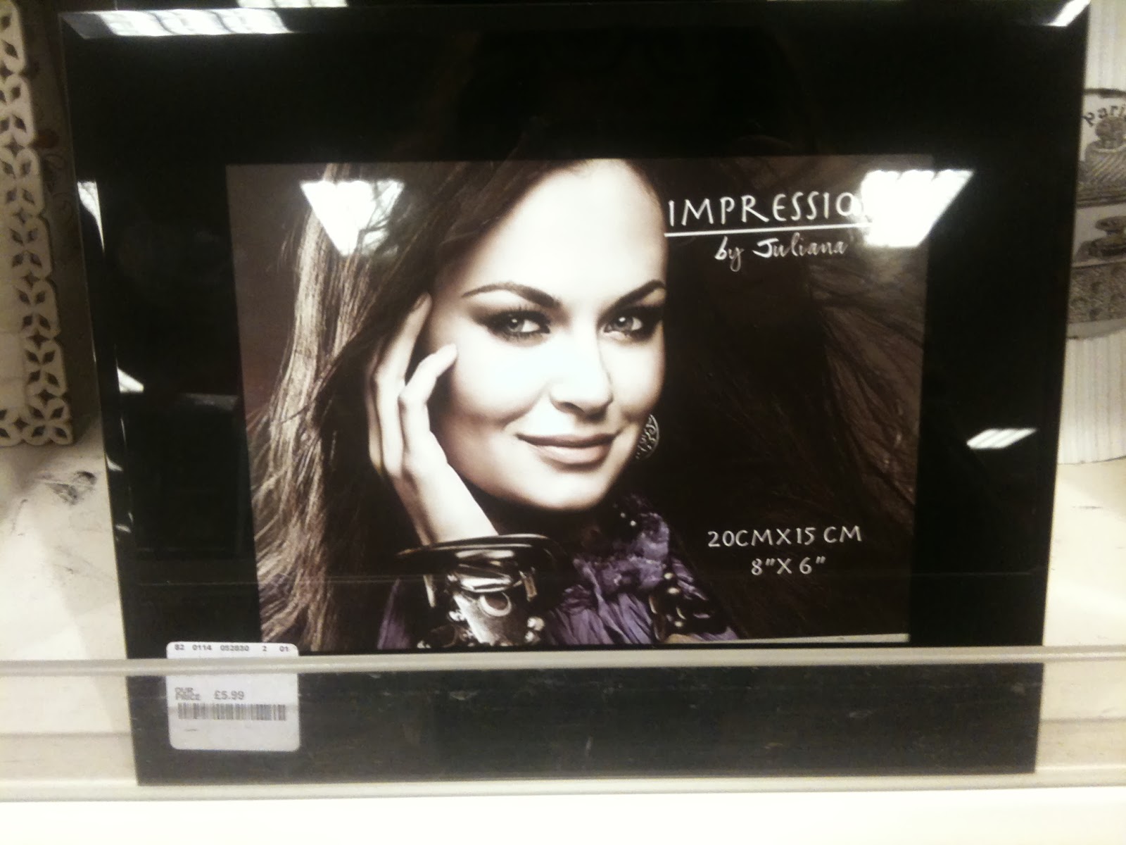
When I first thought of this idea I wasn't to sure how it would pan out but after the crit there seems to be a good response to it. One piece of feed back stated it was generic and obvious but I disagree as in my research I didn't come across any pieces of design that were already existing frames.

For the second question I received equally good feedback:

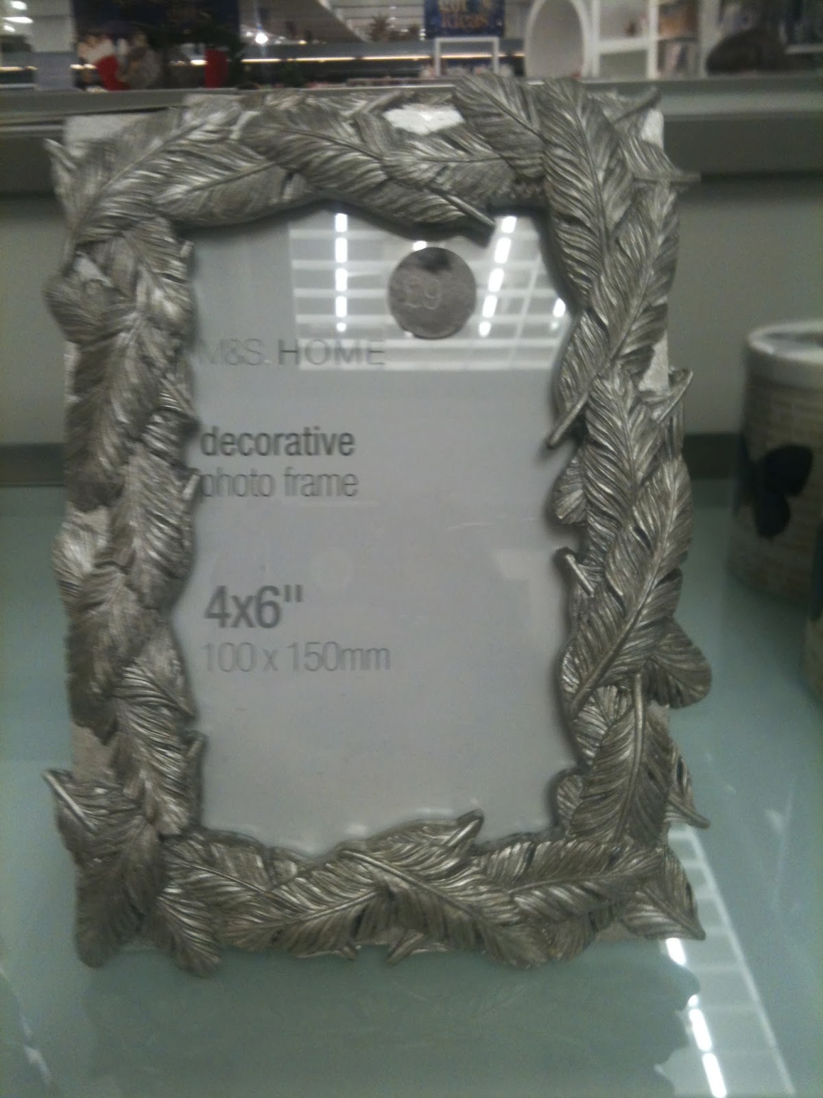
"I think it is the strongest idea - clear and simple. The sans serif typeface would work well in contrast with Clas Ohlson or Ikea frame"

"Need to use image but I think you will be able to combine some of the type with image"

"Strongest concept, however need to include image - cut type out of photograph - this may work effectively - interesting way of including image"

"The type only examples are my favourite of these designs. I like the idea of layering numbers. This could give the opportunity for lots of photoshop manipulation"

If I was to continue with this idea I will definitely look into branding and the shops in which the design would be appropriate. My main problem with this idea is that it doesn't really fit with the brief, it would be better suited to illustrator rather than photoshop, unless like some of the feedback stated, I combine image into the text. This is something I will look into, perhaps by taking photos of the first idea I could then merge the ideas together.


The third question was perhaps not specific enough as I feel I got an answer for the frame and text idea but not for the leaves. The main thing that came from this question was that anything gothic/ sans serif would work well. However one person did write that if I was to run with the leaves idea it would need to be a natural and simple font.

Finding an appropriate typeface is the thing I find hardest. It is a very fine like between looking right and looking awful. There are certain typefaces that suit certain things but it is just about finding the correct one. For whatever idea I choose to progress I will look into appropriate typefaces.


When asked "any other feedback?" I received some interesting responses:

"I think the type and natural framing ideas would work effectively combined. Having the type in the mid ground of the image with the natural framing obscuring some of it maybe" 

- this would definitely be a good way to combine image and text and be able to use photoshop to all its capabilities.

"Great variety go outcomes, keep experimenting with processes and combining elements from each to create a strong overall design" 

one person just wrote "leaves?"  not too sure what is meant by this. This is a good example of how this method of critique doesn't always work because you can question what someone means.

"love the leaves and watercolour images. Could you experiment with type within this? e.g. inside the stems or just in the running colour?"

Although the crit has been useful in getting feedback on the ideas, the question "which idea would work best?" should have been asked because at the moment it is hard to choose a route to go down. Im currently torn because the image idea may be viewed as over done, the text idea doesn't call for a great use of photoshop skills and the leaf idea could be used in photoshop but isn't a photo so doesn't fit well within the brief.If I were to just take photos of leaves the natural rustic feel that has been created by watercolour would be lost.

The next logical steps would be to take photos of natural frames on the camera induction but bearing in mind the feedback I got about the cameras. Then to play around with this in photoshop with text or even merging two of the ideas together.

Thursday 28 November 2013

Photoshop Induction

Photoshop uses pixels to create a piece of work. These are essentially small squares of colour. If they are blown up too large then the image looks blurry  this is called pixilation  The resolution is how many pixels are in a given area. Different size resolutions are used for different things. For example 72 dpi for screens or online work, 300 is used for print. 

Even though the image is made up of squares they blend together and the quality of the photo blends well. You need a higher resolution because it is closer to your eyes so the dots are smaller so you see the whole image. On the other hand with a bill board or a poster that is hung down the side of the building can be a lot lower resolution because people have to stand further away to view the full image. 


Optical mixing is taking two colours and making a new colour. You couldn't mix two pigments together but by placing them very finely together your eyes begin to read them as one colour. It is quite like flicking yellow paint onto a piece of paper and then flicking red over the top. Although both colours remain separate then your eyes merge them together.


Theres a link between the amount of pixels and the size of the file. Maximum pixels you can have in one photoshop image is 300,000 x 300,000! 

If you are working on a web document then if you go higher than 72dpi then the images will take longer to load because the pixels will be too big for the screen. When you create a website you pay for pixel space used. 

Meta data is extra information which is hidden in the file. Depending on the camera it will tell you the settings. 

Image > Image Size. Resample Image off will just redistribute information it won't delete anything or add anything. If an image is 72 dpi but the width:height is 203.2:135.47  then to take it up to 300 for printing then the width and height would be pulled in as the pixels stay close together. Because your not deleting any pixels it will shrink the image size as they pull closer together. when the resolution is changed to 300 the size is altered to 48.77:32.51. 

On the bottom left the "Doc:" if right clicked on then the size and resolution appears.

Colour:

RGB (red green blue) used for screen, it deals with light

CMYK (cyan magenta yellow key) used for print 

even if your working to print you use RGB because some filters aren't available for CMYK because they are designed to work for RGB. In the final steps of creating work then  you save the RGB one as a working document, make a duplicate in CMYK to print.

Gamuts is the complete range of visible colour  
As you can see there is a difference in the colour range between RGB and CMYK.
What you can reproduce with CMYK is a lot less than RGB.


The colour box with with exclamation mark in a triangle is showing that this colour could not be printed exactly as it is out of the gamut range. However if you right click on it it moves the circle to a colour which is similar and able to print. The small cube underneath means it is a web safe colour, a similar thing to before where if you click on it it will move it to the closest  web safe colour.


Hex code is shown at the bottom and highlighted. This is for web safe colours so that they can be used online.  The number correlates online or can be put into other software to get exactly the same colour.

Wednesday 27 November 2013

Brief 1 - Frame (Photoshop): Artist Research

For the 3rd idea I've began looking into using numbers to form an image or piece of design that could intrigue the audience. It could be something different from the bog standard photo of a random family. Roger Fawcett-Tang is a designer who is interested in numbers when it comes to graphics. It is very hard to find a large selection of his work but the work that inspires him and he uses in his books has been interesting and definitely sparked ideas.

This is an interesting idea where not all the numbers are visible or even legible but the negative space shows what number or the start of the number is. This really shows how we use the negative space to determine what  glyph something is, this could easily be viewed as a black pattern (and when you tilt your head to the left that is all it looks like) but our brain automatically makes out the numbers.

A simple piece but the strong contrast in colour is attractive. However this would  not work in a photo frame as it would completely distract from the frame itself. The attractive thing about this piece which could be taken on to a photo frame is how the text is laid out around the edge so that it almost frames the page. This doesn't normally work but there is something about this piece which fits.

A very different calendar design where the months and dates are simple information in columns. But the attractive centre of attention '2009' is made by simply lowering the opacity and layering the numbers. This creates a shape which seems abstract and like a blob of colour from a distance but up close it makes sense. This would draw people in, make them move closer so they can understand it.

This is perhaps the best of the number pieces. It is simple yet gets the point across perfectly. Shifting fluently with the gears in the car is represented by the numbers fluently jointing together, there are not ridges or breaks  and it is not more one number than the other they both have this equal ground. 

This is a simple concept but one that is hard to get right. The type has to be in the right place so that it is not ignored and the numbers and glyphs may look random but need to be placed carefully. With this type of work there is a fine line between it working and it going horribly wrong. The eye is automatically attracted to the 87.4  because of its large size and central position. Your eye then moves and focuses on the text which looks like it would have fitted onto the number. Almost like 2 pieces of a puzzle. 

This 5 works well in a grid format as it keeps it neat and  blocky. This method faces some dilemmas, for example where the five has negative space or cut outs. These have been represented by just a line where as most numbers are recognised by the large areas of negative space. However this piece of design does still work but maybe this is because of the white grid dots, if they were not there then this 5 would look dreadful.

Tuesday 26 November 2013

Brief 1 - Frame (Photoshop): Second Idea

The second idea for this project is looking into having natural frames. Using black and white photos of things found around the city which are a natural frame either with the corner of doors or windows. This could really show how life is framed or that we use frames to see things - our eye naturally frames things to make sense of it. If I went down the idea of using windows and doors, it could have a philosophical meaning behind it, how windows and doors are a small view into something else, in the sense of the photo frame it could be a view into the past looking back on memories. This is a deep tangent for the brief in hand but the concept of using naturally found frames could work really well because it would be an intriguing image that would not distract from the frame but compliment it. A plain silver frame with a range of photos depending on frame size would complete a set and be different whilst all working together.

Brief 1 - Frame (Photoshop) : Artist Research

 After doing Primary research one thing that really stuck out to me was the idea of using water colour to create leaves. Although this may seem not relevant when it comes to buying a frame, if it fits in with the image of the frame - maybe a natural frame or one created out of sticks and twigs, then it would work well. This idea of creating a frame is something that I could look into into an extension of this project to compliment the design of the backing.

I wanted to follow this idea further and look at artists who use water colour. This way I can get an idea of what colours would work well and how the medium can be used to create certain affects.

This watercolour painting by Julia Loken is incredible in my opinion the detail that she has gone into on the leaves especially the one on the bottom right, is truly magnificent. I love the idea of using the colour palette and leaves to compliment and old bark frame, it gives the idea of real authenticity and feeds so well into the natural theme. The opacity of the leaves means that when they overlap they produce interesting layers and colours.

I will play around with the idea of a natural background and take it to crit on friday to get feedback about which method will be best to persue or whether the idea as a whole is feasible. There are a few methods I would like to explore when creating a natural background and those are:

  1. Using paint such as watercolour to create different layers of leaves.
  2. Using actual leaves in mono printing so that the texture is captured.
  3. Creating a stamp and using it to print multiple times - this could work well for multiple pieces of work so each size has different size leaves in a different composition.
  4. Overlapping and collaging real leaves over a light box so that certain areas stay darker and some are lighter, and then photographing this.


The work above is created by Elizabeth Blackladder. Although I don't think her work is worth the price it is given the innocence and simplicity to it has a charming feature. None of her work uses an outline which brings it to a more natural soft edge.

The thing I like about the pieces is how she lays out the leaf. I will experiment with this idea but strip it down so there is only 3 or 4 in a line horizontally or perhaps just one vertically to fill the centre of the frame. The simplicity of the artwork would really compliment a natural frame.

The two types of frame I have in mind for creating this piece of work would be a hand made wooden bark frame or one where it is solid wood. You can see the grooves and natural marks of the wood. This would compliment the back slip best as it would be in the same tonal range and natural theme. However perhaps a silver frame would make the artwork stick out but then this may not sell the frame but rather the piece of work.


Brief 1 - Frame (Photoshop): Primary Research

The first logical step after being given this brief was to go out and do some primary research by taking photos of photo frames. To get a good range of different prices and styles different shops were visited. The main two were T.K.Maxx and M&S. Other cheaper shops and value ranges will be explored later to compare the styles. 

Very minimal writing in an almost hand rendered font makes the image more personal. However the image seems some what irrelevant and highly edited. Perhaps it is to give an idea of what type of photo you would put in the frame. But in my opinion it takes away from what you are actually buying - the frame.
The image they have chosen may be equally irrelevant but the effect of sepia matches the colour of the frame and compliments it well. However I wouldn't say the frame  is overly up market. The image would be better suited in a high market silver frame rather than one that looks like it has been made out of popsicle sticks.

The baby blue colour of the shiny frame is complimented by the image of the child suggesting to the audience it would be the perfect frame for a newborn present or even to frame your best photos of your children.


This seems to be one of the worst overall designs by far. The frame is a tacky silver with wavy lines which hold no real purpose and it is placed with an even worse photo of a couple dancing which was poorly cut out and some varying line weights of purple and grey intwined working up the frame. This is a great example of bad design and really shows this area as a part of design that needs to be improved.

The inside slip of this frame works great with the frame its been placed with. The combination of script and roman text says that it is vintage but elegant and stripped back to the basics. The images that frame it have been placed a bit jumbled but the style in which they have been created works well. They are not straight black on white rather a palette of browns which makes it smoother on the eye and is the perfect combination of text and image.

This textured frame is matched with a selection of leaf prints which look like they have almost been done individually from each leaf. This water colour affect would work great with this more natural frame as it compliments the frame it is in. It looks almost like the frame is made to fit around the artwork and you wouldn't want to ruin it with a photo.

This seems bazar to frame a picture of a chair but by doing this they are trying to give you and insight into how the frame would look inside such a house. How well it fits in with the similar furniture, like it is part of the furniture.

This gold 'classy' frame has been matched with a vintage light gold backing pattern. It is one that is similar to an expensive wallpaper that would be found in a sophisticated boutique. However the Roman font used in this doesn't match or portray the same image. Perhaps it should be script. This pattern seems like a cop out and over done as you would see it in most shops that sell frames.
Again with this design the texture of the frame has been continued into the design of the backing. This works well because it doesn't distract from the frame by being overly good or even being overly bad. It just blends into the background. It isn't an overly amazing piece of design but then again, for its purpose it could arguably be suitable.


The three M&S frames shown above have made no effort with the inside slip. They have just used a simple gothic san serif font and written the basic details. However this may be all the frames need as if they were overpacked with amazing graphics it may take away from the decorative frames.

This M&S frame was one of the rare ones to having some kind of design in it. The ornaments give the viewer an idea that the frame is belonging to this set, that it would fit perfectly with this idea. The rustic sanded down look would fit with a beach house look.


After looking at different frames it has become clear that there seem to be a few main themes that are used in the inner frame slips. Firstly it is the irrelevant image of a family or group of people, perhaps to suggest what you should put in the frame but this seems self explanatory. The other one is furniture or scenery, looking at where you would see the frame or maybe where it has been inspired by. Third and possibly the one with the most potential is taking the idea of the frame and looking at its style and creating a design around this. The fourth is just to simply leave it plain with the basic information. This to me seems like a design which would be used in cheap value frames where they have no interest in how the frame is presented, not somewhere like M&S.


Brief 1 - Frame (Photoshop): Brief


Brief


Re-imagine the backing paper for a photo frame. This must include the dimensions of the frame. You must produce a minimum of three designs, which work as a set across three different frame sizes. Choose from the frame dimensions below:

6x4 inches - 7x5 inches - 8x6 inches

A5 - A4 - A3

Be creative with your manipulations and compositions. Consider how to engage a buyer and what needs to be communicated.

All typography and vector based images must be produced in Adobe Illustrator. Any images must be manipulated in Adobe Photoshop. The final composition must be produced in Adobe Photoshop.
Background / Considerations


Explore a range of concepts in your research and development of your own ideas. Consider the usage, functionality and display within commercial outlets when resolving this problem.

Not all your investigations should take place on the Mac. Digital image capture methods such as scanning and digital photography allow you to import media from a range of sources (photographs, photocopies, drawings, tracings, found material etc.)

Once you have imported this material how can you manipulate using the tools and capabilities of Photoshop (cropping, selecting, layering, repeating, colour changes, reversing out etc.)  

Mandatory Requirements 

In preparation for the second session you must have photographed a selection of images to work with.

The frame backing papers must exist as part of a set/series and must include the frame dimensions. 

Deliverables

A quantity of visual investigation/research.

Developmental work in sketchbooks/worksheets.

Three frame backing papers designed and mocked up in a photo frame.

Minimum of 4 design boards, presenting and discussing the following:

Research
Initial designs
Design choices (colour, format, type, layout)
Final designs


Wednesday 20 November 2013

Context of Practice - Lecture 5: Animation

Animation is derived from the latin word 'animare' which just meant "to give life to". Animation is the art of bringing drawings to life. It artificially creates a series of images to give an illusion of movement, it fools your brain into thinking the image is actually moving. This is called persistence of vision.

For years people have tried to show a story through different images which look like they progress to give a clearer picture of the story. For example the Egyptians used hieroglyphics to show there story or explain something to one another.


A development of animation machinery:

1650 - the Magic Lantern was invented by Christian Huygens (this was basically a simple projector)
1826 - the Thaumatrope was invented by John Hershal
1839 - the Phenakistoscope was invented by Plateau
1834 - the Zoetrope was invented by William Horner
1868 - the Kineograph/Flipbook was invented by Herman Casler

"Animation is not the art of drawing that more but the art of movements that are drawn"
- Norman McLaren

Some key pieces of animation in chronological order:

1902 - George Méliés: A trip to the moon. This was a famous piece of work which influenced things such as mighty boosh and some of Queens songs.

1908 - Windsor McCay: Gertie the Dinosaur. He also went on to produce the first dramatic piece of animation in 1918 about the sinking of Lusitania. It only took 7 days to get around the world!

1926 - Lottie Reiniger: The adventures of Prince Achmed

1928 is when the golden age of cartoons began. Animation had developed its own language and knew what it was doing and how to do it.

1928 - Walt Disney: Steamboat Willie. This was a key point in animation as it was the first piece to successfully sync with music. 

The skeleton dance could be classed as the first music video as he had the song composed first and then the piece of animation was his interpretation of the song.

1930 -  Max Fleischer: Dizzy Dishes was the first sighting of Betty Boop which was eventually censored. Popeye was a character which featured alongside Betty Boop but he became so popular that it became his own TV programme.

1933 - Willis O'Brien: King Kong

1936 - Toybox: Momotaro Vs Mickey Mouse. Japanese Animation was the first to use propaganda to persuade the opinions of their viewers.  

1937 - Disney: Snow White and the 7 Dwarfs. He had to remortgage his house to afford to make it.

1941 - Disney: Fantasia

Disney often used animation of a way of voicing his opinions and one piece was made to convince America to help more in the war.

1951 - UPA Gerald McBoing Boing

1952 - Norman McLaren: Neighbours,  about the stupidity of the cold war when a flower grows in the middle of their garden.

1953 - Chuck Jones: Duck Amuck. Daffy Duck talks to the animator and brings in interaction with the audience.

1954 - Halas and Batchelor: Animal Farm

1959 - Saul Bass: Anatomy of Murder. Begins to take animation into movie trailers and introductions.

1958 - 1985 = The Television Age

1963 - Stan Brakhaye: Mothlight. The first piece of direct film where he stuck moths and leaves to the film.

1963 - Osamu Tezuka: Astro Boy. The beginnings of Anime

Chuck Jones - The dot and the line: A romance in lower mathematics 

1966 = Walt Disney dies

1966 - Terry Gilliam: Monty Pythons Flying Circus.

1969 - Oliver Postgate: The Clangers (also created Bagpuss)

1982 - Gerald Scarfe - Pink Floyd, The Wall

1983 - Cosgrove Hall - Wind in the Willows

1986 - Jimmy Murakami: When the Wind Blows (also created the Snowman)

Disney: Who framed Roger Rabbit

1991 - Disney: Beauty and the Beast. The first piece of animation to use 3D. They sent all their employees to live in France for 6 months so they could get used to the area and be submerged in research

1995 - John Lasseter: Toy Story

Jamie Hewlett: Gorillaz

The lecture on Animation was interesting and showed how much stuff is actually animation. The history and development of Animation has shown a pattern and been very informative. Animation as a whole can prove useful to graphics as it is another form of solving a problem.


Thursday 14 November 2013

OUGD403 Evaluation

The first module has gone well, the work load has been intense and with constant work being set every week it was sometimes hard to keep on top of it all. However this was a great insight into how the industry is and it was nice to have work to do especially an interesting and broad range of projects. A new project being set every week meant that it was possible to briefly explore different areas and keep looking at new techniques and types of graphics.

The first project allowed a wide range of experiment with different resources and media. It was originally a challenge to make the word instrument fit around the font Garamond but it was good to have something like this to get me back into the thought process of designing. It fed nicely into the next project and this really made it feel like it was going somewhere, it also allowed me to see how I could develop my own ideas in graphic design and produce an outcome I am happy and proud with. Although there were a few flaws with my Brief 2 outcome this feels minimal compared to how far I have progressed in illustrator from originally not knowing anything. This has been the hardest and most challenging brief for me but at the same time one of the best because it made me face my illustrator fears.

The Partner project (Brief 3) has been enjoyable because it made people in the class talk when actually they may not have previously. It was a great way to make you think of a practical solution to represent someone. I found the research interesting and a good challenge to find a way of showing they key aspects of someones personality through a letterform, and then making this letterform work through a whole alphabet.

Brief 4 and 5 were my favourite, most probably because of the chosen topic. The flexibility to choose what ever story suited us made it more interesting, I chose Nuclear Power because I didn't really know anything about it but found myself being very negative towards it. The project has led me to completely change my opinion and then with this new found passion and interest in nuclear power I really wanted to create high impact posters that would throw peoples initial thoughts. This has been the most successful project and the one that I have enjoyed the most as its kept me interested and hasn't felt like I have been working.

Overall this project has allowed a nice introduction to the world of design. The tutorials on illustrator have made it less daunting and actually encouraged me to experiment with it in my spare time rather than stick to the comfort of photoshop. The mono printing inductions and digital print have shown me that there are so many possibilities when printing and creating work. Now that I am aware of these different methods I don't feel like creative ideas will be limited. I am excited to move on to other projects and take the skills I have learnt with me to progress and explore other ideas.

Context of Practice - Lecture 4: Print

Print changed the world completely! But print isn't just something pretty like an image or design. Print was a basic way of getting information out there. It is about visual text, its purely there for communication. The context of the print helps us to differentiate between different types of print, its context and purpose affects the way it is designed.

In the past there were small communities of people and all they knew was in that community. They wouldn't know anyone else existed but didn't have a need to because the context was that it was just them.

Offset = another layer and aspect to the printing process. Instead of printing directly ink could be transferred to another surface and then printed from that e.g. potato printing. Printing is a physical thing that exists - once its out there its there for anyone to read but equally when its destroyed it is gone. Print made things real. It took time to produce but was so worth it as it set facts almost in stone. If information was spread via word of mouth, much like chinese wishers, details would change or be left out. Printing completely got rid of this problem - we all knew the same thing. 

Documentation, Communication, Reproduction.

Printing started in Japan in 200BC! From here it took 300 years to get to China. 300 years shows how long it took to travel and that word of mouth was slow, it also shows how disjointed the world was. When printing started in China they used cloth to print onto as it was durable and easy to carry in the sense that it was less likely to break. In 1400BC printing began in Europe.

Religion was a good way to distribute information - It bought people together with a common interest.

When the Gutenburg press was developed in 1450's it changed type all together as it allowed for movable mechanical type. It allowed anyone to print and for mass copies to be made. THere was no restrictions and you could write anything as no-one would say what was right and wrong. Literacy from here really developed because it meant more people could have a copy of something so they had reason to learn how to read. The Gutenburg press allowed them to print 3,600 pages a day compared to the 20 pages previously! It bought around a scientific revolution as it meant we could write down facts and spread them so everyone knew. Print also changed language with the way it was formalised. It reinforced the spoken language.

Marshall McLuhan - the medium is the message. 1911 - 1980. He predicted the World Wide Web 30 year it existed and he argued that print developed our cognitive skills. 

It bought around Individualism as people could express how they felt. Democracy as people could be democratic and have their say, their own freedom. Capitalism as it separated those who could read and write from those who could not creating a class split.

Lino Type = 1960 -1970. Everything changed, it allowed printing and everything that came with it to go down in size.

Etching = It allowed people to see and drawing and understand whats going on. Oldest examples are religious themes.

Renasiance = 1870's. Having 'pretty' artwork and design for the sake of it. It served no physical purpose but would show wealth and design.


Sunday 10 November 2013

Context of Practice: Typography Analysis

The typeface 'times new roman' was invented in 1929 when The times newspaper hired Stanley Morison to design them a typeface. He worked for the font foundry monotype. At the time Monotype foundry was rivals with Linotype, this is significant because The Times used Linotypes typesetting machines so this meant that Monotype had to give over the license to Linotype. Lino type adjusted the name to Times Roman and released it, although it is essentially the same typeface. 

The main use of Times New Roman is for the newspaper however because of its popularity it is widely used online and also as a default typeface on software such as Microsoft Word. It became popular quickly as it was one of the only types that was available in each format.  It fits into the Roman typeface category as its serifs lead the readers eye onto the next letter and help to make each letter easily recognisable for quicker reading. It is seen as a default type and is never really questioned, people take more of an interest in the story and content rather than the type itself, in fact the typeface doesn't even come into question. "There is nothing simple or dull in achieving the transparent page". It is quite a skill to create a typeface that is 'transparent' and rarely thought into by the readers.

Although the typeface is famous and one of the most used connotatively in any other context than the one it is intended for it appears to be cheap and an easy option. Whenever you see a business card or poster where the type is in Times New Roman it makes you think that it has been rushed. That the designer couldn't be bothered to choose an appropriate typeface so rather went with the default. 

"Typography is not a self-expression within predetermined aesthetics, but that it is conditioned by the message it visualises." This stands true to Times New Roman, it wasn't designed with an aesthetic idea in mind rather it aimed to create an appropriate type for newspapers and because of the boxes it had to tick to be appropriate it became conditioned by them. For example the type face in all formats is thinner  but longer vertically so that more text can fit into a line - this is useful for newspaper prints.

"A public speaker is more audible in that sense when he bellows. But a good speaking voice is one that is inaudible as a voice." A  legible font is different to one that is readable. Each letter may be legible but when put together they may be unreadable. Times New Roman is readable as a font the letters flow nicely and don't 'bellow' at you but rather work as a normal 'voice'.


Thursday 7 November 2013

Brief 5 - Message Delivery: Interim Crit

The interim crit yesterday was divided into two groups the first group would layout their work and then leave the room whilst the second group went around and gave anonymous feedback. This was an interesting way of doing it because it meant you were looking at the work soley by itself and it had to speak to itself. It meant that you could see if the message you were trying to portray became clear to an unknowing audience or not. This allows for tweaks to be made before the final crit on friday.

Much of the feedback received was of use and will be considered when making the next set of changes. Below are some points that were highlighted:


  • "Are you for or against nuclear power? make this more clear"
  • "good quote - try different layouts and type faces"
  • "consider kerning and leading"
  • "one plug would be more concise and hard-hitting"
  • "maybe work with the cloud idea but instead of a line around the cloud, use the writing to make a cloud shape"
  • "find a bold typeface that doesn't detract"
  • "experiment with international plugs"
  • "you could think statistically?  - research stats and facts on nuclear energy"
  • "I like the text idea. it is a shocking fact and really reassures people about waste -- focus on waste more"
  • "good statistics to shock audience, effective layout of text and image design, but the text disappears slightly"
  • "best way to show tonnes of information across is in the form of info graphics - simple layouts dependant on perfect positioning"
From here other ideas will be explored but the key issues will be taken into consideration when making the posters.

Wednesday 6 November 2013

Context of Practice: Typography

Technology had a huge impact on typography. The Gutenburg press in 1450's which allowed moveable text and mass production. Including the spread of knowledge, It meant that word and knowledge became widely available for the masses. It kick started the enlightenment from the dark ages.

The structure of language affects how we think as typography is a visual language. Type has become an image. There are 5 different type classifications:

BLACK LETTER
-1400's 
- from Gutenburg press
- old style e.g. Goudy 
- Humanist

TRANSITIONAL
- Trying to make it more readable
- e.g. Baskerville
- Grutesk

MODERN
- Bodoni/ Didot
- mix of contrast in line weights

SWISS MODERN
- 1957 Helvetica

CONTEMPORARY 

Context of Practice: Illustration

Illustration is strategic image making, used within the context of visual communication to convey meaning or concept. 

CONTEXT + CONCEPT + IMAGE = ILLUSTRATION

For example:

BOX OF CERAL + A HAPPY CHARACTER ENJOYING THE CERAL + TIGER = FROSTIES

We are intuitively hard wired to respond to an image. The way the image is portrayed and what materials and methods are used really makes a difference to the illustrative outcome. For example Lance Wyman create animal icons which uses just black and white to show and direct people around a zoo. This is very different illustration, perhaps even classed as design, compared to Jillian Tamaki's illustrations of animals which were used to feature in a magazine about endangered animals. With her work you can see the expression on the animals faces, the show of fear and sadness.


Illustration shows authenticity, craft and consistency. The pieces work together and reflect the brand or book that they are illustrating. 


Tuesday 5 November 2013

Brief 4 - Message Delivery/ Research: FACTS

This post will look at the facts that will be used or could be useful when creating info graphics or the text and image combined piece. Its been interesting reading different fact sources because the way they word the fact really affects the connotations it implies. For example on site wrote "Nuclear energy comes from uranium, a nonrenewable resource that must be mined." which is written in such a negative light, where as another site could have written "nuclear energy is sourced from uranium which is in ample supply and the quantity used means it is almost infinite" Both say the same things but in different ways to support their argument. Because the posters will aim to open people's eyes to the nuclear power options the facts below will focus on a positive light.
  • Nuclear power emits no carbon dioxide.
  • World wide nuclear energy avoids on average 2.5 billion metric tonnes of carbon dioxide per year.
  • nuclear power facilities can produce energy at a 91% efficiency rate 24/7  whilst still having lowest emissions.
  • There are now 430 nuclear power plants in 31 countries.
  • They provide 13.5% of the worlds electricity.
  • All you see at the top of the cooling tower is steam.
  • 6,702 million metric tonnes of CO2 equivalent was released into the atmosphere in 2011.
  • 1 in 5 households and business in the U.S. are electrically powered by nuclear energy.
  • A nuclear power plant must shut down every 18-24 months to remove its used uranium fuel, or radioactive waste.
  • The peace symbol was initially an anti-nuclear weapons symbol.
  • Nuclear power plants are more efficient than coal or other fossil fuels and renewable energy.