Showing posts with label Research. Show all posts

Wednesday, 5 February 2014

Brief 1 - Design is About Doing: Elbow Artwork

I decided that since I was designing for elbow it would be good to see what their current album covers are like so that I can get an idea of what they work with.


This is their album cover. It appears to be painted but has no clear meaning. To me it looks like a rubix cube but it is all one colour which suggests colour has gone but the puzzle has remained. There are many meanings that could be extracted from the album.


I quite liked these two stone statues which suggests they are stuck, having no mouths could also imply they couldn't speak out. The fact that they are placed central with a simple coloured background means they are centre of attention. 


THese were two variations of the 'Grounds for Divorce" cover. It fits in with the same style as the "seldom seen kid" album.


Brief 1 - Design is About Doing: Storm Thorgerson

Storm Thorgerson is perhaps one of the most well known designers for records. His style incorporates different aspects which would not be seen together or are impossible to create surrealist art work but through the medium of photography rather than paint; like traditional surrealism art.


This piece shows the distress of part of him missing. An idea similar to this could work well for the Elbow piece.


I love the use of big sheets of cloth. If it were practical it would be cool to do this but then shape the cloth so that a the outline makes the outline of a face.


A classic and perhaps one of the most famous pieces. Using a simple idea this piece doesn't need any text for people to know what the album is.


The muse albums are probably the earliest albums I remember listening to and being fascinated by their artwork. I clearly rememeber thinking how different they were from other albums are their surreality meant I found myself staring at them for ages.


I love the use of combining two images together to create a new surreal one. Being able to see the sea level makes it more interesting like you are seeing two parts of a scene.


Wednesday, 8 January 2014

Brief 3 - Page Layout: Research

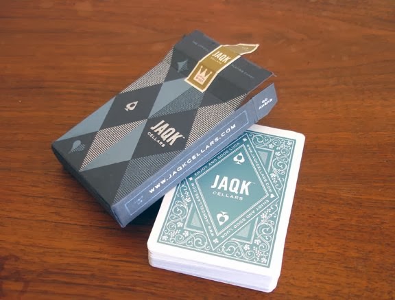
I decided to research a bit more into card backings so that I could get an idea on how they were designed and to see what colours are associated with cards and also styles.
The thing I loved about these cards was how elegant they look. The royal blue works really well with the royalty on the cards and the gold is a nice extra touch which makes the cards feel more expensive. This is a colour scheme I will explore especially if I can print gold, however this may have to be screen printed and issues could arise with fine detailing.

I really like the simple font used on these cards. The gothic san serif fits in so well with the joker illustration. It makes the cards look modern and the white negative space plays into the minimalistic approach.


I just absolutely love the detailing and patterns on these placards. I think the intricate lines make the cards more interesting and special. This feels so much better than the usual bog standard red and green - something I would very much like to get away from.


The dark grungy style of this card almost feels tattoo-y like cards a biker gang would play with. The text and use of colours work really well together and the illustrations have a lot of effort put into them to make them look this good. 

I am still unsure on layout but the colours and style of text on these cards should give me a good basis to work from when it comes to designing my booklet.

Monday, 9 December 2013

Brief 2 - Research: Chosen Word

The word I was given was 'cards'. The first thing I did was pass a piece of paper around the table, everyone wrote the first thing that came to their mind with the word card. This was zoo useful because it suggested and gave me ideas that I had not previously thought of. Below is the list:


  • playing cards
  • christmas cards
  • poker
  • poems and hand written love letters
  • Las Vagas
  • chips (gambling)
  • suits (hearts, aces, etc)
  • different papers and weights
  • poke'mon
  • card games
  • play your cards right
  • business cards
  • credit cards
  • record your own message cards
  • psychic cards - reading the future
I don't know why but I hadn't even considered credit or business cards which just seem obvious now! Business cards would be a good project because it would relate well to graphic design there is a lot of possible things to research which would benefit me. However I have no real interest in business cards. The one that really stands out and interests me is playing cards. 

I love card games and this would also have a lot of different sections I could research such as the history of cards, why were they invented? why the colours? and why the Jack, Queen and King? Another avenue I can research is different types of games etc...

Jumping the gun but the first idea that comes to mind is that I could create a book about different card games with the difficulty level and such displayed on it. Perhaps instead of a book I could create them on different pieces of card so that each one has a different card game on it. However I think this will feed into the next project more than this one. For this project I will research into cards and everything about them.

Wednesday, 27 November 2013

Brief 1 - Frame (Photoshop): Artist Research

For the 3rd idea I've began looking into using numbers to form an image or piece of design that could intrigue the audience. It could be something different from the bog standard photo of a random family. Roger Fawcett-Tang is a designer who is interested in numbers when it comes to graphics. It is very hard to find a large selection of his work but the work that inspires him and he uses in his books has been interesting and definitely sparked ideas.

This is an interesting idea where not all the numbers are visible or even legible but the negative space shows what number or the start of the number is. This really shows how we use the negative space to determine what  glyph something is, this could easily be viewed as a black pattern (and when you tilt your head to the left that is all it looks like) but our brain automatically makes out the numbers.

A simple piece but the strong contrast in colour is attractive. However this would  not work in a photo frame as it would completely distract from the frame itself. The attractive thing about this piece which could be taken on to a photo frame is how the text is laid out around the edge so that it almost frames the page. This doesn't normally work but there is something about this piece which fits.

A very different calendar design where the months and dates are simple information in columns. But the attractive centre of attention '2009' is made by simply lowering the opacity and layering the numbers. This creates a shape which seems abstract and like a blob of colour from a distance but up close it makes sense. This would draw people in, make them move closer so they can understand it.

This is perhaps the best of the number pieces. It is simple yet gets the point across perfectly. Shifting fluently with the gears in the car is represented by the numbers fluently jointing together, there are not ridges or breaks  and it is not more one number than the other they both have this equal ground. 

This is a simple concept but one that is hard to get right. The type has to be in the right place so that it is not ignored and the numbers and glyphs may look random but need to be placed carefully. With this type of work there is a fine line between it working and it going horribly wrong. The eye is automatically attracted to the 87.4  because of its large size and central position. Your eye then moves and focuses on the text which looks like it would have fitted onto the number. Almost like 2 pieces of a puzzle. 

This 5 works well in a grid format as it keeps it neat and  blocky. This method faces some dilemmas, for example where the five has negative space or cut outs. These have been represented by just a line where as most numbers are recognised by the large areas of negative space. However this piece of design does still work but maybe this is because of the white grid dots, if they were not there then this 5 would look dreadful.

Tuesday, 26 November 2013

Brief 1 - Frame (Photoshop) : Artist Research

 After doing Primary research one thing that really stuck out to me was the idea of using water colour to create leaves. Although this may seem not relevant when it comes to buying a frame, if it fits in with the image of the frame - maybe a natural frame or one created out of sticks and twigs, then it would work well. This idea of creating a frame is something that I could look into into an extension of this project to compliment the design of the backing.

I wanted to follow this idea further and look at artists who use water colour. This way I can get an idea of what colours would work well and how the medium can be used to create certain affects.

This watercolour painting by Julia Loken is incredible in my opinion the detail that she has gone into on the leaves especially the one on the bottom right, is truly magnificent. I love the idea of using the colour palette and leaves to compliment and old bark frame, it gives the idea of real authenticity and feeds so well into the natural theme. The opacity of the leaves means that when they overlap they produce interesting layers and colours.

I will play around with the idea of a natural background and take it to crit on friday to get feedback about which method will be best to persue or whether the idea as a whole is feasible. There are a few methods I would like to explore when creating a natural background and those are:

  1. Using paint such as watercolour to create different layers of leaves.
  2. Using actual leaves in mono printing so that the texture is captured.
  3. Creating a stamp and using it to print multiple times - this could work well for multiple pieces of work so each size has different size leaves in a different composition.
  4. Overlapping and collaging real leaves over a light box so that certain areas stay darker and some are lighter, and then photographing this.


The work above is created by Elizabeth Blackladder. Although I don't think her work is worth the price it is given the innocence and simplicity to it has a charming feature. None of her work uses an outline which brings it to a more natural soft edge.

The thing I like about the pieces is how she lays out the leaf. I will experiment with this idea but strip it down so there is only 3 or 4 in a line horizontally or perhaps just one vertically to fill the centre of the frame. The simplicity of the artwork would really compliment a natural frame.

The two types of frame I have in mind for creating this piece of work would be a hand made wooden bark frame or one where it is solid wood. You can see the grooves and natural marks of the wood. This would compliment the back slip best as it would be in the same tonal range and natural theme. However perhaps a silver frame would make the artwork stick out but then this may not sell the frame but rather the piece of work.


Wednesday, 30 October 2013

Brief 4 and 5 - Message Delivery: Chernobyl Photograph

Many photos were taken of Chernobyl and the damaging after affects that came with it. Some truly distressing images are shown of not only the disaster but the affect of children born with radiation poisoning.

No use of legs - they rely on their arms to pull them around.

Deformed toddler with the brain membrane at the back of his head, almost looking like another head.

hydroencephalitis (inflammation of the brain)

These photos may work well with Brief 5 because they are powerful enough by themselves. They don't need text to explain them, the fact they are in a grey scale makes it more grim and powerful as an image. It will be interesting to look into campaigns and see how they have used simple images to raise awareness.

Monday, 28 October 2013

Brief 4 - Message Delivery: Is Nuclear Power just a taboo?


There is a lot of negative press towards Nuclear power, even the idea being suggested as an alternative tends to raise a fair few glares and shaking heads. However is it as bad as people seem to think? What are the real figures and facts behind the use of nuclear power? As a country we need to think of other alternatives for energy understanding that one-day coal will run out and renewable energy may not be substantial enough.

After Chernobyl and Fukushima people are very hesitant and hostile towards the idea of nuclear power. However it can be argued that the proper procedures were not in place when both disaster happened, and although it was a tragic accident, it was perhaps easily avoided If correct precautions were followed.

People worry about radiation from nuclear plants, which is a fair concern, however they seem to overlook the fact that we are subjected to radiation everyday from natural processes, it is not something that is escapable. For example people who live near a large source of granite such as Cornwall have a higher exposer compared to others. Daily checks expose people to a high amount of radiation but this does not seem to be on the same level as nuclear radiation to people. For example x-rays expose you to higher doses of radiation than nuclear radiation.

There are very strict and rigorous plans in place involving both the safety of and in the plant and also in the case of an accident. After Fukushima there were restrictions placed in Tokyo about drinking the radioactive water, and as scary as this sounds they failed to mention that the radiation dose received by drinking the water in Tokyo would have been less than moving to Cornwall and living there for a year.

It is thought that over 100,000 deaths each year is due to coal related air pollution. But this doesn’t seem to be such a worry to people or at least not as much of a concern compared to radiation. 

Brief 4 - Message Delivery: Are we reliant on others to build Hinkley Point C nuclear power station?


One main factor that the government seems to be boasting about is the amount of work the new nuclear powerstation will generate. They argue that it will open up new jobs for an engineering work force, but does our country have a qualified source of engineers suitable? Engineers and Scientists have been undervalued over the past years and the majority of those graduating from university with a degree in hi-tech engineering are not from Britain.

“The problem is that we are fast approaching a point where 80 per cent of postgraduate engineering positions at British universities are taken by students from outside the UK.” – Sir James Dyson

This plays further into the idea that we are relying on other countries to be independent. The government have an ideal of producing nuclear energy ourselves and being fully self sufficient, however since they shot themselves in the foot by arguing they wont allow subsidies from tax payers they have made themselves reliant on other countries.

With the building of Hinkley Nuclear plant we are relying on EDF expertise and ownership and money from the Chinese as previous investor Centrica pulled out last year.

Sir James argued that the country does not invest enough in the engineers and designers of the future, It could be argued that the Hinkley point project reflects this and shows that we are heading for a “looming energy crisis”.
There is a looming feeling of irony with the fact that simultaneous with the government capping immigration the plans for Hinkley will soon go ahead. The government will need the skilled workers which we cannot as a country provide internally.


Sunday, 27 October 2013

Brief 4 - Message Delivery: Pros and Cons to Hinkley Point C

Below there are two lists with a few Pros and Cons to Nuclear Power in relation to building a new reactor power plant at Hinkley point. These lists will be added to as research develops further.

PROS:

  • carbon free energy souce - cleaner energy
  • generating our own power not relying on others to generate it for us
  • creates jobs 
  • produces more energy than renewable sources
  • nuclear power has caused less fatalities per unit of energy generated compared to other sources of energy. The amount of 'explosions' and air pollution from coal, gas and hydro power has caused more fatalities per unit of energy compared to nuclear disasters such as Fukushima and Chernobyl. 


CONS:
  • unsure whether it will save public money - bills may go up
  • nuclear waste 
  • radioactive and is not biodegradable
  • not a renewable energy source
  • cost of burying it in the ground 
  • cost to the environment and financially to import uranium

Saturday, 26 October 2013

Brief 4 - Message Delivery: Research

To gain a better understanding of the new nuclear plant being build at Hinkley Point it is best to look at other sources of information so that the final view is rounded and covers all aspects. 

Hinkley Point A on the left, next to Point B on the right.
Brief History of Hinkley Point

At Hinkley Point there are already two nuclear power stations. The first one named, Hinkley point A, was build in 1957. Both reactors at point A were shut down in April 1999 for a safety review and then returned to service in September 1999, However new faults were identified so just three months later the plant was shut again. The costs of fixing the plant would have been too high so it was announced as closed in May 2000. The second plant, Hinkley point B, started construction in 1967 and was completed in 1971 after a short delay  involving the pressure vessels. This is currently the only nuclear plant in the area that is working, until point C has been built. The closing date of this station coincides with the opening of point C in 2023.

The Strike Price

The Strike Price simply refers to the guaranteed price between the government and EDF. A strike price is not really needed as a government could draw money from public taxes, however because the current government has made it part of its policy to not use the peoples money on nuclear power they can not now be an independent invester. If they were to they would need to gain permission from the EU and would also cause uproar and even make themselves more unpopular.

The strike price stays fixed at £92.50 throughout the lifetime of the power plant, however it will decrease to £89.50 if EDF decide to invest in another plant is Sizewell, Suffork. This is because it is cheaper for them to invest in two plants. 

The strike price is needed to give EDF a motivator. If EDF were to invest by just relying on the market price of electricity then a lot can change within the next ten years so if the price of electricity magically drops in 10 years when the reactor starts up then EDF would loose out. 

The strike price has been set at around double the current market price. This will play well to EDF if the market price doesn't move because the government has to make sure EDF gets the strike price. For example, if the market price remains at £45mwh then EDF would receive an extra £47.50 from the government. However this works both ways. If the market price becomes higher that the strike price then EDF have to give money back to the taxpayers. Electricity bills become reliant on the movement of the market price. If the market price is under strike price then bills will go up because we will have to fork out the difference, but if the market price is higher than the strike price then our bills will go down. 

Unlike the governments promises about lower energy bills in the future, it is actually impossible to know now whether this will be the case. At first prices will rise because the plant is just getting started and needs that initial boost but where prices go after that is anyones guess.

Why is the Nuclear Plant being built?

The government is trying to find new energy sources which are emitting less carbon dioxide. This would allow our energy to be independent to us rather than relying on countries such as our reliance on Russia for gas, or electricity from France. This should, in the long run, drop our energy bills as we are not having to pay a fee set by a different country. Although we will be relying on EDF for support the strike price means that fees are set and the nuclear plant is run by England.