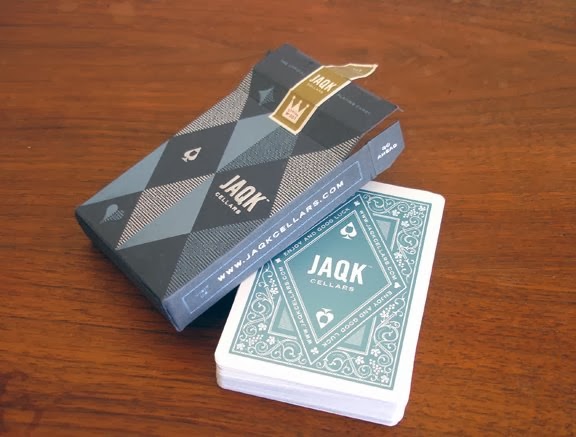
I decided to research a bit more into card backings so that I could get an idea on how they were designed and to see what colours are associated with cards and also styles.
The thing I loved about these cards was how elegant they look. The royal blue works really well with the royalty on the cards and the gold is a nice extra touch which makes the cards feel more expensive. This is a colour scheme I will explore especially if I can print gold, however this may have to be screen printed and issues could arise with fine detailing.
I really like the simple font used on these cards. The gothic san serif fits in so well with the joker illustration. It makes the cards look modern and the white negative space plays into the minimalistic approach.
I just absolutely love the detailing and patterns on these placards. I think the intricate lines make the cards more interesting and special. This feels so much better than the usual bog standard red and green - something I would very much like to get away from.
The dark grungy style of this card almost feels tattoo-y like cards a biker gang would play with. The text and use of colours work really well together and the illustrations have a lot of effort put into them to make them look this good.
I am still unsure on layout but the colours and style of text on these cards should give me a good basis to work from when it comes to designing my booklet.


No comments:
Post a Comment