This was a website I discovered whilst researching which makes the box template for you.
http://www.ideogram.nl/boxmaker/ Ive found it really useful as it means I know the box sizing will work and fit in with the design.
The vibrant colours on the coffee packaging really attracts your attention but the type layout keeps a theme running throughout the packaging.
The simple outline illustrations is what I liked about this packaging . It is neat, clear and crisp. It is also informative about what is in the packaging without overcomplicating the design.
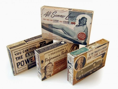
I quite liked the set era theme of these boxes with the overcrowded combination of text and image somehow merging together and working. However I don't think this is appropriate for the target audience of 18-25 year olds because it feels dated although this style has come back into fashion it would be hard to keep a consistency through each card.
The block rectangle packaging really stood out to me with the bright contrasting colours. The colour theme would fit in well with the cards and could easily be adapted to fit in with my work.
I absolutely loved this box idea and think it is so different from conventional boxes however it may be age appropriate for a much younger audience with the illustrated animal. But the box style could be taken and used but I wouldn't be able to justify why I had chosen this particular style.
I thought this was a nice simple idea on the playing cards. To have hearts on the inside tabs just gives it that extra something that stands out.


No comments:
Post a Comment