Showing posts with label brief 2. Show all posts

Thursday, 1 May 2014

Brief 2 - CoP - Publication: Book Example

Final Books


Below is a page by page example of the first book. Each book follows this structure but the images and text are appropriate for that country.


This page is the same in all the books. A basic introduction explaining why I've chosen to do this. and a definition of propaganda.


This page is about the propaganda in the specific country and a quote from someone about propaganda. The quote above is from Joseph Goebbels about propaganda.


All pages follow this layout with text on the left and image on the right.


Brief 2 - CoP - Publication: Final Images


Brief 2 - CoP - Publication: Making the books

Sourcing the paper was pretty cheap as I could get one sheet of A2 sugar paper in the library for 5p. The cover sheets we 30p for an A3  so all together I spent about £1 with plenty left over. I went for two different tones with the sugar paper as when I had looked through the ration book it was done and the pages were slightly different tones. I cut it all down so that it was A4 and I could feed it manually through my printer. Quite often it wont print ascew or slightly off because of the lining.

First I was printing one side landscape and then cutting it then refeeding it and printing the other. However I soon discovered the right size was portrait sheet of A4. This saved so much time as I could skip the trimming part. Once the whole book was printed I lined up the top pages so that it wouldn't need trimming later I could just cut the bottom off.

I found that even though the pages were exactly the same size once folded the ones in the centre ones stuck out. After I finished the book and bound it I cut it down. The whole idea of having a large gutter and small outer margin like in the ration book went to pot as when it cut they all varied on size. However I am not too fussed as it has cut correctly and not cut the type.

Friday, 25 April 2014

Brief 2 - CoP - Publication: Printing The Book And Problems On The Way

I decided I wanted to print my book on sugar paper as it seemed to be the right thickness and texture, as well as it being cheaper meaning I could print all three books for less. I wanted to the paper to be quite thin so that I could staple it together as I had previously planned.

Printing seemed to be  struggle as because of the small size of the book digital print seemed to be impossible to get the lining up right as you have to refeed it yourself. Wanting to print on my own paper meant I couldn't print using the MAC suite computers, the studio printer would take the paper but the ink was printing funny colours; green came out blue etc... I decided the best thing to do was to cut the paper down at home myself and print it there.

I found printing a lot harder than I thought it was going to be. The pagination of the book worked automatically off indesign which was great however it wouldn't let me stop it to turn the paper (as it doesn't print double sided automatically) so at the end I had the sheets but the backs were plain. When I managed to print the other side I couldn't change the way it printed so even feeding the paper back through it printed on the side lower than the first page. In the end I had to re edit the document my self so that page 2 was with 19 and so on... Once I printed one side I had to cut off the excess and then refeed it through the printer this then meant it printed correctly in the right space.

One design decision I made was to have a large gutter to allow for staples and also a small outer margin. However I found that once printed they didn't really line up so that when I cut one side it and it looked okay the other side was missing part of the image or page number. I found this really stressful as I firstly struggled with the print for quite a few hours and then once I managed to get it looking okay and lined up I trimmed the pages wrong.

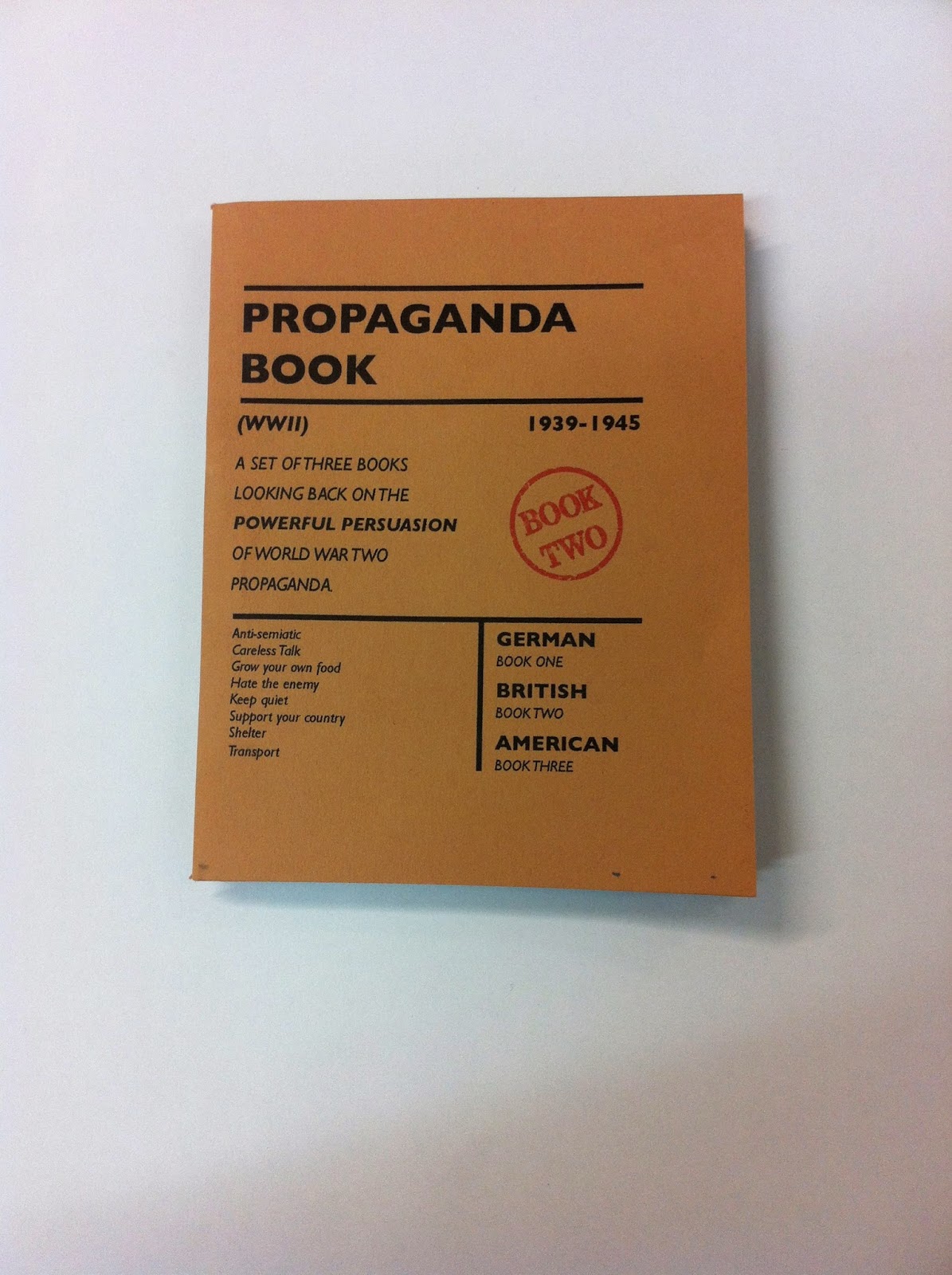
I will reprint the first book I made but decided that when I went onto the second book I would make some adjustments. Even though I liked the large gutter and small margin, because it wasn't printing properly I decided to move the text in so that both pages were more central. This allowed for more leeway when it came to later cutting it.

After I printed my second book I cut them to the same height and then trimmed the sides to make them equal. A few of them are smaller than the others but I have left the cover until after I have bound the book to the cut so it overlaps the content. It is unfortunate that I cannot staple my book instead down the side however the amount of gutter space it would take up would make the book hard to open and read. A simple saddle stitch will probably be most appropriate now.

Wednesday, 23 April 2014

Brief 2 - CoP - Publication: Final Three Book Pages

These are my final three books and all their pages:

BOOK ONE - German


BOOK TWO - English


BOOK THREE - American


Brief 2 - CoP - Publication: Book Modifications

I decided to change the front cover around a bit and wanted a stamp like affect to show what book it was. Below are a few of my experiments with the composition of the stamp.


I experimented with placing it in the bottom corner however this looks too squished and throws the piece of balance.


I quite liked the idea of it slightly overlapping the letter as it is above with the N this makes it feel more like an actual stamp.


This suddenly leaves a huge white gap open and doesn't look overly great.

Here it looks like the book has been stamped in a rush, this is potentially a style I will look at. 

I decided that the sentence in the middle part was too long so I have shortened the line length and increased the leading so that it is easier to read.


In the previous ones it has only been the type which has had a worn stamp aesthetic, I decided that I needed to create the same for my circle.

Here it fits in a lot better. It takes the space whilst still working well in the grid and the blurb is easier to read. I am unsure on whether to have it straight or at an angle. The straight one looks a lot neater, however the book would have been mass produced and quickly stamped, so maybe having it at an angle highlights the mass production.