Combining Type and Image


I originally began experimenting with the type face Alegreya, the whole range of fonts worked really well together to create a type hierarchy. The audience firstly see the brand name, then they should see what it is - a rich moisturising body wash (I will make it stand out). The ingredients are clear and symmetrically laid out. However the type face is too heavy, its chunky look doesn't fit in with the brand image or the personality of the product.
Reading Order
Mart Neumeier in The Brand Gap argues that before you can create emotion with a package you need to get the reading sequence correct. Depending on the product depends on the order in which the information is read.
1. the shopper should notice the package on the shelf either through good colours, strong contrast, bold type etc..
2. Then the shopper asks what is it? this should then show the product name and category
3. why should i care? this should be answered with a brief why to buy message
4. more information to support the why to buy message and define it
5. they are then ready for the "mumbo-jumbo" necessary to make a purchasing decision.
Presenting the information in a natural reading sequence increases a bond with the consumer and chance of purchase.

I wanted to combine the lavender and coconut on the design to clearly show the shopper what ingredients are in the product. The birch tree would not be shown with the ingredients but create the pattern of the box.
Birch Trees
I decided to create my own birch trees by dragging a mix of black and white acrylic paint across a piece of paper with a card. I think the effect has worked well and whilst some of the attempts are perhaps too dark, there are plenty that resemble a birch tree. This method has been a lot quicker than if they were to be painted in detail. Giving the impression of the tree instead of explicitly showing it provides texture and an artistic element (fitting with the target markets main hobbies).


I decided to create my own birch trees by dragging a mix of black and white acrylic paint across a piece of paper with a card. I think the effect has worked well and whilst some of the attempts are perhaps too dark, there are plenty that resemble a birch tree. This method has been a lot quicker than if they were to be painted in detail. Giving the impression of the tree instead of explicitly showing it provides texture and an artistic element (fitting with the target markets main hobbies).


Sorting the type


The combination of the lavender and the coconut works well to show both ingredients off and clearly identify what ingredients are in the product.
Creating birch tree box design


I used the birch trees that I had painted to create a repeat pattern to go around the box. The box uses a combination of light and dark trees, to create more depth they are alternated and overlapped.
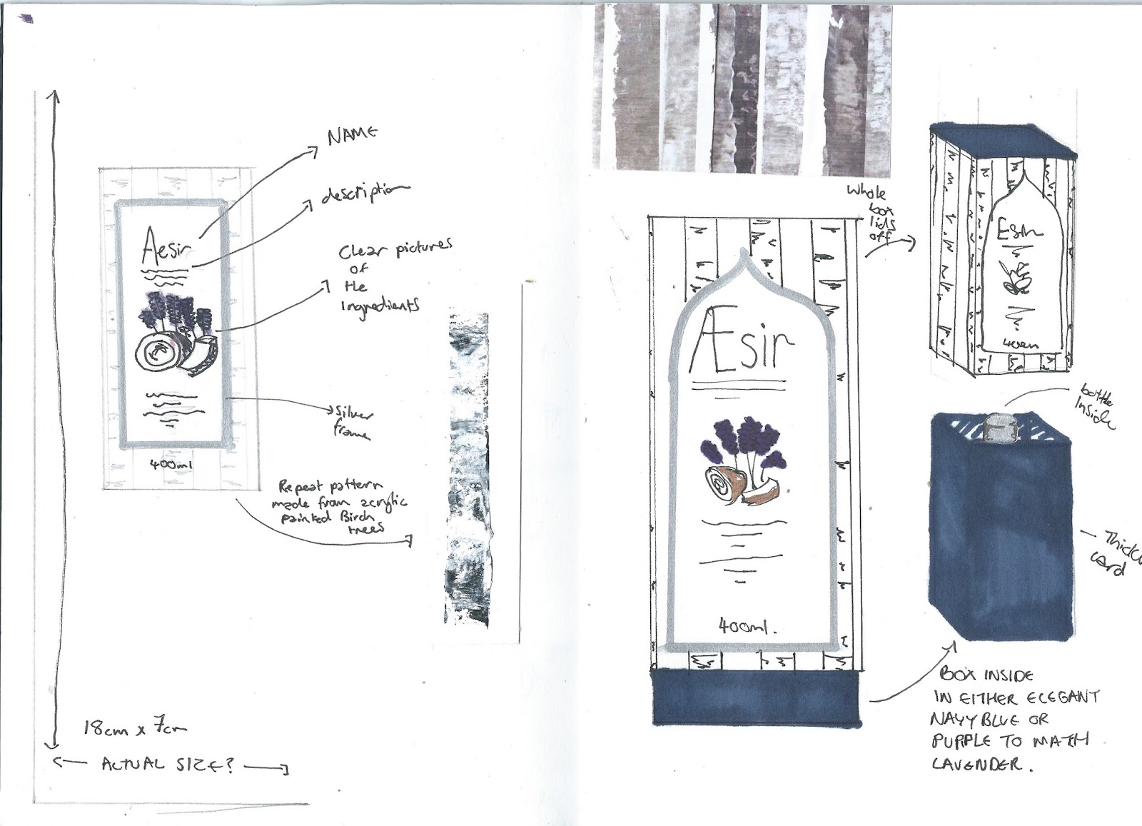
The box will have a solid top but no base, allowing another box to sit inside and protrude out of the bottom. This inside box will be a plain dark colour to compliment the box design. This will add extra protection to the bottle inside whilst also making the box sturdier and the bottle more secure.

I have ordered this pearlescent stock which the birch tree box will be printed on. The shine will catch the light and add a shimmer to the packaging. I want to carefully consider what stocks I print onto because the stock will be a good indicator of luxury. People wouldn't by a 'luxury' product if the packaging was flimsy or didn't look high quality like the supposed product inside.
White Design


No comments:
Post a Comment