Practical: 18-24 Mighty RAW - Final Changes & Final Outcome
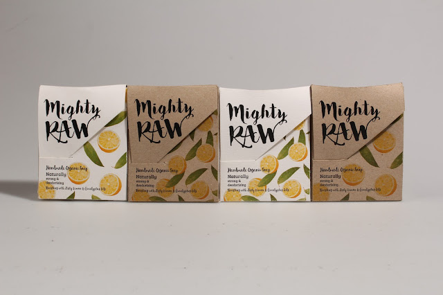
After receiving the feedback from the informal interviews I decided to make a few small changes to the current design. Firstly I neatened up the falling ingredients so that they fitted in with the type and the cut of the box better. I moved the type up so that it was further away from the bottom of the package.
I made two different outcomes, very similar, although one with smaller overlapping ingredients and the other with larger more spaced out ingredients. Both outcomes were printed on white watercolour paper and on brown eco card.
Final Outcome
I have chosen the white stock with spaced out ingredients to be the final outcome. White stock is a lot clearer than the brown, it looks clean and makes the packaging look vibrant and youthful. I believe this outcome is the best because there is room around each ingredient, they fit in well with the hidden type underneath the flap. I have also created a repeat pattern which has been printed on the inside of the package. This adds more colour and life to the inside of the package, making it more exciting when the user opens it to get the bar of soap. It was wise to change the ingredients into a falling pattern as this implies movement and energy; the packaging visually supports the brands energetic and friendly personality.


No comments:
Post a Comment