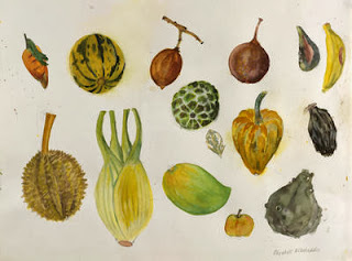
I wanted to follow this idea further and look at artists who use water colour. This way I can get an idea of what colours would work well and how the medium can be used to create certain affects.
I will play around with the idea of a natural background and take it to crit on friday to get feedback about which method will be best to persue or whether the idea as a whole is feasible. There are a few methods I would like to explore when creating a natural background and those are:
- Using paint such as watercolour to create different layers of leaves.
- Using actual leaves in mono printing so that the texture is captured.
- Creating a stamp and using it to print multiple times - this could work well for multiple pieces of work so each size has different size leaves in a different composition.
- Overlapping and collaging real leaves over a light box so that certain areas stay darker and some are lighter, and then photographing this.
 The thing I like about the pieces is how she lays out the leaf. I will experiment with this idea but strip it down so there is only 3 or 4 in a line horizontally or perhaps just one vertically to fill the centre of the frame. The simplicity of the artwork would really compliment a natural frame.
The two types of frame I have in mind for creating this piece of work would be a hand made wooden bark frame or one where it is solid wood. You can see the grooves and natural marks of the wood. This would compliment the back slip best as it would be in the same tonal range and natural theme. However perhaps a silver frame would make the artwork stick out but then this may not sell the frame but rather the piece of work.


No comments:
Post a Comment