Showing posts with label page layout. Show all posts

Wednesday, 8 January 2014

Brief 3 - Page Layout: Grid Research


I currently no nothing about grid systems. Through research I have found that there are two main types of layouts: vertical or landscape. Which one of these you work with will affect your grid. There are also only two types of grids. One that has an even number of columns and one that has an odd number of columns. Being able to choose the right design for what you are presenting is really important.  In one article I found it gave some really good examples of how grids can affect text layout and the page dynamics as a whole.

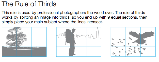
It also looked at the rules of thirds where with photography the intersecting lines is where the centre image should be placed. This is really useful to know and means I may redo some of my photography.

The golden ration is equally interesting and useful for designing. I still don't understand this properly so will look into it and how it can be used in design with page layout.


Brief 3 - Page Layout: Planning

I have never previously used indesign or created any kind of booklet so knowing where to start for this project seems a bit tricky. I decided the best thing to do was to write down all the areas I want and need to cover in the book let and then decide on an order to put them in which makes sense. I have already decided that I don't want a page for each section of research. I would rather have the booklets showing the history of cards but adding in pictures and facts etc as it goes through. This will make for a more interesting read and a nice design.

What do I want to include?
  • Facts
  • Opinions
  • Statistics
  • Imagery
  • Words
  • Tarot Cards
  • Other uses
  • Nicknames and who the court cards are
  • History
  • Manufactures - Bicycle/ Waddingtons
  • Card games with rules
1st page: an introduction to cards, brief history of cards.
2nd page: Tarot cards
3rd page: nick names/who they are
4th page: manufactures OR Other uses
5th page: games

This might not be the final layout but now it is written down I am aware of what I need to fit in. Each page will have a mix of the 100 research items on it.

I've decided to go against the normality and have my page vertically. The reason I want to do this is so that it can work within the proportions of the playing card. I feel that this will link better to the idea of playing cards and combined with my chosen typography it will reinforce the fact it is designed for playing cards.

Brief 3 - Page Layout: Reseach into Books

To get a better understanding of grid systems and page layout I went to the library and looked into a few books. The first one I looked at was 'Making and Breaking the grid' the page that caught my eye was about two columned pages where the page is divided into two with margins around each edge (allowing more for the right hand side/inner margin for binding). The thing that stood out to me on this page was the simple use of just two colours plus stock. The blue grabs your attention and the traditional black and white juxtapose this making for an ascetically pleasing page design.


The second book I looked into was called 'The Layout Book' by Max Weber. I was initially attracted to the book for the interestingly detailed front cover. This drew me in and once I began looking through I found an interesting page using two columns and illustration. It was all printed on newspaper paper with dark blue ink. The magazine was created by the department of Design and Architecture in the British Council with the aim of English as a foreign language. All the illustrations we done by hand by graphic designer, Sara De Bondt. What attracted me to the page was the beautiful hand made illustrations which really took a nice focus. I want to create something with the same idea of it being two columns with illustrations mixed within but with enough surrounding space so that the focus really is on the drawings.


The third book that caught my eye was called 'Good Layout' I found this useful as it really higlighted the basics when it comes to creating a good layout. The piece of design should help the viewer read it with ease - if they struggle they just wont bother. By arranging and emphasising certain parts of text it makes the message clearer and can also change the 
order in which the person reads. 


To organise a layout you must use different type sizes; the header being the biggest, then subheading then body copy. Put colours behind important information to make it stand out. Changing the weight and also leaving white around heavy text draws your eye to it. By putting a photo next to an important piece of text your eye is drawn to it and it re emphasises the point that was being made in the text. 


Tuesday, 7 January 2014

Brief 3 - Page Layout: Design Research

I want my design of the pages to be synced and relatable to the design history of the cards.
Searching around I have managed to find a free downloadable font which is used and referred to as ' card characters' http://haroldsfonts.com/portfolio/card-characters/ 

I am really drawn to this slab serif font as it fits in so well with the theme of the cards. It has an element of looking like a typewriter but the fact that it is thicker removes this. When I first see this font I immediately think of cards. This will be appropriate for headers and titles within  the page layouts, however since there is no lower case it may not be appropriate for body copy. It would be too loud and overpowering and would distract from the words themselves. I will try and find a simpler font which will compliment it.


Although this is an online page layout I loved how the text overlaps the image and the text colours compliment certain aspects of the image. The article as a whole is simple to read and you don't feel bombarded with information or adverts. They have used a simple colour scheme and with two main type faces; a san serif gothic for the titles and buttons and then a serif roman font for the body copy. The light grey/ cream background provides a good base for the typography.


The thing that attracted me to this page layout is how the page follows so nicely from left to right. You could imagine opening this in a magazine and seeing it as one spread. The use of block colours really stands out and the title works great in complimenting this. I am unsure of the yellow text on the right hand size as i feel they would have been better sticking with black and white. However the theme as a whole is something I could incorporate with patterns found on the cards being used as dividers of colour.


I loved the idea of having the images and type separated but with the lime green, black and grey linking the two. The bright colours keep your attention and the use of typography and the chosen fonts make the piece easily readable. It is a risky move having the title so far down the page but the white boarder really balances out the design and links nicely to the pictures.


The colour of the backing images really contrasts against the grey background with black boxes. I completely love the colour scheme used here and there is a great balance of image with text. This way you have something to keep your focus whilst guiding your eye around the page. 

Before I create my page layouts it would be useful to have a decided on theme. I really want to incorporate different aspects of the playing cards such as the typography and colour schemes when it comes to designing the layout.