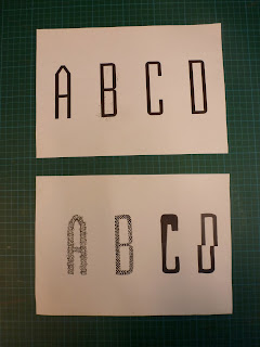
After the crit it was useful to reflect on the feedback given. One of the main things that became apparent is that the new letter forms should be working around the basis of the chosen font. For this reason some of the ideas were scrapped and four were kept and adapted to the silhouette of Briem Akademi (STD Condensed).
The two preferable outcomes from the ideas shown above are the 'A' and the 'D' as both of these portray his character best. The final alphabet and glyphs will be hand rendered onto tracing paper which will show how Johnathan's hand made style of work.
The 'A' will probably work best because it shows the idea of being busy but from afar looking neat and organised.
The next step (shown above) is to format a grid that fits in a 4 by 8 ratio with all the letters in and 6 chosen glyphs. This will then make the process of hand rendering it a lot easier and quicker.


No comments:
Post a Comment