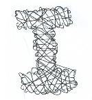
 To create a suitable alphabet it needed to incorporate our partners personality and characteristics in the way it was designed. One thing that is notable from the questions with Johnathan is that quite a few of his hobbies or attributes are linked or could be portrayed in the same way. For example he is a very busy person with work, university and socialising, this can be represented by the idea of movement - lots of lines or a busy letter. However this also could fit in with the idea of his fear of wasps, the lines representing the path the wasp takes.
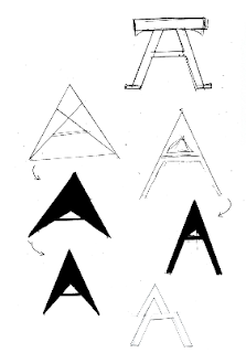
 On the right shows an initial idea of trying to present 'busy' and the sheer amount of work through the alphabet. A significant part to this design was trying to show that even though he is busy and has a lot going on he appears and composes himself as a calm and neat individual. The development on the right is playing around with using capitals only. Capitals are best because they are a statement, bold and can also relate loosely back to his love for caps.
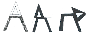
This idea developed further as it began to look at the slicing up of letters to show the break between the two sections; busy and neat and organised. The first A on the left is showing the idea of it being hectic under the service, the idea that no-one knows how busy he is. This developed further into actually slicing the letter to reflect the mechanical side of his personality. The letter is being constructed and deconstructed depending on your outlook

The next idea that followed looked at a combination of a few things: his love for driving to relax, his dream job of being an F1 driver and his love for mechanics. The first thought that comes to mind with the idea of driving was speed, this again links back to the idea of being busy and speeding around. Acrylic paint was used to create letters that looked like they were moving. Acrylic paint was the best material choice as it lends itself well to being smudged and creating movement.


No comments:
Post a Comment