Showing posts with label Alphabet soup. Show all posts

Tuesday, 29 October 2013

Brief 3 - Alphabet Soup/Typeface: Last Modifications


After the crit it was useful to reflect on the feedback given. One of the main things that became apparent is that the new letter forms should be working around the basis of the chosen font. For this reason some of the ideas were scrapped and four were kept and adapted to the silhouette of Briem Akademi (STD Condensed).

The two preferable outcomes from the ideas shown above are the 'A' and the 'D' as both of these portray his character best.  The final alphabet and glyphs will be hand rendered onto tracing paper which will show how Johnathan's hand made style of work. 

The 'A' will probably work best because it shows the idea of being busy but from afar looking neat and organised.


The next step (shown above) is to format a grid that fits in a 4 by 8 ratio with all the letters in and 6 chosen glyphs. This will then make the process of hand rendering it a lot easier and quicker.


Monday, 28 October 2013

Brief 3 - Alphabet Soup/Type Face: Interim Crit

The feedback that was given for Brief 3 has been really useful for developing the alphabet further. The way the crit was laid out meant that we didn't present to the group, but rather lay our work out and let it speak for itself. On a separate sheet was written anonymous feedback which we could then use to develop our alphabet.


The main pieces of feedback that seem to be of value are the following:

  • examples of the font silhouettes being used as the starting point
  • begin looking at 3D and mechanical 
  • Top heavy letters work well
  • exploring the idea of tracks and working that in with the font of Briem Akademi
  • tall letterforms
  • 'divided idea is most visually pleasing' - idea of constructing and deconstructing
  • choose a clear path, focus on one of his traits or think of overlapping traits
  • focus on creating more legible letterforms
From this it allows for a wide range of ideas to be developed further and hopefully form a strong basis of work.

Brief 3 - Alphabet Soup/Typeface: Development

To create a suitable alphabet it needed to incorporate our partners personality and characteristics in the way it was designed. One thing that is notable from the questions with Johnathan is that quite a few of his hobbies or attributes are linked or could be portrayed in the same way. For example he is a very busy person with work, university and socialising, this can be represented by the idea of movement - lots of lines or a busy letter. However this also could fit in with the idea of his fear of wasps, the lines representing the path the wasp takes.


On the right shows an initial idea of trying to present 'busy' and the sheer amount of work through the alphabet. A significant part to this design was trying to show that even though he is busy and has a lot going on he appears and composes himself as a calm and neat individual. The development on the right is playing around with using capitals only. Capitals are best because they are a statement, bold and can also relate loosely back to his love for caps.                                                                                                                                                                    
This idea developed further as it began to look at the slicing up of letters to show the break between the two sections; busy and neat and organised. The first A on the left is showing the idea of it being hectic under the service, the idea that no-one knows how busy he is. This developed further into actually slicing the letter to reflect the mechanical side of his personality. The letter is being constructed and deconstructed depending on your outlook

The next idea that followed looked at a combination of a few things: his love for driving to relax, his dream job of being an F1 driver and his love for mechanics. The first thought that comes to mind with the idea of driving was speed, this again links back to the idea of being busy and speeding around. Acrylic paint was used to create letters that looked like they were moving. Acrylic paint was the best material choice as it lends itself well to being smudged and creating movement. 

Then the idea of the car engine itself became the focus looking at taking aspects of the car engine and simplifying them down so that they could represent letters in their basic shape. The side view of a V engine worked well as a V and a Con rod works well as an I, however although this idea may work it doesn't lend itself well to the whole alphabet. The "i" on the far left works well as the letter is still legible and clear but shows the track well. This will definitely be an idea to continue.


Tuesday, 15 October 2013

Brief 3 - Alphabet Soup/ Type Face: Paired Questions

Today we were put in pairs and given a list of questions to get to know each other better but mainly to find, and then eventually create, a type face that expressed them as a person. Below are the questions and answers:

When are you happiest?
Christmas time

What is your greatest fear?
Wasps and angry dogs

Favourite place in the world?
Florida

What is your earliest memory?
Saving my cousin from drowning

What is your most embarrassing moment?
Knocked out by my younger sister and split my head open

What makes you unhappy?
Family disputes

Who would play you in a film of your life?
Denzel Washington

What is your favourite smell?
Freshly cut grass

What is your favourite word?
Debate

What would be your fancy dress outfit?
Crayola

What is your guiltiest pleasure?
Twilight

How do you relax?
Drive around

If you could edit your past what would be one thing you change?
Concentrating more in school

Dream Job?
F1 driver


Here is a list of other information I have found out that could be useful when creating an alphabet:

  • Wishes he could play drums
  • Interested in mechanics
  • Works a lot
  • Localised
  • Favourite colour is red
  • Rap
  • Caps
  • Forgetful
  • Busy
  • Likes a routine
  • Sarcastic
  • Motivated
  • Outgoing
  • Prefers working by hand and then scanning it in
  • Minimal

Monday, 14 October 2013

Brief 1 - Visual Thinking/ Alphabet Soup: Creating 10 letters


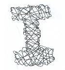
First of I began looking at creating the letter out of lines, I was trying to portray the fine detail and accuracy that is used to create an instrument and equally the precision some instruments create such as a scalpel that cuts a fine line. The top right P works well because the outline is easily visible unlike the one below where I played around with lines creating the P without a guided outline.


After experimenting with lines I began to looking at using just one thin line to emphasis the same point. The top left L is my favourite because it is sharp and clear, it would work well as body copy text and at the same time stands out well as a single letter form. The serifs have been kept the same as those found in Garamond font but the lines dramatically reduced, this brings the attention to the serifs and also gives the illusion of the lines being neater and finer. 

The large O is playing around with varying the width, I think having it at opposing angles works well as it brings something new to the letter. The axis has changed which highlights the instruments different shapes, and how some shapes can be found in others.


I took the idea with the O and began to look at how varying the thickness are curved parts of the text would look. Above shows the idea in one word. I decided to add prominent serifs to the ascenders and descenders to end the letter to add a prominent end to each letter. I have recreated this below but adding in the x height, base line and caps height. I did this so that the text would line up and the kerning would be better.


As you can see I changed it slightly removing the serifs so that the end of the letters would end promptly. I decided not to have a separate caps height, I want the ascenders to end at the same height as capitals to bring the idea of unity and how everything has to work together in harmony.


I then started to look at what Serifs would look like and whether on the top they would need to be full or just on one half, I personally prefer the d where they go outwards from the letter, I feel like it would nicely lead on to the next letter without distracting from it. Another thing I like about it is how there is an equal distance between the X height and both cap height and baseline, this makes the letter feel longer and elegant because instruments are very refined and dainty this font shows it off well. 


I then began looking at varying the X height so that i could see how it affected the letter form, this gave me a better idea of how an instrument inspired font would look. I experimented with changing the width on the curves (like before) but at different x heights although I prefer the plain lettering shown in the top left corner because it is simpler and would work better when it came to body copy.


Above I began to play around with using paper and layering. I quite like the idea of using a stencil as it implies copying and mass producing which instruments do, how well this would work as an alphabet is a different question! The layering of black and brown card is meant to symbolise the layering of instruments in an orchestra where it isn't soley one instrument but every one has a part to play. The thin brown slab serif U is slightly wider that normal width and would work well to show free flowing and smooth instruments.


 I then began playing around with etching and played with the idea of mono printing. I scratched out the letter 'I' into plastic and the layered it with black paint to see what effects would be produced. I found that although the idea was good the actual outcome isn't legible or overly amazing this is because the plastic is too thin so no deep groves could be cut. It would have worked better if I used a thicker material like lino and then worked with the same technique. 

Friday, 11 October 2013

Brief 1 - Visual Thinking/ Alphabet Soup: Crit Feedback

The crit today was very useful. I found that previously I was really struggling on ideas and how I can progress. The feed back I got about my current 10 designs was that they were good but were too similar to each other in their set styles. Below is a list of things that were suggested to work on:


  • LINE WEIGHTS - I want to experiment with varying the weights. One point that came up was that instruments are precise and intricate, this has made me rethink about the line weight and experiment with making it all thinner and delicate. The thinner and neater the letter form the more legible it will be. 

  • ONE INSTRUMENT -  Look at potentially focusing on one instrument and basing all the type on different parts of that instrument instead of having a wide spectrum. The word  'instrument' is so broad that the idea of narrowing it down could make it easier to focus and produce a good piece of work.

  • TYPE ON INSTRUMENTS - Another idea that was suggested was to look at the type used on instruments like scalpel  or even guitars. The point behind this was that they use small fonts and the writing is normally hidden but still clear and legible, this could be something that may work for mine. It will also be worth looking into how the fonts are written on the instrument. For example on a guitar it maybe be etched into a small metal plate. This opens up the option for experimenting with etching and other techniques that may be used such as engraving and embossing.

  • GRID - Look at creating the letters in a grid this will fit in with the idea of it being neat and precise and will act as good guide lines.

Now I will begin to look into working by hand and also using other materials to create the letter forms, I will experiment with textures that relate to instruments.

Wednesday, 9 October 2013

Brief 1 - Visual Thinking/ Alphabet Soup: Development


Since the anatomy of type lecture I have began to experiment with subtly editing the letter forms in Garamond. At first I didn't feel i had any initial ideas because everything that came to mind would change the letter too dramatically. However I've managed to look at modifying a few letters to get to grips with the brief, this will also be useful for the crit on Friday where i can ask for feedback. 

Because I didn't know where to start i firstly began by looking at the shapes of instruments and tried to work the basic shape into the letter form. 


Above left is the original J in Garamond, to the right of it is the modified J. I began by extending the curve around so it ended just before the centre, I removed the tail and replaced it with a serif. The thought behind this was focusing on a saxophone, I wanted the J to be smother and have a more defined curve. The end of the saxophone spreads out like the serif so I thought this would be a better comparison than the rounded tail. I will develop this more and look into changing the thickness so that it all matches or looks neater, I will also look into changing the width of the serif so that it is more prominent.


Above shows the P in Garamond and also the modified P (on the right). I started by extending the counter down so that the bowl would turn oval and the distance between the x height and base line would be lowered. I did this so that, like the J, the letter would give the appearance of being longer and thinner. I removed some of the weight of the side of the P to help with the illusion. I wanted the letter to subtly represent a trumpet or a brass instrument from a birds eye view. I will look into editing the head serif so that its angle helps to represent the trumpet.


Above shows the Garamond Q on the left and on the right my edited version. I didn't want to change too much to the Q as i felt its letter form was already appropriate for the word instrument. However i did change the tail to more of a styled serif so that it fitted in with the theme and looked more musical whilst remaining legible. The 'chunkier' serif ends work better with instrument when it comes to musical instruments because, to me, it represents the mouth piece on the brass instruments.


Above shows the 'I' both original and edited. I haven't done much to the modified 'I' just extended out the brackets so that they became longer than the top of the 'I'. I wanted this to show a musical stand as that is closely linked with the idea of instruments, I will definitely work on this and hopefully at the crit I will be able to get an outside opinion on possible options. I will also begin to looking into other types of instruments such as scientific or surgical.


With the U I wanted to look at other types of instruments, here i have began looking into instruments used in science. The U is meant to symbolise a test tube, to change it I brought the two stem sides of the U together and removed the inner section of the top serifs. This was so that it held the test-tube shape. Although this letter form hasn't had a drastic change it creates a completely new letter form.


With the V about I wanted it to represent a medical instrument, I began looking into different types of scissors or pliers which held a similar shape to a V. The swirled tails represent the handles. I wanted to play around with distorting the shape slightly and i think this letterform has done that. However thats not to say I am overly happy with this out come. I don't think it fits in well with the other letter forms and although the idea is good it could do with tweaking.


Above shows the A, the original idea behind this was looking at a bunsen burner stand as a scientific instrument. Im not overly happy with this outcome because the letter looks squished and the crossbar is too high which gives the impression the letter is bottom heavy. Hopefully the Crit will provide some useful feedback and ideas on what i can do to edit it.


On the C I have extended the brackets which have made the aperture smaller so that the space is enclosed. This has changed the shape into something that could potentially represent many instrument categories.


With the Y above I wanted to try and show a funnel as a scientific instrument. I think this has worked relatively well as the shape is clearly defined. The bottom serif has been made smaller to keep the attention on the top half of the Y, I did experiment with it being larger but it ended up looking like a cocktail glass. The thicker left hand arm draws your attention immediately to the letter and gives the illusion of something in the funnel. 


I decided that when it came to the H I wanted to play around with a different type of instrument. The H was my impression of Instruments of torture. I wanted to keep the idea of a guillotine so simply moved the angle of the cross bar so that it would represent the blade and it was made the cross bar thicker so it would hold more emphasis.

These are my 10 current modifications, I plan on changing them and improving them when I get feedback from the critique on friday.


Monday, 7 October 2013

Brief 1 - Visual Thinking /Alphabet soup: Brief


Brief:

Produce a set, series or sequence of ten letterforms, which explore and communicate your interpretation of the word that you have selected from the randomiser.
Using your newfound appreciation of the anatomy of typographic forms and the wealth of research that you have already gathered, focus on the manipulation of existing letterforms in order to solve this problem.


Background / Considerations


Think visually. Consider what the visual essence of your subject matter is and how best to communicate this. What are the obvious responses? How can you beyond these? How subtle can you be? Do your ideas operate as a set, series or sequence?
The following terms may prove useful:
 Trace, erase, layer, combine, outline, silhouette, and surface.
Consider the most effective and controlled use of media appropriate to your subject matter. EXPERIMENT with a range of possible line qualities, marks, colour and paper types. How will colour help with the communication? What paper stocks can you work with? Do you need to draw, photocopy, photograph, collage, trace or combine all of these processes?
Mandatory Requirments
Each image should contain only one letterform however the set should demonstrate a range of possible solutions. Each resolved letterforms should be supported by a broad range of visual investigation in the form of design sheets and notebooks. This should all be documented on your blog.
Deliverables 

Produce ten physical resolved solutions in 10cm x 10cm format. Each should represent a well crafted and clearly presented typographic form.


-------------------


From this brief I randomly selected the word Instrument and the font Garamond, Below is a list of my initial thoughts. At first I was unsure of where to go with the brief so it helped to jot down ideas. I will try to get a better understanding of typography before manipulating the letter forms.

Instrument:
  • musical - brass, percussion, string, wind
  • tools or implements to do a job - neat, precision
  • people - being used as an instrument
  • surgical
  • science and technology 
Garamond:
  • serif
  • mainly used online 
  • works well in body text
  • Claude Garamond (1480 - 1561)
  • created in 1540's