Thursday, 9 April 2015

Essay Practical: Design Research

The package design needs to portray the idea of an organic, fresh and natural product. It will be a midrange price product so the design will need to reflect this; obviously having a basic range of air is stupid and a higher end product would be appropriate, however the focus of my essay was supermarket package design. Therefore it seems fitting for the product to be midrange, something that would be seen on supermarket shelves.

I have begun to look into existing package designs which fit appropriately into my categories. I want to see what the packaging has in common as well as how many of the characteristics I wrote about in my essay are used.

The characteristics I explored in my essay are:
• Personification 
• Hand rendered elements
• Opportunity to be creative (Vance Packards 8 Hidden Needs)
• A window into the product
• Colours
• Multifunctional package design (going beyond the purpose)
• Sustainability


Arbor Teas
•Strong Colour
•Sustainable materials

Arbor Teas use a sustainable packaging and primarily the colour green which is synonymous to nature; reflecting the natural product inside. The simple design avoids complication which the viewer naturally links the product inside - no unnecessary ingredients just pure natural tea.


Kallo
• Hand rendered elements
• Strong colours

Kallo takes a normally boring food and transforms it into something exciting and intriguing. Using bright but not harsh colours attracts the eye whilst clearly distinguishing the different products in the range. The same illustration has been used at the bottom of each design; the impression of fields gives the customer reassurance that they are buying a natural and healthy product. Keeping the illustrations the same throughout helps to strengthen the brand and product identity. Using the leaf as a logo strengthens the organic image and the use of the simple vector butterfly above doesn't distract from the design but instead implicitly suggests freedom and nature which again portrays the product to be organic.


Wembe
• Multifunctional packaging

Wembe soaps uses natural colours to reflect the natural ingredients in their soap range. The nicely designed, good quality wooden box allows the customer to continue using it after the soaps have been used. The aesthetic and tactile elements of using actual wood makes the customer feel like they are getting good value for money.


Lucy's Goat Milk Soap
• Personification
• Window into the product

Lucy's Goat Milk Soap uses a friendly Woman's name to portray an independent business. By using a name it breaks away from a corporate image and gives the customer a mental image of a small farms product. By using a band around the soap rather than a plastic container it allows the customer to smell and touch the product before buying it. This helps to reduce post cognitive dissonance, this is especially useful when this type of product tends to come with a price tag to reflect the amount of labour gone into the product.


Simply Organic
• Window into the product

Simply Organics range of herbs and spices come in glass bottles, nicely presented and with minimal design. The fact that the labels are directly onto the bottle rather than a wrap around label really allows the customer to see the product before buying. It also uses the actual ingredient as backing so each one is a different colour and texture. This is really simple design done well.

Saturday, 4 April 2015

Essay Practical: Finalising an Idea

Currently I quite like the idea of creating the packaging for a jar of air. Although it does sound ridiculous, if I could get the packaging right it would show that people are heavily influenced by the packaging design when it comes to buying a product. A range of different 'airs' could be branded from different points in the country such as Devonshire air, The Yorkshire Dales air and Seaside air. This would allow me to produce a range of different designs whilst maintaining a clear style throughout.

I am currently unsure who my target audience is. Naturally I feel that it should be a luxury product aiming at wealthier people as those who are money conscious or money savvy perhaps are less likely to buy air. However with the luxury design comes a steep price tag which would may restrict the products success, however it would be necessary as having a cheap product with an expensive feel contradicts. My essay focused on the key successful characteristics in supermarket packaging so it is perhaps better to aim for that target audience to keep in fitting with my essay. However the characteristics that were noted in my essay would easily apply to a range of different priced products.

Each different type of air could have a persona to relate and sell the product. Seaside Sally and Farmer John could work to promote the products. However using the word farmer almost implies the smell of manure, not an overly fresh or pleasant smell! It may work better to have them as a family relation like Grandpa Dave's Devonshire Air as people would relate the family title as something friendly and trustworthy. Devon is also a place where a lot of people retire to so this would fit with the personification of a loving grandparent and could be related to the atmosphere when visiting a grandparent in the country; fresh, clean air.

The packaging would have key sentences which would really highlight the fact that the air is fresh and organic. '100% locally sourced' would help to support this idea whilst also removing any corporate image. This was something that I really focused on in my essay, the idea of the products being seen as local rather than mass produced by a big corporation. The use of a persona would also help in removing this image by giving the product a face. Hand rendered elements will be used throughout to give it that extra humanistic touch.

National Trust - Giving away air
http://www.telegraph.co.uk/news/earth/earthnews/7419759/Bottled-air-given-out-by-National-Trust.html

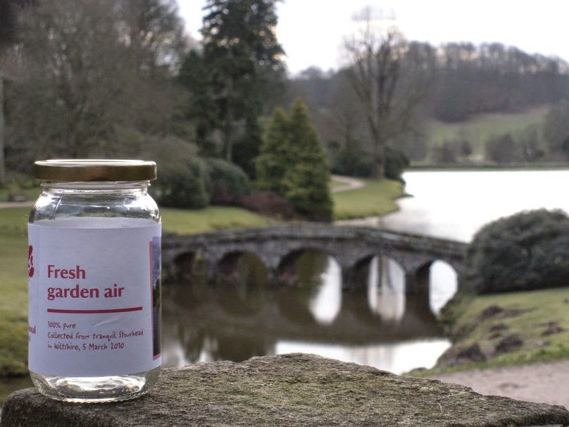
I remembered this article from a while ago where the National Trust were giving out jars containing country and seaside air to busy inner city workers. The aim was to reduce stress. Just one jar could relieve stress for 10 minutes.

"The most relaxing activity was a walk with a breath of sea air, according to 72 per cent of those surveyed, with 66 per cent saying that a walk in the country air was the best stress reliever.

But 59 per cent of people said a breath of fresh air of any kind was enough to reduce their stress levels."


The packaging design created, although in-keeping with the national trust image isn't overly great. However they were given away for free so to some extent the design is irrelevant as people love free stuff. However when trying to sell a product people can get for free the design will be crucial.


They furthered their campaign which had a strong visual image. Using white text on an image looks fresh and clean. Using the National Trust logo instead of a heart to symbolise love means that viewers connote the idea of love to the National Trust and therefore outside spaces.


Chinese Millionaire Sells Cans of Fresh Air

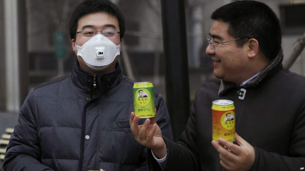
China's foulest two-week period for air pollution in memory has rekindled a tongue-in-cheek campaign by a multimillionaire with a streak of showmanship who is selling canned fresh air.

Chen Guangbiao, who made his fortune in the recycling business and is a high-profile philanthropist, on January 30 handed out soda pop-sized cans of air, purportedly from far-flung, pristine regions of China such as Xinjiang in the northwest to Taiwan, the southeast coast.

"I want to tell mayors, county chiefs and heads of big companies: don't just chase GDP growth, don't chase the biggest profits at the expense of our children and grandchildren and at the cost of sacrificing our ecological environment", Chen said.

This has been really interesting not only to show there is a demand for fresh air but also to show governments how important the environment is to the public.


Thursday, 26 March 2015

Study Task 05: Writing and formatting correctly - exercise

Write a blog entry for this task - discuss 3 things that you have learned, observed, noted about the dissertations that you looked at and how this will help when addressing your own written piece.


The first dissertation I looked at was 'A historical and theoretical Analysis of the concious use of white space. Its changing interpretations and influence on Graphic Design.' I was drawn to it because I was interested to see how they had written over 8,000 words on white space. The first thing I noticed was the amount the author had used the word 'I'. This is unprofessional and I am surprised that it has been used in a dissertation. Not only had they used 'I' but also written it when talking about a pieces of work "I feel that..." I was always taught never to use feel or other such words when talking about a piece of work especially in a dissertation. I've noticed that he has also laid his work out in chapters, this is a good idea that I will use when writing my dissertation as it is a great way of breaking up such a heavy amount of content.

The second dissertation I began reading was 'An analysis of how supermarket brands use socio-economic subcultural differences to build a consumer base and how is this reflected in brand identity' I chose this one because of my interest into supermarket design and brand identity. The structure of the dissertation is good, one thing I noticed which I didn't see in the last dissertation was triangulation. The author has included different arguments to help shape his main points but also linked them.

By looking through these two dissertations I have been able to see a difference in writing standards. I will take on board what I have learnt from each dissertation and make sure that when I write my own I do not fall into the same problems. Equally I will take away what I have learnt and apply it to my future dissertation. 

Sunday, 8 March 2015

Practical Idea From Essay

After writing my essay on the key characteristics for successful package design I want to create a final outcome which uses these techniques to brand something which you wouldn't normally buy.


NYC Garbage 
I decided to look into NYC Garbage because it is a good example of a product people buy solely for the way it has been packaged. If you offered someone some rubbish they would turn it down however the packaging here clearly works as people are buying it even though it is $50 per cube!


NYC Garbage was created by Justin Gignac who began to package garbage to show the importance of package design. He did this by finding something no-one would ever buy and packaging it so they would. Over 1,400 NYC Garbage cubes have been sold.


Saturday, 21 February 2015

Study Task 04: Practice-based research

Technique
My final practical outcome will be some form of packaging. One practical issue that may occur is that I won't be able to make it to industry standard, I will have to cut the package out myself rather than having a machine cutter. This will leave a lot of the final presentation down to my cutting abilities. I also won't have such a wide range of stock on offer so will be limited with what I can produce.

Content
There will not be an excessive amount of content. However I will make sure to include everything necessary to sell the product. I will write the content myself.

Communication
I will communicate what the product is through the packaging. Using the techniques raised in my essay I will also be able to use the packaging to visually communicate my essay.

Research / Analysis
I could create a survey to see how many people fall for packaging and how many of those people are aware of it. It would give me an opportunity to ask people what type of packaging they like and what they like about it.

Exploration / Evaluation
I can explore further into packaging and narrow my research down to suit my specific product as the essay is an overview.

Testing
I can test the final product by putting it on a supermarket shelf and seeing if it catches peoples attention. Failing that I can just ask people what they think and if it would sell.

1. What is your research question?
Outline and Explain the key characteristics for successful supermarket packaging design.

2. Do you have a hypothesis (an assumed conclusion that you will endeavour to prove)?
A hypothesis isn't appropriate for this essay. Instead it will go through the main points and explain how they make for successful packaging

3. What are the contexts of your research interests?
I am interested in package design and how people buy products purely by the aesthetic of the package.

4. Sources of primary/secondary research.
Books, Questionnaire, Primary research - going into supermarkets and observing.

5. How will your practical work relate to your written work (synthesis)?
My practical work will use my essay as a guide to creating the piece.

6. What methods will you use to research, develop, create and test your work?
I will use package design books from the library, throughout development I will ask peers for feedback.

7. Provide a proposed timeline for your work to completion (consider carefully whether you will need access to college facilities).
Week 1: Think of an idea
Week 2: Begin planning idea
Week 3: Design
Week 4: Create mock up
Week 5: Alter design and print final

Tuesday, 20 January 2015

Essay: Quotes

NO LOGO -
                                                                                                                                                                                                                                     
"Familiar personalities such as Dr. Brown, Uncle Ben, Aunt Jemima, and Old Grand-Dad
came to replace the shopkeeper, who was traditionally responsible for measuring bulk
foods for customers and acting as an advocate for products... a nationwide vocabulary of
brand names replaced the small local shopkeeper as the interface between consumer and
product." 28

But there were those in the industry who understood that advertising wasn't just scientific;
it was also spiritual. Brands could conjure a feeling —
think of Aunt Jemima's comforting presence —but not only that, entire corporations could
themselves embody a meaning of their own. 28

 Aunt Jemima from Quaker Oats' early packaging, humanizes production
for a population fearful of industrialization. 24

Survey of Future Packaging Trends -

http://www2.dupont.com/Packaging_Resins/en_US/assets/downloads/Survey_of_Future_Packaging_Trends.pdf?src=vocus_survey2012_whitepaper

• Respondents say cost is the top factor driving the industry today (59%) but they predict it will fall significantly
in importance in 10 years (dropping 28%) to below factors like sustainability (51%) and food safety/security
(37%)

Future trends in Europe are sustainability (53 percent) and food safety and security (40 percent)

‘The sustainability/green agenda will be at the forefront of future trends. As economies re-prosper there will be
more onus placed on retailers and brands to deliver a packaging message in response to the ‘all packaging is
bad’ momentum.’

Overall
• Cost matters most (75 percent) when it comes to evaluating sustainability in packaging today, but falls to the
third most important criteria (41 percent) overall in 10 years.
• Lifecycle analysis (52 percent) and recyclability of the package (46 percent) will be the two most important
criteria overall in 10 years.
• The source of raw materials will become increasingly important (from 20 percent today to 40 percent in 10
years) to tie with cost as the third most important criteria in 10 years.

Overall
• The packaging industry today clearly thinks that consumers value convenience (76 percent) and shelf appeal
(58 percent).
• In 10 years, respondents think this dynamic will completely change, with consumers valuing sustainability
features, specifically perceived “greenness” of the materials (increasing 23 percent), recyclability (increasing
27 percent) and reusability (increasing 13 percent ).

Sunday, 18 January 2015

Essay: Packaging and Design Trends for 2015

A package is a storyteller, and yields tremendous influence.  It persuades and entices a buyer. It makes promises. And its design is every bit as important as the product within.

Packages are increasingly becoming useful extensions of a product, adding value and pleasing customers by decreasing waste.
The packaging industry is subject to trends and movements like any other, and here are exciting new developments to watch for in 2015.
Stand Up PouchFlexible Packaging
The flexible packaging category will continue its incredible growth in 2015. Stand-up pouches will see the largest growth here, because they’re convenient and useful, and allow for unique design and capacity.
WineHyper-functional Packaging
Packaging that goes beyond the basics of housing, protecting and transporting a product will flourish in 2015. Consumers want innovation and added value. Occasionally consumers buy products because they desire add-ons as much as the actual products. Multi-use packaging will be seen as superior to packaging that offers only a product inside. However, the packaging must be designed so the customer easily recognizes the dual function for this trend to succeed.
Natural Material Cup
Raw and Natural Materials
Environmentally-friendly packaging that uses raw and natural materials is ideal for connecting with green-conscious consumers. Raw and natural materials are tear resistant and high in elasticity, and lessen the consumers’ guilt about buying packaged products.
White on Clear Olives
White on Clear Packaging
Today’s brands strive for an honest and pure image. White on clear packaging is a trend that allows a product to speak for itself. A transparency in packaging can symbolize brand transparency.
Hand Written BreadHand-Drawn or Hand-Written Typography
With technology on the rise, brands are looking to connect with consumers in a personal way. They want customers to connect with the face behind the brand, one that is welcoming and thoughtful. Hand-drawn, personal, and imaginative features project this image.
Milk MinimalismMinimalism
The design movement of minimalism is creating big waves with its simplistic designs and unique finishings, such as emboss or matte. Visually, the minimalism design stands out as bold in color and text, yet not overpowering. This eye-catching trend appeals to millennials.
Onion Ring BagDesign and Color Variation
When a brand offers a product with flavor options, each package needs to be distinguishable and unique but maintain an equivalent representation. This is accomplished with unique design and color variations.
Bespoke Technology
Brands solicit consumer interaction with QR codes and social media hashtags, but a new technology allows consumers with smartphones to instantly connect with influential people through a link on a package. This technology, from Bespoke Technology, links the online and offline worlds via special content. A consumer points his or her smartphone at a package and receives a unique message from a celebrity.
These are some of the inspiring new advances you can watch for in 2015, as companies seek to further the human connection between their brands and consumers. With an emphasis on environmentally-friendly materials, dual functioning, minimalism and hand-written and hand-drawn typography, this will be a thrilling year for packaging and design trends.