Wednesday, 5 February 2014

Brief 1 - Design is About Doing: Storm Thorgerson

Storm Thorgerson is perhaps one of the most well known designers for records. His style incorporates different aspects which would not be seen together or are impossible to create surrealist art work but through the medium of photography rather than paint; like traditional surrealism art.


This piece shows the distress of part of him missing. An idea similar to this could work well for the Elbow piece.


I love the use of big sheets of cloth. If it were practical it would be cool to do this but then shape the cloth so that a the outline makes the outline of a face.


A classic and perhaps one of the most famous pieces. Using a simple idea this piece doesn't need any text for people to know what the album is.


The muse albums are probably the earliest albums I remember listening to and being fascinated by their artwork. I clearly rememeber thinking how different they were from other albums are their surreality meant I found myself staring at them for ages.


I love the use of combining two images together to create a new surreal one. Being able to see the sea level makes it more interesting like you are seeing two parts of a scene.


Tuesday, 4 February 2014

Brief 1 - Design is About Doing: Rose Photoshoot

I wanted to look into time lapses becuase it is a good way of showing movement and the change but stuck in the same setting. I decided that I would research further into one of my ideas - the dying rose. I wanted to look into how time lapses work to show the progression of alive to dead. Below are some photos which I liked the look of which I felt were useful to these ideas.


The city going from night to day slowly shows the transformation. Perhaps I could do this from left to right with my flower so that it the further right it goes it fades into dead.


This was a photo I got shown which shows the whole year but for one scene. The camera was left in one place and each small line represents a day so that explains the lineyness. The reason I  liked this piece was the idea behind it although I don't think the image is overly food and the   brown to green doesn't face in well. 


This was more focusing on adjusting the aputure and was an image that I may look into recreating. In the grounds for divorce song it talks about gambling with sticks, which could refer to pool. The idea that they are moving shows the times passing; how long they have been there playing it. 


This was a time lapse showing the moon movement. The thing I liked was how the image has stayed the same colour and not been over-layed messily. 

The movement of traffic seems like an obvious one but the idea of the movement stuck in one place seems to suggest staying in one place a lot. Maybe I could transfer this to a still bar shot with people walking and moving around.


Brief 1 - Design is About Doing: Time Lapses

I wanted to look into time lapses becuase it is a good way of showing movement and the change but stuck in the same setting. I decided that I would research further into one of my ideas - the dying rose. I wanted to look into how time lapses work to show the progression of alive to dead. Below are some photos which I liked the look of which I felt were useful to these ideas.


The city going from night to day slowly shows the transformation. Perhaps I could do this from left to right with my flower so that it the further right it goes it fades into dead.


This was a photo I got shown which shows the whole year but for one scene. The camera was left in one place and each small line represents a day so that explains the lineyness. The reason I  liked this piece was the idea behind it although I don't think the image is overly food and the   brown to green doesn't face in well. 


This was more focusing on adjusting the aputure and was an image that I may look into recreating. In the grounds for divorce song it talks about gambling with sticks, which could refer to pool. The idea that they are moving shows the times passing; how long they have been there playing it. 


This was a time lapse showing the moon movement. The thing I liked was how the image has stayed the same colour and not been over-layed messily. 

The movement of traffic seems like an obvious one but the idea of the movement stuck in one place seems to suggest staying in one place a lot. Maybe I could transfer this to a still bar shot with people walking and moving around.


Brief 1 - Design is About Doing: Leif Podhajsky

I began looking into some of the albums I liked to find out the designers behind them. The first one I looked at was Bonobo and I found out the designer, Leif Podhajsky, has a very unique and clear style to his work. He uses multiple bright colours and uses photographs multiplied to created an interesting layering affect. All of his type is simple san serif. I think this is the best type to use because it means it doesn't clutter the album or distract from the psychedelic background; the type very much fits in with the modern day style.


Brief 1 - Design is About Doing: Brief (SECRET SEVEN)


LIVE BRIEF: SECRET 7”

http://secret-7.com/

Design a 7" record sleeve for one of the following 7 singles:

Black Sabbath - Age of Reason

Grounds for Divorce - Elbow

Strange Creatures - Jake Bugg

Team - Lorde

Karmacoma - Massive Atttack

Virginia Plain - Roxy Music

Get It On - T-Rex

Background / Considerations
You need people to see your work and the essence of graphic design is communication. There is no value producing work for it to be placed in a draw. Often the best work or best ideas are the one that people have seen. You must get use to distributing your work at the any available opportunity.

Remember design is about doing.
This is an opportunity to visually and conceptually exploit every possible angle of your ideas. We are expecting a visual feast of ideas before you even consider resolving the problem.

Mandatory Requirements 

Final resolution as specified in the competition brief.
Examples of the four sleeves you didn’t select to enter.
A min of thirty “thumbnail” possible design treatments and supporting design development work.
Documentation on your blog and design sheets.
Deliverables
FIVE visual variations of your chosen record sleeve.
Supporting Work.


Studio Deadline 

14th February 2014

Module Deadline 3rd May 2014

Saturday, 18 January 2014

Brief 4 - Communicate: Packaging

I wanted to create a box packaging for my cards but as I have previously not designed any packaging I wasnt too sure where to begin. I began looking into a wider range of packaging but with a similar box format as it seemed pointless to explore ideas which are inappropriate for my product.


This was a website I discovered whilst researching which makes the box template for you. 
http://www.ideogram.nl/boxmaker/ Ive found it really useful as it means I know the box sizing will work and fit in with the design. 


The vibrant colours on the coffee packaging really attracts your attention but the type layout keeps a theme running throughout the packaging.


The simple outline illustrations is what I liked about this packaging . It is neat, clear and crisp. It is also informative about what is in the packaging without overcomplicating the design.


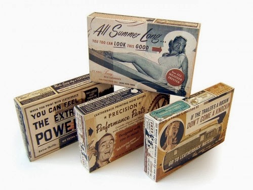
I quite liked the set era theme of these boxes with the overcrowded combination of text and image somehow merging together and working. However I don't think this is appropriate for the target audience of 18-25 year olds because it feels dated although this style has come back into fashion it would be hard to keep a consistency through each card.

The block rectangle packaging really stood out to me with the bright contrasting colours. The colour theme would fit in well with the cards and could easily be adapted to fit in with my work.


I absolutely loved this box idea and think it is so different from conventional boxes however it may be age appropriate for a much younger audience with the illustrated animal. But the box style could be taken and used but I wouldn't be able to justify why I had chosen this particular style.


I thought this was a nice simple idea on the playing cards. To have hearts on the inside tabs just gives it that extra something that stands out.

Brief 4 - Communicate: Chosen games

I want to colour code and divide the games into three categories; Traditional, Drinking and Gambling. Each category will hopefully have five different games in. Those games will be rated on a scale of how easy they are to play and also how long they take to play. Obviously some games can be transferred to different categories so an originally traditional game could be played as a drinking game.

Traditional:
1. chase the ace
2. go fish
3. old maid
4. cheat/ bullsh*t
5. irish snap
6. beat jack out of doors

Gambling:

1. blackjack/ pontoon
2. poker
3. newmarket 

Drinking:

1. ring of fire
2. higher or lower
3. ride the bus
4. cards on a cup
5. palmtree 

I wanted to have a simple rating system so that certain information was obvious. The information I decided I wanted to be shown was:
  • How many people can play
  • How easy the game is
  • How long the game takes
  • What category the game is - Drinking - Traditional - Gambling.
Originally I had the idea of a staring system but this didn't seem to fit in with the questions. You cannot star how long the game takes or how easy it is because people will misread the stars for how good the game is. If it is easy to play and quick then it will be mistaken for a bad game. 

I researched into other rating systems. On games the age appropriate number is in a square. It is bold so it is easy to see and stands out. Other game symbols show what the game includes like a warning such as gambling, violence and bad language. I like the high contrast colours because they work as a set, they are informative and you immediately know what the game involves rather than having to read around for it. 


Whilst cooking I noticed that the cookbook had a good rating system which was in a column on the right top corner. This style really fitted in with the book as it uses a strong colour theme and you can quickly find the information you need - how many people, how easy it is, costing etc...


In the front of the book they had a useful key to highlight what each section meant. This is something that I would definitely look into and want to implement.